The best Power BI visuals
The Visual Vocabulary is a complete guide to which Power BI visuals to use. Depending on the data you want to display, you will need to use one or another.

Download the ebook
What is Visual Vocabulary?
Visual vocabulary in Business Intelligence (BI) is a set of graphical and visual elements that are used to represent and communicate information in an effective and understandable way. These elements include graphs, charts, tables, diagrams and other visual resources that help users to analyse and understand data in a clearer and faster way. The visual vocabulary is based on design and usability principles, and its main objective is to facilitate interpretation and decision making based on the data. By using visual vocabulary in BI, organisations can visualise and communicate information more effectively, which in turn facilitates the understanding and analysis of complex data. Visual vocabulary is a powerful tool in the field of Business Intelligence, as it allows users to visualise and understand large amounts of data more clearly and efficiently.
Visual Vocabulary with Power BI
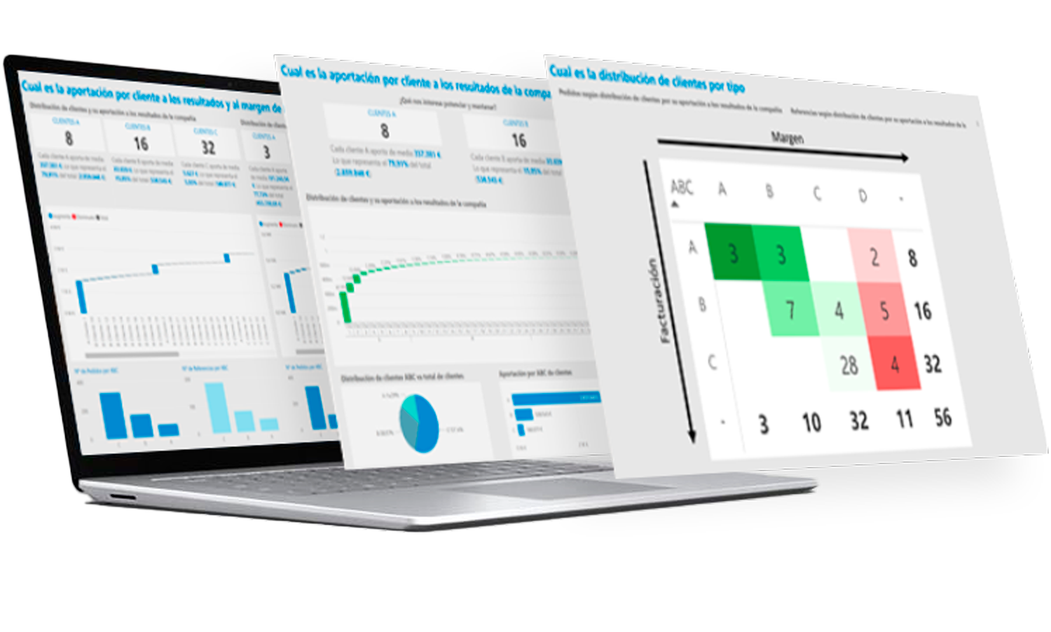
In Power BI, there are a number of visual vocabulary elements that allow you to represent and communicate information effectively. These elements include charts such as bar, line and pie charts, as well as tables, diagrams and other visual elements. The main purpose of using this visual vocabulary in Power BI is to facilitate interpretation and decision making based on the data. By using these visual elements, users can analyse and understand the data in a clearer and faster way. In addition, the visual vocabulary is based on design and usability principles, which ensures that information is presented in an attractive and easy-to-understand manner. In summary, the visual vocabulary elements in Power BI are a powerful tool for visualising and understanding large amounts of data clearly and efficiently.
Power BI Visuals
Power BI visuals are visual elements used in Microsoft's Business Intelligence platform, Power BI, to effectively represent and communicate information. These visuals include graphs, charts, tables, diagrams and other visual resources that allow users to analyse and understand data more clearly and quickly.
The importance of Power BI visuals lies in their fundamental role in the democratisation of data. Thanks to these visual elements, anyone, regardless of their level of technical expertise, can easily access and understand the data. This means that you don't need to be a business intelligence expert to interpret the information and make data-driven decisions.
By democratising data, Power BI visuals enable more people to take advantage of the information available and make informed decisions. This is especially relevant in the business world, where data-driven decision making can make the difference between success and failure.
In short, Power BI visuals are visual elements that allow information to be represented and communicated effectively in Microsoft's Business Intelligence platform. Their importance lies in the democratisation of data, allowing more people to access and understand information in a simple way, which in turn facilitates informed decision making.