The value of data visualization
We reflect on the value of data visualization in business decision making, in the business environment and in life in general.
You've probably heard the expression "a picture is worth a thousand words" at some point. Even "seeing is believing" is one of the phrases we use habitually and which reflects a current of thought integrated into the collective imagination, even though we do not realize it.
Beyond popular sayings or phrases, visualization is part of our culture and, inevitably, of our way of being and perceiving. In fact, visualization and image are becoming more and more socially relevant. In the business world, visualization is a fundamental part of content consumption, of the purchasing process and even of entertainment and learning.
We humans are becoming accustomed to understanding from images and, through them, to defining what matters to us, to shaping our emotions and to acquiring knowledge.
In this sense, visualization has also become one of the most important facets of business decision-making. Understood as the graphic representation of a thought, when used well, it provides an orderly outline of all the pieces that define a concept, as well as the importance of each one of them. In short, visualization helps us understand things better and contributes to the generation of opinions. An example of this are the graphical representations after an election period that explain which party has won, how many seats it has, the power ratio with respect to the opposition, etc. And all visually. Apart from sensations and feelings, graphic representations communicate realities.
In the business world, the importance of data visualization is now unquestionable. Anyone working in a company will know that the need to make decisions is constant, even though it is not an easy process. In fact, making decisions is becoming more and more complicated, especially if we take into account the progressive volatility, uncertainty, complexity and ambiguity (VUCA) of the market. Precisely because of this complexity, the creation and development of methods that facilitate decision making and contribute to making better decisions is crucial. In this regard, the use of data, data analysis and data visualization are essential.
In the era of digitalization, 5G and the Internet of Things; everything we do generates information that can be used to make decisions after collecting, sorting and enriching data. According to DataSphere, in 2025 each individual will produce 4909 data per day.

This research emphasizes what many have been predicting for a while: companies have an increasingly valuable asset for optimizing their business activities. However, it's important to note that data by itself does not generate intelligence or knowledge. For that to happen, data analysis and data visualization are essential.
The market confirms this. In recent years, Google acquired Looker, a data analytics company, for $2.6 billion. Shortly after, Salesforce purchased Tableau, one of the most important data analysis platforms, for $15.7 billion. Oracle and Microsoft have signed an agreement to integrate their cloud environments, and Microsoft is clearly and directly investing in Power BI, a data analysis and visualization platform declared by Gartner as the leader in the business intelligence market.
The need to visualize data is advancing as business decisions evolve to meet more demanding requirements. Today's business decisions, regardless of the area or business unit, must be:
- Efficient
- Comprehensive (referring to all areas, departments, and channels of the company)
- Fast (virtually real-time)
- Action-oriented
Analyzing information in real-time, identifying valuable insights, and gaining knowledge about our customers through an efficient dashboard or visualization platform enhances the capabilities of any organization or business. In addition to fostering understanding, data visualization helps organizations, among many other things, to:
- Understand what is happening and why at all times.
- Measure and analyze impacts.
- Place the customer at the center of the organization, making the company customer-centric.
- Predict problems before they occur and prevent them.
- Promote lean environments.
- Identify insights.
- Generate new business opportunities.
- Enable the creation of stories.
- Foster transparency within the organization.
- Activate an agile leadership model.
In essence, data visualization empowers organizations when it comes to making decisions, expressing their ideas, and avoiding false beliefs. Furthermore, data visualization also promotes cooperation between the company and its customers, as well as the generation of insights and business opportunities
The Importance of Color in Data Visualization
Color is a key factor when representing something graphically, as it helps differentiate elements. However, those responsible for designing these graphics often face a challenging situation, especially when they need to represent a large number of categories, which often results in a rainbow of colors. The best option is to avoid excessive use of colors, as an excess can lead to confusion and hinder data reading.
How can you represent many variables without using a large number of colors? This is a question we often ask ourselves when working with Power BI.
Here are 10 alternatives to using many colors in a visual. Try them out, observe the results, and let us know how it goes! 10 ways to use fewer colors in a visualization:
- Use the same color throughout the visualization
When faced with a visualization that has too many colors, try applying the same color throughout the visualization. This prompts us to ask ourselves: What are colors for? What is their function? Usually, it's to differentiate categories. However, most charts are designed to represent different items, and colors are not necessary.
For example, in a simple bar chart, the bars already represent and separate different elements. Do you need different colors for this? The answer is no.
- Play with shades
A good way to differentiate elements through color is to apply brighter and softer versions of the same color instead of using different colors. Using this technique gives our chart a professional appearance, and the information recipients can distinguish between classifications. Moreover, variations in shade can also be used to emphasize elements. The human visual sense is adapted to perceive brighter colors, so nuances are used to highlight some elements over others.
- Beyond color
There is a world beyond colors. Most reporting tools and platforms contain graphical elements that allow visual differentiation between variables without the need for different colors. For instance, in a scatter plot, instead of distinguishing points with colors, we can use different sizes, shapes, or patterns of the same color.
In a bar chart, we can play with texture or opacity. However, with these graphical elements, we also need to be cautious. Just like with colors, excessive use of them can make the visualization difficult to understand.
- Highlight one or a few categories
Communication is a fundamental part of data visualization. If you want to convey ideas about the data through the visualization, it is crucial that, before designing it, you decide what you want to emphasize. Take a few moments to reflect and ask yourself: What statement do I want to make through this visualization? What visual element helps me illustrate that statement? Once you have it clear, visually highlight that element and keep all the others in the background.
- Group Categories
As we've seen, when we highlight categories through color, we are classifying the visual elements into two groups: important elements and less important elements. For example, if we need to visually represent a large number of countries, instead of displaying them all in the visualization, we can group them by continents and thus reduce the number of elements. However, in some types of visuals, it's impossible to group categories by showing only the most important ones, as the less significant categories are essential for conveying the message.
- Categories by Color
To present information in the best possible way, it is sometimes necessary to group all categories, even the less significant ones. Therefore, a solution for this purpose could be to display all categories but group them by color.
- Use Labels
A useful alternative to colors for differentiating variables is direct labels. These allow the recipient to identify the characteristics of a chart with a single color. Moreover, they provide information that colors cannot represent. For example, if we have a chart with bars for each geographical area, colors alone may not be sufficient to identify each territory. However, if we label each bar, it will be possible to know which place it represents.
- Tooltips
When direct labels cannot be used, tooltips are a good alternative. These are comments or information that appear only when the user hovers the mouse over an element. This means that users can only see one tooltip at a time, making it difficult to compare categories or quickly find a specific category. Therefore, direct labels are better for displaying important information, while tooltips are useful for presenting less significant details without cluttering the visualization with direct labels.
- Change the Chart Type
In some cases, it is advisable to change the chart type to avoid using colors. This way, elements will be clearly distinguished through their position, such as using a clustered bar chart instead of a stacked one. This can completely change the narrative of our dashboard, so we should not overlook the choice of visuals.
- Small Multiples
There is an extremely effective visualization technique for reducing the number of colors when other alternatives are not feasible: "small multiples." This technique involves splitting a chart with many categories into several individual charts for each category. This allows each category to have its own space rather than being all grouped in a single visual. Small multiples facilitate the visualization of trends in each category but make comparative analysis more challenging. Therefore, it's not the best choice when you want to encourage comparison. If you want to transform a chart into small multiples, don't worry. This doesn't mean you have to create a new chart for each category. Most business intelligence tools incorporate features that automate the process. For example, Power BI has offered the "small multiples" function since 2020.
Tools for Data Visualization in a Business Intelligence Environment
Today, virtually all companies require business intelligence tools to create appealing corporate reports, whether for communication within their own teams, with other departments, or with clients.
In this regard, data visualization is a key tool as it democratizes information. In simple terms, visualization allows users who speak different languages to understand each other. For example, if someone from the sales department wants to know which territory had the lowest order conversion rate last month, they would want to be able to ask using their own language and get a direct response that allows them to quickly grasp the information and navigate through the data to reach a conclusion. This is precisely what data visualization enables.
Furthermore, BI and data visualization tools are capable of providing personalized results and offer users all the information they need in a single environment accessible from any device. These types of tools are often quite autonomous and update information automatically. By using such tools, users can even manipulate the information and adapt the visualization to their specific needs to support the business decision-making process.
The Most Used BI and Data Visualization Tools
Microsoft Excel
Microsoft Excel is probably not the first choice that comes to mind when thinking about data visualization tools in business intelligence systems. However, it remains the most widely used analytical tool in business environments due to its high accessibility. No other solution on the market has such widespread usage, especially among users in the business world.
Today, Excel is a self-service BI tool that includes end-to-end functionality through integration with other Microsoft tools such as PowerQuery, PowerPivot, PowerView, and PowerMap. Its connection to other analysis and visualization tools makes Excel incredibly easy to use for non-expert users, and more technical users can expand their analytical and visualization capabilities by combining it with other services for business intelligence.
Power BI
Power BI is another tool that is part of Microsoft's technology portfolio. Power BI is a powerful data analysis, business intelligence, and data visualization tool that, in fact, positions itself as the market leader in analytics and BI platforms according to Gartner's Magic Quadrant.
Power BI consists of a set of five distinct tools or platforms:
-
Power BI Desktop: This is where data connections are established, and corporate reports are created.
-
Power BI Service: It is the service that enables the publishing and sharing of reports with other users, as well as viewing the reports and allowing other users to view and even edit them.
-
Power BI Mobile: This tool helps in formatting the initial reports to make them optimal for viewing on mobile devices.
-
Power BI Pro: It is a usage license that allows organizations to publish reports with a much lower limit on capacity and data storage.
-
Power BI Embedded: This enables the publication of Power BI reports in custom applications and other portals through web services, APIs, and SDKs without the need to acquire a pro license.
Power BI allows users to gather data from various source origins and relate them in a single environment for subsequent visualization through dynamic, interactive, and highly engaging visuals. It also enables data analysis and sharing with other users.
In terms of visualization capabilities, the use of visual objects in Power BI Desktop is one of the simplest options for generating visual reports from a dataset. Power BI includes a wide range of high-performance standard visuals that do not require programming. Additionally, Power BI allows users to create their own custom visuals. For more complex operations, such as data modeling before transforming it into a visual, users can execute DAX functions to create calculated columns and metrics.
As a Power BI partner company, Bismart utilizes this powerful data visualization, business intelligence, and analysis tool to create the best solutions for our clients.
Pyramid, from the Pyramid Analytics corporation, is a tool geared towards business analytics that offers self-service analytics and business intelligence systems.
Pyramid includes six different modules: formulation, presentation, modeling, discovery, illustration, and publication. The illustration module is dedicated to data visualization and allows users to develop charts from data, as well as texts and infographics. The tool includes 36 pre-designed charts that can be expanded to more than 150 different visualizations.
Among other things, Pyramid offers:
- Reusable content that can be added to corporate presentations or other types of reports.
- Dynamic texts based on data.
- Dynamic infographics.
- Composite visualizations.
- Visual workflows for illustrating processes.
Charticulator
Charticulator is a Microsoft tool that specializes in data visualization for users with a less technical and non-programming background. Specifically, Charticulator is a tool for creating visuals without the need to write code.
It is an open-source application that allows us to create custom charts and visuals without having to write code, overcoming the limitations of other tools that enable the design of very basic visuals or more comprehensive tools that require the involvement of a programmer. Charticulator is Microsoft's solution for enabling non-programmers to create complex, high-performance visuals.
For example, this powerful tool allows users to specify the layout of charts interactively, without having to program data transformations.
Do you want to create custom, high-performance charts without writing a single line of code? Download our Charticulator user guide!

Tableau
Tableau is an American company recently acquired by Salesforce. Tableau has been listed by Gartner as a leader in its Magic Quadrant for several years, although in recent years it has been overtaken by Microsoft's Power BI.
Tableau is a data visualization platform that is very useful for converting and simplifying data, creating dashboards, and quickly analyzing data. Tableau offers simple visualizations that are relatively easy to develop, making it a good choice for non-technical users.
With this tool, you can:
- Create charts and dashboards displaying KPIs.
- Build dashboards and charts.
- Display KPIs.
- Analyze and explore data.
- Share your dashboards and reports with users who also have access to the tool.
- Connect data with other tools like Microsoft SQL Server, Spark, or Hadoop Hive Server.
QlikSense
QlikSense is a BI platform owned by the Swedish company QlikTech, founded in 1993.
QlikSense is a data visualization tool suitable for non-technical users, as it allows for relatively simple creation of visualizations. Additionally, QlikSense enables users to ask questions about graphical representations of data.
With QlikSense, you can:
- Query data visualizations.
- Easily explore data views.
- Create interactive visualizations.
- Perform smart queries.
- Share the information from your visual analysis with other users.
Business Objects
Business Objects is a set of BI and reporting platforms through which users can create reports and visualizations. Additionally, Business Objects allows data analysis and deriving insights from information.
Specifically, Business Objects includes two products: Business Objects Edge Edition, ideal for small and medium-sized enterprises, and Business Objects Enterprise, geared towards large enterprises.
With Business Objects, we can:
- Perform queries and navigate through data.
- Apply layers to metadata and control the lifecycle of objects.
- Create visualizations and corporate dashboards.
- Obtain insights.
- Perform queries and analyze data.
MicroStrategy
MicroStrategy, an American company founded in 1989, specializes in offering business intelligence and OLAP software. Their BI tool allows the creation of formatted reports and interactive dashboards, among other possibilities.
The main capabilities of MicroStrategy include:
- Creating data visualizations quickly in the form of charts, maps, or diagrams.
- Including a library of charts that any user can utilize.
- Discovering insights.
- Developing visuals through Visualization Builder and SDK or utilizing visuals created by third parties.
- Data Discovery.
To choose the right data visualization tool for our company, we must consider the needs and specificities of our business, as well as technical aspects of the tool. The key factors to consider include whether the platform can connect to the existing APIs, cost, the technical proficiency of users who will use it, and the platform's ease of use and scalability.
Reporting Services (Microsoft SQL Server)
You might think that with SQL Server Reporting Services, you can't create visually appealing and interactive reports and dashboards, right? Well, you're wrong!
Bismart's BI consulting team specializes in ensuring that all of our clients' business needs are met. In this regard, our reports not only have optimal technical quality but also apply the most cutting-edge usability, storytelling, and interactive communication criteria when designing reports, dashboards, or any type of document with Microsoft's Reporting Services.
In this sense, by applying the right BI principles, we can take our standard Reporting Services reports to another level to provide a better response to our clients' business needs. Design, data visualization, usability, and communication play a fundamental role in creating appropriate visualizations so that top-level executives can make better decisions based on data.
Our team of experts maximizes the possibilities of Reporting Services by developing dashboards tailored to the specific needs of each organization, with powerful exploration, navigation, interaction, and storytelling features.
How do we do it?
- We consider the audience for whom the dashboard or report is intended.
- We apply the best visual cohesion patterns and data readability.
- Our dashboards and reports always incorporate storytelling. A corporate dashboard or report should tell a story and follow a narrative thread.
- We select the most appropriate data sets, performance indicators, and KPIs based on the business objectives to be achieved.
- We consider color cohesion, information readability, and the corporate image of each company.
- We complement the design of dashboards and reports with a comprehensive consulting service that keeps us in constant contact with the client to find out which information is most relevant in each case, what the client needs to address, and what their expectations are.
Do you want to design optimal dashboards, both visually and in terms of content and technique?
Data Visualization with Power BI
As we have seen, data visualization is an imperative need in the business environment. We have also seen that there is a wide range of data visualization tools on the market, which also include data analytics functions and allow users to create corporate reports, dashboards, and charts.
In this regard, choosing the right platform can determine the success or failure of our data analysis processes and influence data-driven decision-making. Selecting a tool that is compatible with the expertise level of our users and aligns with the business needs is crucial. Power BI is one of the best data visualization tools on the market.
At Bismart, as a Microsoft Power BI partner company, we rely on Power BI to create our dashboards, reports, and more.
- Download our e-book with the 21 best practices for report creation in Power BI
Power BI is an intelligent system with predictive capabilities that allows users to transform complex datasets into dynamic and interactive visualizations that promote data understanding and the extraction of insights.

Why Power BI?
Power BI is Microsoft's preferred data analysis, business intelligence, and data visualization tool and is the market leader in data analysis and BI platforms. It consists of a set of self-service, cloud-based tools that enable businesses to access, analyze, and understand their data, transform it, and create impactful and engaging visualizations from it.
The Power BI platform was created by Microsoft as a tool designed for business analysis and is, therefore, one of the top platforms when it comes to satisfying the business intelligence needs of companies. Furthermore, Power BI is the tool with the highest connectivity and integration capabilities with other tools and is accessible from any device.
Power BI empowers users to perform the typical functions of BI platforms such as grouping, forecasting, and quickly applying measures to data. At the same time, it includes more advanced capabilities such as data modeling through the DAX formula language. It also allows users to develop artificial intelligence capabilities without having to code to uncover hidden insights in data that would otherwise be inaccessible.
The main advantage of Power BI over other data visualization platforms is its great potential for presenting information and design. Power BI enables the creation of interactive, dynamic, visually appealing, and impactful visualizations that contribute to the understanding of information by any user, thus leading to conclusions, obtaining valuable insights, and, consequently, making informed decisions. Additionally, with Power BI, information, visuals, and reports can be easily shared with other licensed users, and the tool supports the customization of all reports and dashboards.
Power BI includes security measures that protect data and promotes data integration due to its high connectivity and integration capabilities and its ability to collect and integrate data from virtually any data source and in any format. With Power BI, users can integrate relational and non-relational data as well as add datasets from other programs like Azure, SQL, Excel, CRM, Google Analytics, etc.
In summary, the most prominent benefits of Power BI are:
- High Visualization Capabilities: Power BI enables the creation of high-performance and visually stunning visualizations that can be interacted with and explored. Additionally, in Microsoft's AppSource, Power BI users can find pre-designed visuals validated by Microsoft, although the tool also allows for the creation of custom visuals and customization of visualizations, reports, and dashboards.
- Integration and Connectivity: Power BI can connect to a wide range of tools, both Microsoft and external, and can import data in multiple formats, collecting data from virtually any database. It also enables the blending of data from different sources and disparate formats into a single view and supports data transformation.
- Sharing Reports, Data, and Visuals with Others: Power BI allows users to share their creations with internal or external users, including coworkers and clients. Thus, Power BI promotes collaborative work and the development of coordinated business strategies.
- Automation: Power BI updates data automatically, enabling top executives to make real-time decisions.
- Versatility: The tool is useful for all departments within a company and can be used by any user due to its user-friendly interface.
- Cost-Efficiency: Both Power BI Desktop and Power BI Mobile are free platforms. However, other Power BI tools, such as Power BI Pro, require a monthly or annual subscription fee.
What can I do with Power BI?
Power BI is one of the best options in the market for data analysis, meeting the business intelligence needs of companies, visually representing data, and creating corporate reports and dashboards tailored to the business needs of each organization.
Power BI is a tool designed to support the management of organizations in the decision-making process, allowing business leaders to assess their performance, discover areas for improvement and weaknesses, identify business opportunities, and even predict future scenarios and make forecasts. Power BI assists all business units within a company and contributes to the transformation of organizations into customer-centric companies. It is useful for departments such as sales, marketing, HR, operations, logistics, executive roles, and more.
In essence, Power BI is a key tool for the smooth operation of a company. It stands out for its ability to draw conclusions from data and its contribution to making better decisions.
The Best Power BI Visuals
Have you heard of Visual Vocabulary? It's a comprehensive guide for report and dashboard creation that helps us choose the best Power BI visuals based on the dataset we want to display.
The Bismart BI consulting team, following the Visual Vocabulary criteria, selects the appropriate charts, visuals, and custom visuals based on global consensus supported by the Financial Times Graphic Team, Microsoft, and Tableau. Visuals are more than just images; they are a form of graphic symbolism that serves a fundamental communication purpose. Therefore, we should not choose the visual we like the most but the one that best represents the information we want to convey.
In this regard, visual vocabulary is a form of expression that combines graphics and imagery with words. According to the Financial Times, creating reports following the agreed-upon visual vocabulary guide is crucial because a significant part of society is unable to understand charts that, for some, may be considered simple. This paradox poses a significant social problem because in the age of information and data, it is essential for everyone to have the ability to navigate through data and information. If this possibility is hindered by a lack of understanding, it undermines the right to information and the development of critical thinking and independent opinions of that person.
In the business context, this problem translates into the fact that even if an organization has an expert team in data processing, it is most common for the more technical profiles to lack the necessary knowledge to know how to communicate complex information to non-experts.
Thus, visual vocabulary emerges as an alternative to this dilemma and enables a bridge between data scientists and analysts and individuals with basic data and statistical knowledge.
SQLJason has created a Visual Vocabulary guide adapted to Power BI.
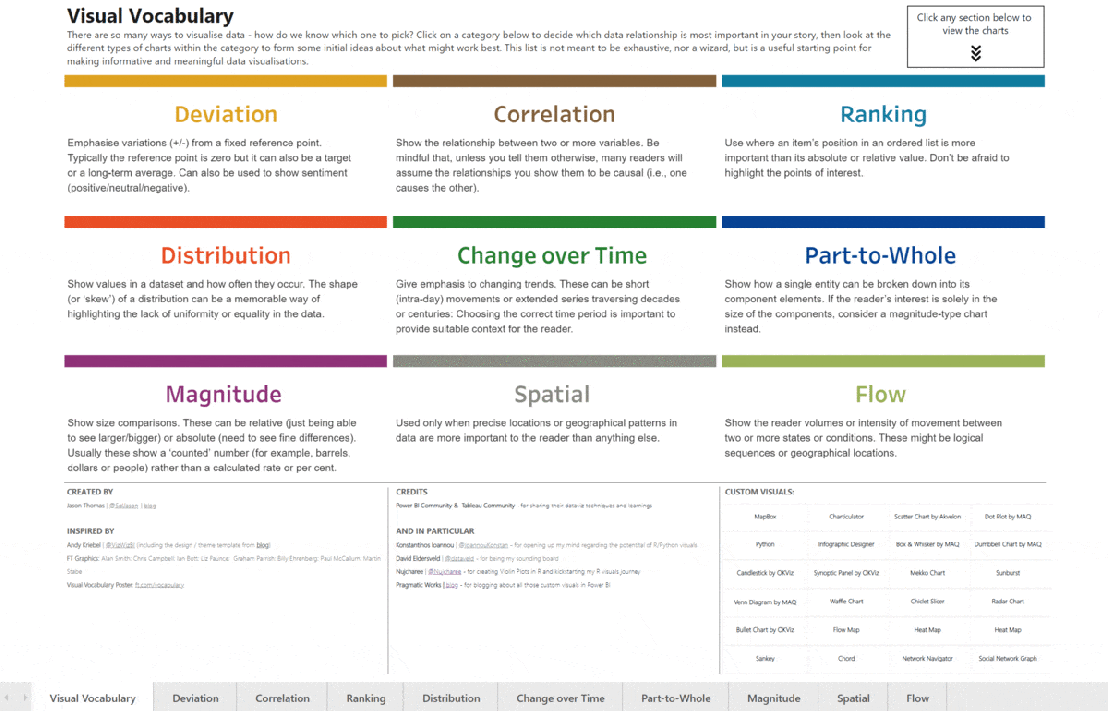
What Does It Explain?
The most important aspect when choosing a chart or visual is to consider the category and the data you want to display. In this regard, Power BI has the following categories of visuals:
Deviation
Highlights variations (+/-) from a fixed reference point, which is usually 0 but can also be a long-term average or a business goal.
Deviation is also the best option when you want to express a sentiment (positive, neutral, or negative).
Correlation
Expresses the relationship between variables. It's essential to consider that, unless stated otherwise, most people assume that the relationships shown are cause and effect. In other words, one is a consequence of the other. Therefore, if you intend to express a relationship between two or more variables that is not causal, you must indicate it properly.
Ranking
Used to position an element within an ordered list and highlight that this element is more important than the absolute or relative value.
Distribution
Displays the values of a dataset and the frequency at which they occur.
Change Over Time
Used to emphasize changes in data (trends) over a period of time. The time period can be short (a day) or extended into longer series (decades, centuries, etc.). Choosing the most appropriate time period is crucial to provide the reader with the appropriate contextual temporal sense.
Part-to-Whole Relationship
These visuals express the possibility that a single entity can be broken down into several constituent elements and the link between all entities.
Magnitude
Magnitude charts show comparisons between sizes, which can be absolute or relative.
Spatial
Spatial visuals are used when geographic location is more relevant than any other factor. In other words, when you want to place an element geographically more than anything else.
Flow
Highlights the intensity of movement between states or conditions, whether it's logical sequences, geolocations, etc.
Tree Decomposition and New Visuals: Power BI's Innovations
In November 2019, Microsoft introduced an update to Power BI that had a significant impact on the data visualization capabilities of the platform.
The most interesting innovation in the update was undoubtedly the introduction of the tree decomposition chart and the new Power BI visuals.
The tree decomposition chart is used for root cause analysis by visualizing the contribution of individual categories to a whole. This visual enables the breakdown of a set to examine each category separately and decide how to arrange the categories based on a specific measure selected, such as the number of sales.
The great advantage of this visual is that it allows for predictions and simulations so that executives can make better decisions.
Beyond the tree decomposition chart, the Power BI update also introduced other new visuals:
- Update of ArcGIS Maps, which can now connect to ArcGIS Enterprise services through authentication.
- New xViz visuals, including Advanced Gauge and Hierarchical Filter.
- ZoomCharts Drill-Down Waterfall Visual. ZoomCharts Drill Down Waterfall is a new visual added to the group of custom visuals by ZoomCharts.
- Financial Reporting Matrix from Profitbase to facilitate the development of financial reports and dashboards.
- Distribution. This distribution visual enables the display of a performance indicator for each category in the selected visual field.
- Tree. With this new visual from CK Corporation, you can present hierarchical data in a tree structure.
Optimize Data Visualization with Zebra BI
Creating high-quality and inspiring dashboards and visualizations has become a competitive advantage for many corporations today. In this regard, Zebra BI stands out as a highly useful service for organizations looking to take their data visualization to a more advanced level. Zebra BI elevates data visualization to another level.
In mid-2020, Bismart entered into a partnership with Zebra BI. Bismart specializes in creating technological and business intelligence solutions, with one of our essential tools being Power BI. We strive to ensure that our Power BI solutions meet our clients' business needs. Being partners with Zebra BI has allowed us to enhance the design of our Power BI solutions and expand our data visualization capabilities.
Zebra BI visuals are especially useful for finance, marketing, and sales departments. Through this tool, we can create better reports, particularly financial reports.
Zebra BI is a service designed to optimize the visualization capabilities of Power BI and Excel. The tool complements Power BI and Excel's visualization capabilities by adding unique possibilities and functions that these platforms do not have. Zebra BI enhances the power of reporting, report creation, data visualization, and analytical capabilities in Excel and Power BI. Let us tell you how!
Enhance Your Power BI and Excel Visuals with Zebra BI
Zebra BI is a tool designed to meet advanced company needs for data visualization, data analytics, and reporting. More than just a tool, Zebra BI is a service provider of unique, interactive, and specialized visuals that can be integrated into Power BI and Excel, increasing the reporting and analysis capabilities of these two tools with unique functionality possibilities.
Zebra BI visuals are validated by Microsoft and are a reference in the market. Even Microsoft uses Zebra BI visuals in its internal reports.
Bismart is a partner company of Zebra BI, and through this partnership, we have improved the quality and technical capabilities of our data visualizations and reports.
Discover everything you need to know about Zebra BI in this report.

Why Choose Zebra BI?
In addition to being a self-service BI service integrated with two of the most powerful business intelligence and analytics tools on the market—Power BI and Excel—Zebra BI offers numerous advantages and benefits that other data visualization tools do not provide.
Zebra BI complements Power BI and Excel by adding extra capabilities such as simplifying data modeling, segmented tables with custom segments (MTD, YTD, YTG, and Full Year), charts with more dimensions, price calculations, or the ability to highlight specific columns in tables and charts.
These capabilities make Zebra BI an ideal and essential service for finance, marketing, and sales departments. Zebra BI significantly reduces the complexity of creating reports related to revenue, profit, loss, and outputs in Power BI, and it also offers the possibility of making these reports much more comprehensive and dynamic.
Furthermore, the service stimulates the identification of business insights, as it allows data scientists to obtain specific information through advanced functions and more thorough analysis. One of the great advantages of Zebra's visuals is that, instead of merely illustrating reality, they allow you to visualize the causes of that reality. Zebra's visuals not only inform users about their business situation but also help them discover why that situation exists.
The most notable advantages of Zebra BI include:
- Advanced visuals and reports: Zebra BI includes unique functionalities that enable you to create more comprehensive and advanced charts and visualizations. Examples of these are waterfall charts with subtotals, forecasts in monthly reports, or advanced analysis with multiple small multiples. Additionally, Zebra's visuals are visually responsive and include more than 4 base measures with variations in a single visual.
- More comprehensive charts: Zebra BI complements the chart creation capabilities of Power BI and Excel with matrix, automatic variance, waterfall, lollipop, bar, and other types of charts.
- Suitable for all users: Zebra BI's matrix allows users to create extraordinary visuals easily and relatively effortlessly. It is a platform with optimal, intuitive usability that guides users through the creation process.
- Streamlines reporting: In addition to enabling the creation of more comprehensive reports, Zebra BI also streamlines the report creation process, as well as calculations and the visualization of business insights.
- Flexible tables: With Zebra BI, you can create flexible tables where you can add charts, show or hide columns as desired, create hierarchies, or collapse rows without limitations.
- Optimal design: As a specialist tool for design and visualization, Zebra BI allows companies to adapt the design of their reports to their corporate image.
- Simplifies data models through PY, Forecast, and YoY growth rates, among others.
- Allows you to highlight columns of your choice, both in tabular and chart formats.
- Complements reports with N-type analyses, profit and loss calculations with subtotals, cost investment functions, etc.
- Microsoft Validation: Zebra BI's visuals are certified by the American multinational and are integrable and compatible with all Microsoft technologies.
Moreover, Zebra BI continuously updates and enhances its capabilities and visuals over time. In August 2020, Zebra BI introduced new features to its platform, further expanding its capabilities for creating specialized visuals. The key changes included:
- Displaying 4 base measures with variations in a single visual: Zebra BI allows you to create up to 4 base measures for a single visual.
- New capabilities to highlight tables and charts: Zebra BI's update brought the new possibility of highlighting specific columns with the chosen color, both in charts and tables.
Zebra BI Office: Zebra BI Visuals Now in Excel and PowerPoint
Zebra BI Office enhances the functionality of visuals in Excel and PowerPoint to provide a richer and more comprehensive report creation experience. Zebra BI Office offers a wide range of visuals such as pivot tables, charts, maps, and comparison tables to enhance data analysis and presentation capabilities. These visualization elements allow users to enhance their report presentations with visually appealing information more easily.
Furthermore, Zebra BI Office enables users to extract information quickly and easily through its advanced analysis tools, including filters, pivot tables, and interactive charts. All of this can be done without the need for coding and with an intuitive user interface, which means that users can save time when creating complex reports.
In summary, Zebra BI Office provides a wide range of visualization tools to enhance the report creation experience in Excel and PowerPoint, giving users a quick and easy way to extract information through advanced analysis tools without the need for coding. This saves users time when creating complex and engaging reports.
➡️ Explore everything you can achieve with Zebra BI Office for Excel by downloading Zebra BI's official Excel templates.
The templates include the following reports:
- Annual and monthly sales variance table
- Profit and loss statement
- Cash flow statement
- EBIT contribution analysis
- Price and volume mix
- Subscription business model
- Marketing budget variances

Optimize Your Data Visualization and Reporting Capabilities with Zebra BI!
Zebra BI Office extends all the functionalities of Zebra BI for Power BI to two new environments: Excel and PowerPoint.
Zebra BI visuals in Excel
The integration of Zebra BI with Excel addresses one of the weakest points of this tool: data visualization.
Currently, Excel is the most widely used analytical tool by organizations. Although it is not specifically designed for business intelligence, many companies use it for that purpose.
Despite Microsoft's efforts to bring Excel into the realm of business intelligence, advancements in terms of visualization have been limited. While Excel is a fundamental and necessary tool, its data visualization capabilities fall short. Excel visuals are not designed to drive business decision-making, enhance data understanding, enable effective communication, and rapidly generate insights. In short, Excel is not the right tool for creating actionable reports.
But that is about to change.
Zebra BI Office for Excel offers solutions to one of the main limitations faced by Excel users through two add-ins: Zebra BI Charts and Zebra BI Tables.
Zebra BI Charts: This add-in includes all the visuals and charts from Zebra BI for Power BI, with responsive, interactive, and adaptable features. Zebra BI Charts visuals for Excel allow for automatic calculation of variations concerning previous periods, plans, or forecasts, as well as growth rates and totals. Furthermore, they are intelligent and interactive visuals that adjust to the visual's size, displaying more summarized information in smaller visualizations and providing more specific details in larger visualizations.
Zebra BI Tables: This add-in enables the visualization of structured data in both table format and charts with integrated variations, similar to what is found in Power BI.
Both add-ins include Zebra BI's own toolbar, which provides complete design and creation freedom to users. Zebra BI visuals allow for customization of design, addition and editing of formulas, visual representation of variations, and direct comments from the visual.
Zebra BI Office for PowerPoint
Zebra BI Office for PowerPoint offers the same capabilities as Zebra BI for Excel, but now available in PowerPoint.
The integration between Zebra BI and PowerPoint aims to enhance both business and internal presentations of companies. By having powerful visuals like those from Zebra BI in a widely used platform like PowerPoint, it provides the opportunity to communicate data in a visually appealing and easily understandable way. This allows for a more impactful and effective presentation of information.
Zebra BI Office: Highlights
1. Transform Data into Interactive Visuals with One Click: One of the standout features of Zebra BI for Excel is its ability to quickly convert numbers into interactive, visually appealing, and adaptable charts and tables. With a simple click on "create visual" and data selection, Zebra BI automatically generates advanced visuals. Here are some of its key functionalities:
- Multiple Small Multiples: Zebra BI charts use advanced algorithms to effectively represent multiple small multiples.
- Dynamic Comments: All Zebra BI visuals allow for adding dynamic comments directly on the charts.
- Zebra BI Cards: Zebra BI KPI cards allow you to include multiple KPIs in a single visual without affecting report performance and loading times.
3. Deviation Visualization: Data alone doesn't provide complete information. To make data meaningful, it needs to be placed in its context. Zebra BI facilitates this process by automatically calculating absolute and relative deviations. These deviations are displayed in the visuals, contextualizing the data and aiding in generating insights.
4. Enrich Your Presentations and Reports by presenting data within its context, enabling business users to draw conclusions in seconds. With Zebra BI, transform your data into relevant and easily understandable information.
5. Generate Advanced Analysis Reports: With Zebra BI for Excel, creating sophisticated reports is easier than ever. You can design multiple charts in a single visual, providing greater flexibility and communication power. Moreover, Zebra BI allows for importing complex Power BI pivot tables into Excel and PowerPoint, bridging both tools into the world of business intelligence.
6. Make Informed Decisions, Don't Just Decide: The ability to add comments to visuals is an invaluable feature for executives to quickly understand data and avoid drawing incorrect conclusions. Zebra BI's dynamic comments automatically update when data changes, ensuring the accuracy and relevance of the presented information. With Zebra BI, you not only make decisions but make the right decisions based on a clear and up-to-date understanding of your data.
Zebra BI in Excel: Enhancing Collaboration with Power BI Users The supposed rivalry between Excel and Power BI is more of a myth than a real competition. In our article "Excel vs. Power BI," we made it clear that these are platforms with different purposes. In fact, Microsoft recommends using both tools together as part of an organization's business intelligence toolkit.
In this regard, Power BI users can also benefit from Zebra BI's integration with Excel and PowerPoint.
With the new add-ins, regular Power BI users can now directly import their data sets from Power BI into Excel. This means there's no need to create copies of data sets to, for example, generate a pivot table in Excel. This option not only promotes data security and governance but also ensures a single version of truth across all business tools.
Democratizing Prescriptive Analysis and Actionable Reports in the Business World
In addition to explaining the features of Zebra BI Office and the new opportunities it brings, it's important to highlight the significance of this release.
At Bismart, as partners of Zebra BI, we are excited to see how the advantages of Zebra BI expand and the impact this merger will have in the corporate environment.
In recent years, we've witnessed the convergence of descriptive analytics and predictive analytics, giving rise to prescriptive analytics. While descriptive analytics helps companies understand what has happened so far and predictive analytics helps predict what will happen in the future, prescriptive analytics focuses on determining what actions to take. Today, prescriptive analytics is crucial.
However, prescriptive analytics requires effective data visualization, and this is where Zebra BI for Excel and PowerPoint promises to make a difference.
Although in the field of business intelligence and data analysis, we are familiar with tools that allow analytical functions and the creation of advanced reports, outside this environment, the reality is different.
Despite not being designed for this purpose, Excel remains the most widely used business intelligence tool by organizations. In practice, many companies are not data-driven, and most business users still copy and paste huge Excel tables into PowerPoint presentations. This results in significant losses of time and money in poorly planned meetings and business presentations.
In 2019, the cost of poorly planned meetings was estimated at $399 billion.
In these meetings and presentations, time and communication are crucial. Business users need to understand the information within seconds. Thanks to Zebra BI, they can now create meaningful visualizations, generate business intelligence, and make data-driven decisions with a single click.
Beyond making life easier for users already familiar with Zebra BI and other business intelligence tools like Power BI, the availability of Zebra charts in Excel and PowerPoint brings data analysis, business intelligence, and data visualization to those less familiar with these concepts. Consequently, Zebra BI Office contributes to data democratization and promotes the development of a data-driven corporate culture.
In summary, Zebra BI Office represents a significant step towards data democratization in the business world.
Zebra BI charts address data visualization limitations in Excel and make it easier to obtain relevant information without switching platforms.
As for PowerPoint, it's now easier than ever to create presentations with interactive charts and pivot tables, transforming meetings and presentations into more comprehensive experiences.
➡️ Don't miss the opportunity to try Zebra BI Office for yourself! Download the Excel report templates with Zebra BI charts now.
Data Visualization Tools: Key Considerations for Choosing the Right Option
Data visualization is essential for transforming complex information into understandable graphical representations, facilitating data-driven decision-making. Selecting the appropriate data visualization tool depends on various factors, including specific business needs, ease of use, integration capabilities, and available functionalities.
Notable options include Microsoft Power BI, known for its integration with the Microsoft ecosystem and ability to create interactive dashboards. Tableau is another powerful tool offering advanced visualizations and an intuitive interface. Qlik Sense provides associative analytics that allow flexible data exploration. Looker, now part of Google Cloud, focuses on data modeling and creating customized reports.
When evaluating these tools, it's important to consider aspects such as scalability, technical support, user community, and total cost of ownership. The right choice will enable organizations to fully leverage their data and gain valuable insights to drive growth and operational efficiency.
10 Strategies to Optimize Color Use in Data Visualization
Color is a powerful tool in data visualization, but excessive use can lead to confusion and hinder information interpretation. To prevent charts from becoming a meaningless "rainbow" of colors, it's essential to apply strategies that prioritize clarity and understanding.
One key recommendation is to use a single color to represent multiple categories, relying on labels and other visual elements to differentiate data. Additionally, employing textures, patterns, or variations in opacity can distinguish elements without resorting to a wide range of colors.
Grouping less relevant categories under the same color and highlighting the most important ones with distinct tones helps focus the viewer's attention. Direct labels and tooltips can also provide additional information without visually overloading the chart.
In some cases, changing the type of chart may be the best solution to represent data more effectively without relying on color. For example, choosing charts that use position or shape to differentiate categories can reduce the need for multiple colors.
In summary, effective visualization doesn't depend on the number of colors used but on how they are applied to enhance understanding and facilitate data-driven decision-making.