Today, companies support the process of data-driven decisions through dashboards and corporate reports, which provide them with greater visibility and understanding of their results. Furthermore, dashboards also increase corporate control over business processes.
Dashboards serve to visually represent data —data visualization— and to offer a clear picture of the business reality by integrating multiple data sources into a single and properly organized interface.
Dashboards are the tool that allows company directors to monitor their business activity and key performance indicators (KPIs).
What is a dashboard and what is its purpose?
A dashboard is a business tool used to visualize metrics and key performance indicators (KPIs) in a clear and understandable manner. Its main objective is to provide an overall view of a specific area of business activity and assist leaders in making informed decisions.
Similar to an Excel spreadsheet, a dashboard collects data sets and presents them visually in one place. Its structure, presentation, and graphical elements can vary according to each company's needs and may include tables, charts, KPIs, performance indicators, text, and other visual elements.
The purpose of dashboards is to facilitate the understanding of any area of the business for decision-makers and to monitor activity and track overall business performance.
A dashboard can be used to analyze and study different business units or specific parts of business activity. Therefore, it is common for organizations to have multiple dashboards, such as one for each department, one for a particular customer segment, or even one to analyze specific projects.
Which indicators are relevant in a dashboard?
A dashboard can include a variety of indicators, but it's important to select those that are relevant for the analysis you want to perform. For example, if you want to evaluate the performance of a company's sales department, you can include indicators such as the number of new customers, ongoing negotiations, closed sales, among others.
On the other hand, if you intend to analyze the progress of a specific project or initiative, you can consider metrics related to hours worked, productivity, results achieved, and profitability based on the hours invested, among others.
Who uses a dashboard in a company?
Dashboards are primarily used by decision-makers and those responsible for analyzing the productivity of a particular business area. Therefore, it can be used by both the CEO of a company and department heads, project managers, area supervisors, among others. However, there are also cases where other employees can use dashboards to track their own work or analyze the performance of specific projects.
For example, in the marketing department, it's common for all team members to use the dashboard to analyze the performance of their initiatives, monitor campaigns, and more.
Explore in greater depth the characteristics a dashboard should have and how it is linked to corporate strategy in our webinar "Dashboards: Clarifying Concepts."
What is the difference between a dashboard and a report?
Both dashboards and reports are tools that facilitate data democratization by presenting it in a comprehensible manner so that any user can make informed decisions and delve into business activity. However, it's important to note that a dashboard is not the same as a report, and they serve different functions.
Dashboards, also known as dashboards, are visualization tools that contain the most important information about a specific topic, usually related to business performance, a business area, or a particular department. Their purpose is to track performance and assist in business decision-making.
In a dashboard, the big picture is more relevant than the details. Information is presented concisely and clearly on a single screen, using metrics, key performance indicators (KPIs), and performance indicators, with the goal of guiding strategic decision-making related to the business.
On the other hand, reports can address issues of any scope and are not necessarily related to business performance, although they can include it. For example, a report can quantify and track the progress of a specific project, which, once completed, will no longer be relevant.
Corporate reports typically consist of multiple pages or sections with charts and tables to represent the information. Unlike dashboards, reports are more detail-oriented and precise, with the aim of providing an overview based on detailed and well-structured information.
Additionally, dashboards are more likely to generate questions aimed at optimizing aspects of the business than reports. A key difference between them is that dashboards tend to be dynamic and enduring, while reports often have an expiration date and are linked to projects or topics of finite duration.
In summary:
- Dashboards are more comprehensive, as they integrate the most relevant information from one or more business areas into a single screen, with the goal of monitoring and drawing conclusions from a global view.
- Reports focus on a single theme and treat it in more detail and depth, typically on multiple pages. Furthermore, reports involve a higher level of granularity than dashboards.
-
When to use a dashboard?
The choice between dashboards and reports depends on the specific characteristics and needs of each organization, based on its business logic. In general, dashboards are used to graphically represent aspects related to overall business activity that require continuous monitoring over time. These tools are designed for diagnosis and are ideal for quantifying the achievement of business objectives and visualizing the evolution of business performance. Dashboards provide key information to advise executives and managers in making important decisions. Don't miss our 12 indispensable tips for creating a dashboard.
When to use a report?
Reports are used when a thorough analysis of a specific aspect over a defined period of time is needed. They are the appropriate tool for conducting a detailed and in-depth examination of a particular thematic area over a limited period. At Bismart, as a Microsoft partner in Power BI, we develop our reports and dashboards using this tool. Our team of Power BI experts has created an e-book that compiles the 21 best practices for creating reports in Power BI, based on their extensive experience.
Types of Dashboards
The design of a dashboard is crucial for its effectiveness in business management. However, for it to fulfill its purpose, it must be appropriately tailored. A dashboard should be designed with its audience in mind and be coherent with its specific purpose. Depending on its function, recipients, and the context it seeks to represent, four types of dashboards can be identified:
- Balanced Scorecard
- Executive Dashboard
- Analytic Dashboard
- Operative Dashboard
-
Balanced Scorecard
One of the most common applications of dashboards is the assessment and monitoring of business performance. Companies use dashboards to visually display metrics related to their activities and monitor their performance over time.
In the 1990s, the approach to understanding and evaluating business performance underwent a significant shift when Kaplan and Norton introduced the concept of the "Balanced Scorecard (BSC)". This approach transformed the way business performance is analyzed by providing a complete view of the activity, in contrast to the limited perspective that focused solely on financial metrics.
Today, most companies use Kaplan and Norton's Balanced Scorecard perspective to monitor their performance, as it analyzes multiple aspects of their activity. However, there is still some confusion about what exactly a Balanced Scorecard is and, more importantly, how it should be, and why not every dashboard can be considered a Balanced Scorecard.
A Balanced Scorecard (BSC) is a tool used to comprehensively represent and evaluate business activity. Its goal is to translate all aspects that make up an organization's strategy and mission into a set of performance indicators. These indicators establish a strategic management and measurement system that allows companies to calibrate and monitor the strategies and actions implemented to improve their performance.
It's important to note that a BSC is not just any dashboard. It must include all aspects related to a company's strategic plan and action, which are represented through performance indicators and KPIs (Key Performance Indicators). From the BSC perspective, all performance indicators must be linked to a business objective, which, in turn, is part of the organization's strategic plan and action.
The Balanced Scorecard integrates all the elements that make up the business strategy and is used to assess and weigh the evolution of business performance, the result of implemented strategies and actions, and ultimately, to evaluate how a business is progressing toward achieving its objectives.
If you want more information on how to create a BSC, how to define performance indicators and KPIs, as well as their calculation, we invite you to download our "Guide for Business Performance Assessment and Action Plan":

Differences Between a Balanced Scorecard and a Dashboard
Both the Balanced Scorecard and a dashboard serve different functions within an organization. The Balanced Scorecard is a structured system designed to help companies optimize their business performance and make decisions that shape their strategic plan of action. Therefore, it's crucial for companies to understand the strategic focus of the Balanced Scorecard and implement it in line with their principles and business logic.
In addition to their differentiated use and focus, the design and content of a Balanced Scorecard and a dashboard also have differences.
The Balanced Scorecard visualizes business objectives, Key Performance Indicators (KPIs), and performance indicators, providing a comprehensive representation of the organization's strategic plan from which the action plan is derived. Furthermore, it should assist top executives in communicating the business strategy.
On the other hand, a dashboard visualizes indicators related to a specific aspect of business activity and is used to track the specific objectives of the project or initiative at hand.
Regarding design and content, the Balanced Scorecard should include:
- A strategic map reflecting all business objectives established by the organization and their subsequent transformation into performance indicators and KPIs.
- A matrix containing all strategic objectives, KPIs, and performance indicators.
- The use of colors, alerts, and other evaluation measures that visually represent whether the performance and achievement of business objectives are within acceptable parameters set by the company, and how the activity evolves.
On the other hand, the design and content of a dashboard can vary widely and depend on the specific aspect to be analyzed. However, most dashboards typically include graphs, tables, and other visual elements representing operational objectives and short to medium-term performance indicators in the area under analysis.
In summary, we could say that a Balanced Scorecard or dashboard shows us what we are doing, while a Balanced Scorecard informs us whether we are doing it well or not.
Characteristics and Benefits of Key Performance Indicators
Key Performance Indicators (KPIs) play a crucial role in an effective dashboard. To be useful, they must possess certain characteristics. Here are the five key characteristics that KPIs should have:
-
Actionable: KPIs should allow everyone in the organization to influence their outcome through their activities. They should be practical tools that drive decision-making and action.
-
Quantifiable: Measurement of KPIs should be objective and statistically observable. They should not depend on subjective criteria, ensuring objectivity in their assessment.
-
Understandable: KPIs should be understandable to all members of the company. It's important that they are accessible to everyone and expressed in clear and accessible language, especially strategic indicators.
-
Repeatable: KPIs should be repeatable and applicable over time. A performance indicator that only applies for one month or for a specific project has limited value. They should be consistently usable to evaluate performance and make informed decisions.
-
Timely: The primary function of a performance indicator is to provide relevant information about what needs to be known. They should be capable of providing the right information at the right time to support decision-making.
In addition, performance indicators offer several benefits to organizations:
- They support business goals, decision-making, and action implementation. KPIs allow measuring progress toward established goals and provide key information for making strategic decisions and concrete actions.
- They foster a learning, collaborative, and continuous improvement environment. KPIs help identify areas for improvement and potential errors. By exposing them in work or management meetings, they encourage discussion and drive a process of continuous improvement.
- They strengthen teamwork and align organizational goals. Properly defining KPIs ensures that all members of the company are aligned to achieve strategic objectives. By aligning KPIs with the company's structure, teamwork is promoted, and greater organizational cohesion is achieved.
- They promote personal growth and transparency. Sharing KPIs fosters transparency in all areas of the company. Additionally, the focus on KPIs stimulates personal growth and the achievement of business goals.
In summary, effective performance indicators possess key characteristics and offer significant benefits to organizations, driving decision-making, learning, teamwork, and growth.
Tips and Best Practices for Business Indicators
The definition of performance indicators is a crucial strategic step for any company. Below are some recommendations and best practices for establishing effective indicators:
-
Reflect on the usefulness of each indicator: It's important to take time to reflect on the usefulness of each indicator. Before choosing an indicator, we should ask ourselves why we need it, whether it will truly help us measure what we want to achieve, and if it is relevant to our objectives.
-
Limit the number of key indicators: Some companies have a large number of indicators, but too much information can be as detrimental as too little. It is recommended to set a maximum of two key indicators per objective or business area. If more indicators are needed, it's important to consider their relevance in the background.
-
Monitor and analyze the indicators: Once the indicators are established, it's crucial to dedicate time to monitoring and analyzing them. To encourage continuous improvement, it's necessary to periodically analyze the data from the indicators and use them as a basis for informed decision-making.
-
Use leading indicators: Leading indicators are those that predict future results. For example, if a monthly sales indicator appears in red on the dashboard, we cannot change the result of the previous month. However, leading indicators allow us to anticipate future results based on previous indicators and by applying a cause-and-effect logic. This gives us the opportunity to correct adverse results and prevent problems before they occur.
In summary, when establishing business indicators, it's important to reflect on their usefulness, limit their quantity, monitor and analyze them, and use leading indicators. These practices contribute to the effectiveness of the indicators and the decision-making process for the growth and success of the company.
2. Dashboard for Executives
A dashboard for executives is a specific type of dashboard designed for the senior management of a company. Its main objective is to assist executives in making data-driven decisions.
Therefore, an executive dashboard is a dashboard that provides highly relevant information about the state of the company and must be capable of presenting the business reality on a single page, allowing executives to reach conclusions and make decisions quickly yet comprehensively.
Unlike other more specialized dashboards, this type of dashboard serves an essential storytelling function. Hence, it's important to present the information in an understandable manner so that the target audience does not have to exert significant effort to comprehend it.
An executive dashboard should be highly interpretive and foster conclusions rather than encourage data exploration.
Of course, any dashboard should allow the possibility of investigating and exploring information in more detail (drill-down), including direct access to data sources for querying if necessary. However, while data exploration may be more frequent in other types of dashboards, an executive dashboard should promote the opposite. That is, presenting data in a way that is easily interpretable without the need to delve deep into it. Nevertheless, if a more detailed exploration is required, the usability of the dashboard should be suitable for users with limited technical expertise to analyze the data easily, quickly, and intuitively.
Additionally, it is crucial for the executive dashboard to incorporate an appropriate narrative that leaves no room for different interpretations and, above all, confusion or misinterpretations. In this regard, data visualization and the choice of visual elements in the dashboard are of vital importance. Visual elements in an executive dashboard should be clear, properly labeled, and self-explanatory. A visual with multiple dimensions, a large number of variables, and data can be less effective.
In summary, if this type of dashboard is presented to a room with 8 executives, all of them should arrive at the same conclusions and understand the same story. Otherwise, the dashboard would not be fulfilling its purpose.
How to Create an Executive Dashboard
When it comes to designing an executive dashboard, there are several key steps to follow. Below are best practices for creating a report in Power BI, a widely used business intelligence tool.
1. Define the main objective and specific goals of the dashboard
Before starting to design the dashboard, it's essential to dedicate time to determine what you want to show, what the main objective is in relation to business goals, and how to organize the data so that the message is clear to executives. This step is especially important in this type of dashboard, as it involves not only choosing what information to display but also what information to highlight and how to structure it, justifying the reasons behind the selection.
2. Select appropriate metrics and key performance indicators (KPIs)
In an executive dashboard, data and information are typically presented as performance indicators and KPIs related to business performance. It is crucial to choose the right data and information to include in the dashboard and select appropriate performance metrics and KPIs. If not chosen correctly or applied incorrectly, the dashboard will lack meaning and will not fulfill its purpose.
3. Use appropriate visual elements
Once you have decided what information to display and which performance metrics and indicators to use, it's important to determine how to visually represent the information so that it is understandable and effective. In an executive dashboard, it's crucial to select clear, easy-to-understand, visually appealing, interactive, and simple visual elements. There are various visual elements available in Power BI, and it's recommended to choose those that best suit the dashboard's needs.
4. Ensure that the story being told is the right one
As the dashboard takes shape, it's advisable to take a pause and evaluate whether it meets the objectives set at the beginning. Polishing the dashboard's narrative is essential, and tools like Power BI facilitate the creation of data-based stories. If you believe that the dashboard's message is not right, is not understandable, or if the information is too extensive or complex for executives to analyze and make quick decisions, it's necessary to step back and reconsider the content and design of the dashboard.
5. Prioritize usability and user experience
Usability and user experience are key elements in any dashboard, but they become even more important in this type of dashboard. Executives and senior managers often have non-technical profiles, so navigating through screens, visual elements, and data may be more challenging for them compared to other roles. Therefore, it is essential to prioritize usability and user experience and choose a dashboard creation platform like Power BI that promotes these features.
6. Validate the information with non-technical employees
Before presenting or implementing the dashboard, it is advisable to validate the information with employees who have limited technical expertise. These individuals, not being familiar with the subject, the information, and the purpose of the dashboard, can provide an objective perspective and ensure that the dashboard reflects the intended story.
By following these best practices, you can create an effective executive dashboard that provides senior management with the necessary information to make data-driven decisions quickly and accurately.
3. Analytical Dashboard
Un cuadro de mando analítico es una herramienta poderosa diseñada para estimular el análisis de datos. Si bien está dirigido principalmente a analistas y científicos de datos, también puede ser utilizado por mandos intermedios, especialmente directores de departamento, que necesitan tomar decisiones y evaluar el rendimiento de sus áreas de negocio.
A diferencia de los cuadros de mando para ejecutivos, los cuadros de mando analíticos suelen contener una gran cantidad de información y conjuntos de datos extensos. Su estructura es más compleja y menos intuitiva en comparación con otros tipos de cuadros de mando.
Lo que distingue principalmente a un cuadro de mando analítico es su enfoque en el análisis de datos históricos. La comparación y el contraste de datos entre múltiples variables son aspectos cruciales en la ciencia y análisis de datos. El objetivo de un cuadro de mando analítico es proporcionar toda la información necesaria para que las personas adecuadas puedan identificar tendencias, realizar comparativas, manipular variables y dimensiones, y hacer predicciones.
Los usuarios de un cuadro de mando analítico deben tener la capacidad de comparar datos a lo largo del tiempo para verificar, por ejemplo, si las fluctuaciones en el rendimiento están relacionadas con acciones corporativas o con otras fuerzas externas, como el contexto socioeconómico o la estacionalidad. Por lo tanto, el uso de datos históricos es fundamental en este tipo de cuadros de mando. No solo ayudan a comprender el presente y descubrir las razones detrás de la evolución del rendimiento, sino que también son esenciales para la previsión y la capacidad de hacer predicciones futuras.
Dado que los cuadros de mando analíticos incorporan grandes conjuntos de datos históricos y una cantidad considerable de información, la visualización de datos juega un papel crucial. A diferencia de los cuadros de mando para ejecutivos, donde los elementos visuales ayudan a los altos cargos a tomar decisiones rápidas sin tener que consultar los datos directamente, en los cuadros de mando analíticos, los elementos visuales se utilizan para representar de manera visual y clara grandes cantidades de datos que se pueden consultar, combinar y explorar en mayor profundidad.
La exploración y la interacción son requisitos fundamentales en cualquier cuadro de mando analítico. Los usuarios deben poder interactuar con los datos y los elementos visuales, realizar exploraciones y análisis. Por lo tanto, elementos como tablas dinámicas, filtros interactivos y desgloses son muy útiles en este tipo de cuadros de mando.
Dado que los cuadros de mando analíticos son herramientas más complejas que otros tipos de dashboards, requieren un nivel de comprensión y conocimiento en áreas de datos, estadísticas y análisis que es posible que el trabajador promedio de una empresa no posea. Los datos en un cuadro de mando analítico suelen ser complejos, al igual que los análisis para los que se han diseñado. Por lo tanto, es recomendable restringir el acceso a este tipo de cuadros de mando a perfiles más analíticos y científicos dentro de la empresa, mediante la asignación de permisos de usuario. De esta manera, garantizamos que solo los usuarios adecuados puedan acceder y trabajar en ese cuadro de mando.
-
Operational Dashboard
An operational dashboard (OD) is a type of business dashboard designed to monitor the performance of specific operations and areas within a business. Its primary function is to track and evaluate the performance and execution of ongoing processes and activities.
Therefore, the data included in an operational dashboard is primarily operational data. This type of dashboard incorporates operational performance indicators and KPIs related to the performance of processes and activities in a specific area of a corporation's business. It plays a vital role in any organization by monitoring a specific functional area and the various ongoing operations related to that area.
Unlike other types of dashboards, the operational dashboard focuses on providing a view of the short and medium-term reality since it is a tool for supporting urgent decision-making. However, like most dashboards, historical data also plays an important role in this type of dashboard, as comparisons between time periods are relevant for decision-making. In the case of the operational dashboard, comparisons are typically made on a monthly, quarterly, or four-month basis, without encompassing longer periods.
In addition to being the primary tool for reviewing the progress and functioning of business areas, the operational dashboard is crucial for identifying errors or areas for improvement and anticipating potential issues related to ongoing operations and processes.
However, when designing a good operational dashboard, it is important to consider its limitations and respect them. Although this type of dashboard explores various business operations, it provides a limited view of business activity and should not be confused with a balanced scorecard, as it is not a comprehensive strategic management tool. Instead, it focuses on specific business areas and a shorter time frame compared to a Balanced Scorecard (BSC).
How to Create an Operational Dashboard (OD) in 5 Steps
The process of designing an operational dashboard (OD) follows five key steps that will help you create an effective dashboard focused on business operations. Let's see how you can carry out this process:
1. Define the purpose and objectives: Just like with any dashboard, it's crucial to start by defining the purpose of the dashboard and identifying the business objectives you want to represent. Transform these objectives into clear and measurable performance indicators.
2. Establish KPIs and performance indicators: Once you have a clear understanding of the objectives you want to measure, it's time to define the KPIs and performance indicators that will help you assess progress toward those goals over time. These indicators should be relevant and provide valuable information about the performance of specific operations and processes.
3. Identify and collect necessary data: Data is the foundation of any dashboard. Ensure that you identify the data needed to measure the established KPIs and performance indicators. If the data is already available, verify that it is in a compatible format and ready for analysis. Otherwise, collect the required data. If data comes from different sources with different formats, you may need to perform data integration to make them consistent and comparable.
4. Use a business intelligence (BI) tool: To create an operational dashboard, you'll need a business intelligence (BI) tool that allows you to turn data into information and knowledge. You can use tools like Power BI, which provide powerful data visualization and analysis capabilities.
5. Design data visualization: Once the data is integrated into the dashboard, it's time to work on the structure and design of the dashboard. Data visualization plays a crucial role in the effectiveness of the dashboard. If you're using a tool like Power BI, choose the appropriate visuals that fit your needs and help convey the information clearly and concisely.
Remember that an operational dashboard focuses on monitoring and evaluating business operations, so it's important to define objectives, select the right performance indicators, collect and prepare the necessary data, use a BI tool, and design effective visualizations. With these steps, you can create an operational dashboard that provides valuable information for decision-making.
Advantages and Benefits of a Dashboard
There are numerous advantages and benefits that dashboards provide, including the following:
- They offer objective information about a company's performance and provide a solid knowledge base on which to make decisions.
- Objective information from dashboards highlights areas for improvement within the company, allowing management to make necessary changes.
However, without an appropriate technological solution, implementing dashboards can be tedious and come with many disadvantages:
- Significant monthly efforts are required for manual report generation
There is a high likelihood of errors when performing manual calculations (e.g., in Excel).
Meetings often focus on whether the data is correct or not, where it was obtained from, or how it was calculated, rather than on analyzing the results and making decisions.
- Information is not updated or available when needed
A static "snapshot" is provided (typically monthly) with limited temporal analysis capabilities. Reports are often static, unattractive, and offer minimal interactivity or analysis possibilities.
- Obtaining a global view of the business: The balanced scorecard provides a complete view of business activity and its evolution over time. This allows decision-makers to identify relevant information, assess business strategies, and understand the reasons behind the results.
- Stimulating new business strategies and opportunities: The main goal of a dashboard is to convert data and metrics into easily understandable information to drive decision-making. In this sense, the dashboard encourages the generation of new business strategies and the improvement of existing ones by identifying insights and significant trends.
- Reducing risks: Dashboard information must be constantly updated, almost in real-time, so that those responsible for analyzing specific areas of the business can detect potential challenges or obstacles and address them in a timely manner, thus avoiding potential risks.
- Improving internal communication: In a company, it is common for department heads and executive positions to hold regular meetings to analyze the performance of each business area. Having a powerful presentation and data analysis tool like the dashboard enhances internal communication between different departments and facilitates information exchange within the organization.
- Enhancing external communication: Additionally, dashboards are commonly used in meetings with external collaborators, partners, and even clients to present the most important company indicators or metrics that reinforce the discussion of key points in the meeting. This improves communication with external stakeholders and helps convey relevant information effectively.
Tools for Creating Dashboards
The quintessential tool for creating business dashboards and reports is Microsoft Power BI. At Bismart, as a preferred Gold Partner of Microsoft in Spain, we work with Power BI because it is the tool that allows us to work with the highest data quality and security.
Power BI uses visual charts to display the insights hidden within data. There are many ways to represent data, and it's a valuable skill to know them and apply them appropriately to the context and needs of each company.
How to Successfully Implement a Dashboard?
Organizations use dashboards as tools for tracking and analyzing their key performance indicators (KPIs) and results. The implementation of a dashboard involves a process of continuous improvement, in which periodic changes must be made to adapt to current circumstances and align the indicators with the organization's goals.
It's important to consider that dashboards require an adaptation period to assess whether their design, usability, and analysis are aligned with the business strategy and user needs. This will allow for a proper diagnosis of results and facilitate decision-making.
However, the implementation of these technological solutions presents challenges, such as time management, understanding the current situation of the company, involving top executives, defining priorities and strategic objectives, and identifying critical variables necessary for monitoring each functional area.
First and foremost, it's important to correctly define the performance indicators and KPIs that will be displayed on the dashboard, ensuring consistent interpretation. This involves considering aspects such as the purpose of the indicators, the calculation method, and the data source. The number of indicators should be appropriate, avoiding both information overload and lack of relevant information, as both can be problematic.
The availability and quality of the data needed to calculate the indicators are crucial to ensure that information is always accessible, minimize the effort required to obtain data, and ensure its accuracy.
Furthermore, data visualization criteria and user experience are essential for facilitating the use and understanding of information on the dashboard. Special attention should be paid to the visual presentation of data, ensuring an intuitive and easy-to-navigate interface.
In summary, effective implementation of a dashboard requires appropriate indicator selection, availability and quality of data, and careful visual presentation to optimize the user experience. These elements will contribute to making the dashboard a valuable tool for informed decision-making within the organization.
The Impact of Noise on Business Decision-Making
A study conducted a decade ago by researchers from Princeton University examined the impact of information quality on decision-making. Four volunteers and 19 laboratory rats participated in the study. The results revealed that the participants had no difficulty processing logical information and making optimal decisions. However, when external "noise" was introduced, such as irrelevant clicks, the respondents made mistakes and deviated from the best option.
This phenomenon can manifest itself in any field and underscores the importance of business leaders being vigilant about what is happening within their teams at all levels of the organization, as well as external events. Access to quality information and data is essential for executives to carry out their work with the greatest confidence. However, an excess of information can create noise and hinder data-driven decision-making.
To make informed decisions, companies, especially at the executive levels, need to have precise, relevant, and contextualized information. Leaders must have the capacity and access to technologies that allow them to filter out the noise and focus on relevant information to achieve established objectives. In this context, dashboards become an essential tool for obtaining clear and accurate data, enabling more informed and effective decision-making.
Below, we summarize the elements that can contribute to the success of dashboard implementation:
Top-down approach: It's important to approach the process from a strategic perspective, starting by defining strategic lines and objectives, and then specifying the necessary data that will allow measuring the degree of compliance with those objectives.
Involvement of the Management Team: Having the involvement of the management team in the initial and final stages of the project is crucial. This ensures the correct definition, review, and validation of the obtained results.
Precise definition of indicators: It is essential to establish a clear definition of the indicators to ensure they are given a single interpretation. Aspects such as the purpose, calculation method, and data source help establish appropriate metadata for each indicator.
Appropriate number of indicators: Both a lack of information and an excess of indicators can represent problems. It is necessary to find a balance and select an appropriate number of indicators that are relevant and provide a comprehensive view of the situation.
Availability and quality of data: To guarantee the success of the dashboard, it is fundamental to have available and quality data for the calculation of indicators. This implies ensuring that the information is always available, minimizing the efforts required to obtain the data, and verifying its accuracy.
User-oriented tools: It is important to use tools that are intuitive and user-friendly. They should facilitate the understanding of results visually and interactively, highlighting the most relevant findings in predefined reports. Additionally, ad-hoc report generation should be allowed for better analysis and diagnosis of results.
Beyond what has been mentioned, experts in reporting at Bismart consider that the successful implementation of a dashboard depends on 10 key factors:
-
Data quality: Before implementing a dashboard, it's essential to consider that its effectiveness depends on the quality of the data used. To ensure that the dashboard meets the established objectives, having high-quality data is fundamental. Informed decision-making relies on data quality, and the same applies to the results obtained through the dashboard.
-
Precise definition of indicators: Once data availability and quality are assured, it's crucial to correctly define the performance indicators that will be used in the dashboard. The definition and establishment of performance indicators and KPIs are decisive and complex steps in the business intelligence and activity monitoring strategy. These indicators are closely linked to the company's business objectives, so their proper definition will ensure adequate monitoring.
-
Number of performance indicators: In addition to indicator content, it's important to be mindful of the quantity of indicators used. A dashboard with too many indicators can hinder understanding of activity progress, while one with too few indicators may offer a limited view of goal attainment. Finding the right balance and selecting the appropriate number of indicators according to specific needs is essential.
-
Top-down approach to dashboard reading: It's essential to build the dashboard using a top-down approach, highlighting the most important performance indicators first and then the more specific ones. This approach allows for viewing activity from a strategic perspective and enables in-depth exploration so that users can analyze data from different levels of detail.
-
Selection of dashboard type: Each organization may have different types of dashboards, as not all serve the same purpose. There are various types, such as the Balanced Scorecard (BSC), executive dashboard, analytical dashboard, and operational dashboard (OD). The design and content of the dashboard will depend on what you want to monitor and its specific purpose.
-
Involvement of top management: The involvement of the management team and strategic executives in the initial and final stages of the dashboard implementation project is crucial. The dashboard reflects the business strategy, so it's necessary for the management team to review and validate business objectives, indicator definitions, and the overall dashboard approach. Additionally, in the final stages of the project, top management should confirm that the dashboard meets established objectives, is well-constructed, provides proper readability, and has appropriate design and usability.
-
Training for the team and end-users: A dashboard is an interactive tool that requires the participation of end-users. Therefore, it's important to provide specific training to users so they can interact with the dashboard, understand the data, and draw conclusions. Training should cover both the technical aspects of the dashboard and the ability to understand performance indicators and apply them in decision-making.
-
Dashboard usability: Usability plays a fundamental role in users' ability to work with the dashboard. End-users often have limited technical knowledge, so it's essential that the dashboard is user-friendly and tailored to users' knowledge levels.
-
Interoperability of corporate platforms: A dashboard is part of a data flow that extends from data collection to data-driven decision-making. To ensure the project functions correctly, it's crucial to ensure the interoperability of the dashboard with other corporate platforms and systems.
Real-time updating of the dashboard: A dashboard should not be static since it's related to business activity and strategy, which constantly change. Therefore, it's important to choose a dashboard that allows real-time updating of data, performance indicators, and even design when necessary. Additionally, it's advisable for the dashboard to set alerts that notify of any anomalies in activity.
How to create a dashboard in Power BI?
If you're looking to create a dashboard in Power BI easily, we'll provide you with the key steps to achieve it. One of the great advantages of Power BI is that it allows users to generate dashboards from datasets, which is essential for companies to track their business activity and make data-driven decisions.
In the business world, creating dashboards has become a common practice. That's why Power BI offers the option to create themes that allow analysts and data scientists to apply a consistent design across multiple dashboards, eliminating the need to build each dashboard from scratch. Additionally, dashboards can be customized to match the corporate identity of the company.
Are you ready to harness the power of Power BI and turn your data into impactful stories? Download our e-book and discover how to create your first Power BI Dashboard in just 5 simple steps.

-
Select the dataset to visualize
The first step in creating your dashboard is to choose the dataset you want to visualize. Dashboards are designed to visualize data and make it understandable. Before you start creating the dashboard, it's important to take the necessary time to think about and decide what information you want to display and why.
It is essential that the dashboard aligns with the business objectives and fits the logic of the company.
-
Connect the data sources
It is common for companies to need to include datasets from various sources in the same dashboard. To effectively track business activity, it is necessary to include data from different areas of the business. In this regard, data and system integration is key because data fragmentation into multiple sources and formats can complicate the process.
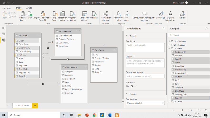
If the data is integrated into a single source and format, you simply need to connect that source to Power BI using the "Get Data" option. However, if the data resides in different sources and has diverse formats, you will need to select the various data sources and then create a data model that standardizes the format so that you can use them.
If you want to explore the properties of your data, in the "Fields" tab, you will find a list of all the fields in the database, and in "Properties," you can see the configurations applicable to the data.
Once the data has the desired format and is compatible, you will get something similar to this:
-
Establish relationships between tables
As shown in the image above, Power BI organizes data into tables and automatically establishes relationships between them when it detects fields with the same name. However, it's important to review the relationships generated by Power BI and modify them if they are incorrect or if you want to establish a different type of relationship between the data.
You can modify relationships in the "Model" > "Relationships" > "Manage Relationships" section.
-
Visualize the data
As mentioned earlier, the primary goal of a dashboard is to visually represent data, making it easy to interpret for anyone and enabling data-driven decision-making.
Power BI is one of the best tools on the market for data visualization, and creating visualizations with Power BI is quite straightforward. In the "Report" view, you will find different charts and visual elements that you can use. Simply select the fields you want to represent in the chart and specify the calculation you want to perform for each value.
Once created, you can format the visual in the "Format" section and add additional information in "Analytics."
-
Design the dashboard
In addition to choosing visualizations, it's important to consider the design and format of the dashboard. The layout of information, the use of colors, sizes, and text fonts can make a difference in making the dashboard easy to understand, tell the story you want to convey, and be effective according to the objectives for which it was created.
A useful dashboard always serves a narrative function. How we structure information, design, colors, and text are vital elements in building an effective narrative and adapting the dashboard to the corporate image, whether it's your own or a client's if you are developing the dashboard for third parties.
These are the 5 basic steps to create a dashboard in Power BI. Of course, there are many advanced options, such as applying segments, measures, filters, and tooltips, to name a few.
The Best Visuals and Charts in Power BI
The Visual Vocabulary is a comprehensive guide to Power BI visuals, indicating which one is most suitable for each function. Depending on the data you want to display, you should choose one or another.
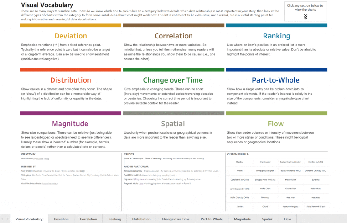
If you have a dashboard created by Bismart, you will see that the charts, visuals, and custom visuals we have used are not based on a consultant's whim but on a worldwide consensus on which Power BI visuals are used in each case.
Bismart recommends the use of this graphical symbology to visualize specific data and represent information in a simpler way. It is known by different names: dataviz, data visualization, visual vocabulary, data stories, Power BI visuals, better chart choices, and more.
Whatever the name, what you should know is that there is a visual vocabulary backed by the Financial Times Graphics Team and by Microsoft Power BI and Tableau to facilitate the selection of charts for representing data.
The visual vocabulary does not seek to prescribe how charts should be made but to take advantage of the opportunities to use them in conjunction with words.
The creation of this visual vocabulary is because, as explained by the Financial Times, a significant part of society cannot understand simple charts. This is a serious problem because in the era of post-truth, it is crucial to be able to navigate between data and information to form critical opinions. Furthermore, it is not always possible to avoid using charts to explain the data they contain because the information conveyed by certain charts cannot always be replaced by verbal explanations.
Another issue related to the graphical representation of data is that companies that create dashboards are experts in data processing but are not trained to share complex information with non-expert audiences. That's why at Bismart, we train our statisticians, and they always work alongside expert consultants in conveying complex information.
One of the actions that arise from this relationship is the use of this visual vocabulary, which helps promote better chart selection and, ultimately, bring data experts closer to people with basic statistical knowledge.
Inspired by the work of the Financial Times, SQLJason has created the Power BI version of the visual vocabulary. In addition, you will find some custom visuals that he found relevant.
The most common BI tools have many types of standard charts that are easy to use and can be very useful in many cases. However, sometimes the client's information needs require the creation of custom charts. For this, there are other tools that allow a high level of customization through manual illustration, such as Adobe Illustrator. These tools have limitations in creating custom charts, as they do not allow linking multiple data attributes to graphic elements. Another option is custom visual programming, which can be done using a library like D3.js or declarative languages like Vega. These offer great control over the transformation of data into graphic elements but require very advanced programming knowledge.
A new approach to creating custom charts
To achieve a balance between customization, simplicity, and the required level of expertise, Microsoft Research has conducted an open-source project called Charticulator. Charticulator is a tool that simplifies the creation of custom visuals or charts without the need for coding. This tool overcomes the limitations of other approaches that either yield very basic visuals or are constrained by the technical expert's programming knowledge.
Take a deeper look at Charticulator
These visuals explain the information hidden within a business's big data in an illustrative manner. However, it's essential to have enough interpretative capacity to turn this information into insights. But what's the difference between data, information, and insights?
Data consists of raw numbers, words, images, etc., collected by the company according to well-defined standards related to the company's business objectives. Collecting data in this way, instead of gathering any type of data without considering its value, is crucial to avoid ending up with an unmanageable volume of low-information value.
Information refers to sets of data that have been processed to be visualized in a much simpler format, such as data visualizations, reports, or dashboards. However, simply having information is not enough; it needs to be interpreted to generate strategic improvement actions. This is where insights come into play.
Insights are the result of data and information analysis. They help us understand what is happening in a specific context and generate strategic actions. Insights are the key to understanding our target audience, creating better products, and discovering markets. A good insight arises from analysis and research but depends on appropriate objectives and good data collection methods.
As mentioned earlier, it's essential to use defined and logical standards for data treatment for visualization. Companies can choose to work with fixed dashboards or self-service BI. Both approaches have their pros and cons, which always depend on business needs and objectives. In broad terms, dashboards are created by technical professionals and are fixed query tools for other members of the company to create reports. In contrast, self-service BI allows non-technical users to create their own visuals according to their information needs.
To work in this way, it is essential for the company to have an environment for documenting indicators and dimensions according to which data should be processed. To define them, you need to consider who the end users of the tool will be to ensure its success and use. Therefore, it is crucial to develop a suitable working methodology and have a tool to carry it out. However, the most important aspect is to provide support to users.
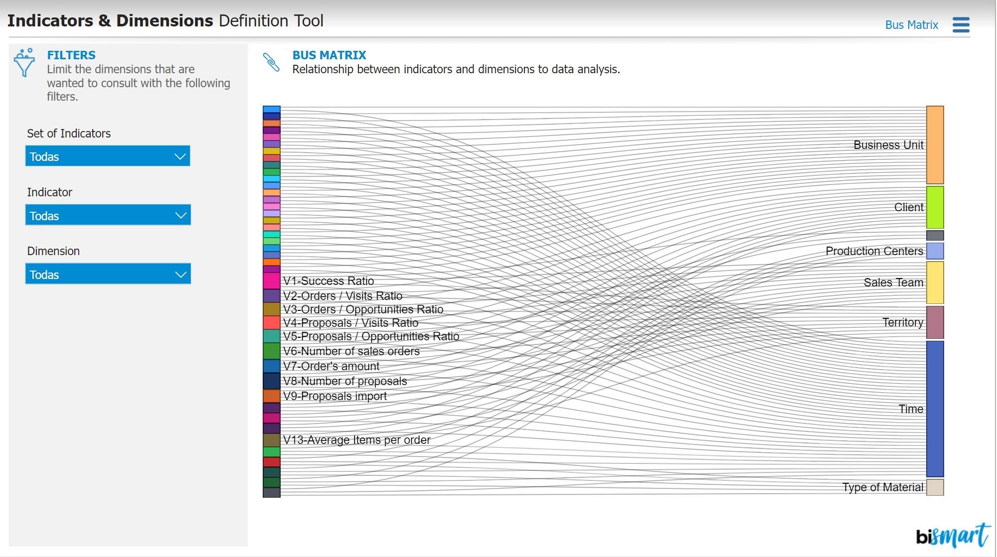
At Bismart, we have developed a tool for this purpose called the Indicators & Dimensions Definition Tool. It provides an environment for documenting indicators and dimensions in the definition phase. It also includes a Bus Matrix, which allows us to know which dimensions can be analyzed for each indicator or to which indicators each dimension applies.
This tool guides the definition process and also serves as a documentation and consultation tool. It has a section that acts as a dictionary and an indicator card, where you can consult all the attributes that define the indicator. In this section, you can filter indicators so that you can narrow your search by area of interest. The tool also includes a dimension card where, once again, you can filter dimensions by functional area and see the hierarchies that make up these dimensions. Additionally, you can see where the displayed data comes from. Finally, the Bus Matrix allows you to see the analysis capabilities, meaning it shows which dimension can be used to analyze each indicator and vice versa. For example, you can see that at the product level, you have the indicators "success ratio," "number of sales orders," and "number of proposals.
Watch Indicators & Dimensions Definition Tool Webinar
In addition to Power BI, at Bismart, we are partners in Spain with Zebra BI, a company that creates powerful visuals for Power BI that add significant value to finance dashboards.
We have always paid special attention to ensuring that our Power BI solutions provide an appropriate response in three fundamental areas: business, communication, and technical quality. To achieve this, we always work with the best platforms and providers, such as Microsoft or, more recently, Zebra BI. Zebra BI is a leading provider of Power BI and Excel visuals that enable clear, concise, simple, and appealing data visualization. Even Microsoft uses them for its internal reporting!
Zebra BI visuals are particularly ideal for the fields of finance, marketing, and sales. They allow you to create all the charts that a financial expert might need to explain business performance in detail. This includes generating easy-to-use income statements, profit and loss reports in Power BI with subtotals, cost allocation function, re-orderable columns, automatic variance charts, and more. Zebra BI Tables are by far the most powerful table/matrix visual in Power BI. It enables the creation of highly flexible tables with embedded charts, expandable and collapsible rows, column reordering, profit and loss calculations, top N analysis, and much more.
Therefore, by incorporating Zebra BI visuals into our solutions, we take data visualization to the next level and further enhance our reports, primarily in the financial area.
The 10 Best Power BI Dashboards
Power BI offers a wide range of options for creating and designing dashboards, providing businesses with the ability to customize dashboards to meet their specific needs. At Bismart, as a preferred Microsoft Power BI partner, we use Power BI for the development of our dashboards and reports.
Were you a fan of the featured dashboards in Power BI? Microsoft discontinued the featured dashboards a while ago, replacing them with favorite dashboards.
Organizations often require multiple dashboards to analyze and track various aspects of their business, departments, projects, or campaigns. Over time, some dashboards may become obsolete and are replaced by others that better suit the demands of an increasingly digital, multidimensional, and technological market.
In this regard, our team of business intelligence experts has selected the 10 best Power BI dashboards, which we list below.
Furthermore, we have created an ebook aimed at CEOs, which includes the 15 essential Power BI dashboards with examples and an explanation of the metrics they should include. We have also included 5 specific dashboards for companies in the healthcare, hospitality, energy, public, and retail sectors. Don't miss out!

-
Financial Dashboard
Financial dashboards are essential for any organization. These dashboards include the key financial indicators of a business and play a fundamental role in monitoring the economic health of the company.
The metrics and performance indicators in a financial dashboard may vary depending on the nature and business logic of each organization. However, common metrics include forecasted and actual revenues, net profits, forecasted and actual costs, accounts payable, inventories, among others.
-
Sales Dashboard
Sales dashboards are crucial for any organization. These dashboards are used to monitor sales and their evolution compared to previous periods, helping executives analyze the performance of the company's sales team.
In addition to providing information on overall sales performance, these dashboards also include specific data on product groups, sales channels, and customer segments. Some may offer detailed information on revenue generated by different regions, profitability of sales in specific geographic areas, or the return on investment of campaigns and promotions.
These dashboards typically include KPIs that reflect the achievement of the company's main sales objectives.
-
Indicators and Dimensions Definition Tool
Key performance indicators are essential for monitoring business activity. If indicators are not properly defined and do not focus on the right data, business strategies are likely to be affected. Working with incorrect information and inadequate measurement of results hinders progress.
In this context, dashboards dedicated to managing and publishing the data that defines indicators, dimensions, and their relationships are extremely relevant.
An indicators and dimensions dashboard provides an analytical environment, both at a functional and technical level, that fosters proper communication between the IT department and other functional areas of the company.
This type of dashboard translates into greater autonomy for any member of the organization, as it provides an environment where they can access key information to monitor business activity.
Additionally, this type of dashboard helps minimize errors caused by the incorrect use of indicators, optimizes the results of tracking meetings, and reduces the time spent on report preparation.
-
Cost Optimization Dashboard
In addition to the classic financial dashboard, some companies go further by implementing a cost optimization dashboard.
These dashboards are created to carry out cost reduction projects and optimize the supply chain of organizations.
How? Through a dashboard dedicated to cost optimization, companies can track the evolution of their costs, compare them with historical data, and analyze the return on investment of all their projects.
Adopting a dashboard with these characteristics allows leaders to consider all variables that affect financial performance, draw conclusions, and drive transformative changes.
-
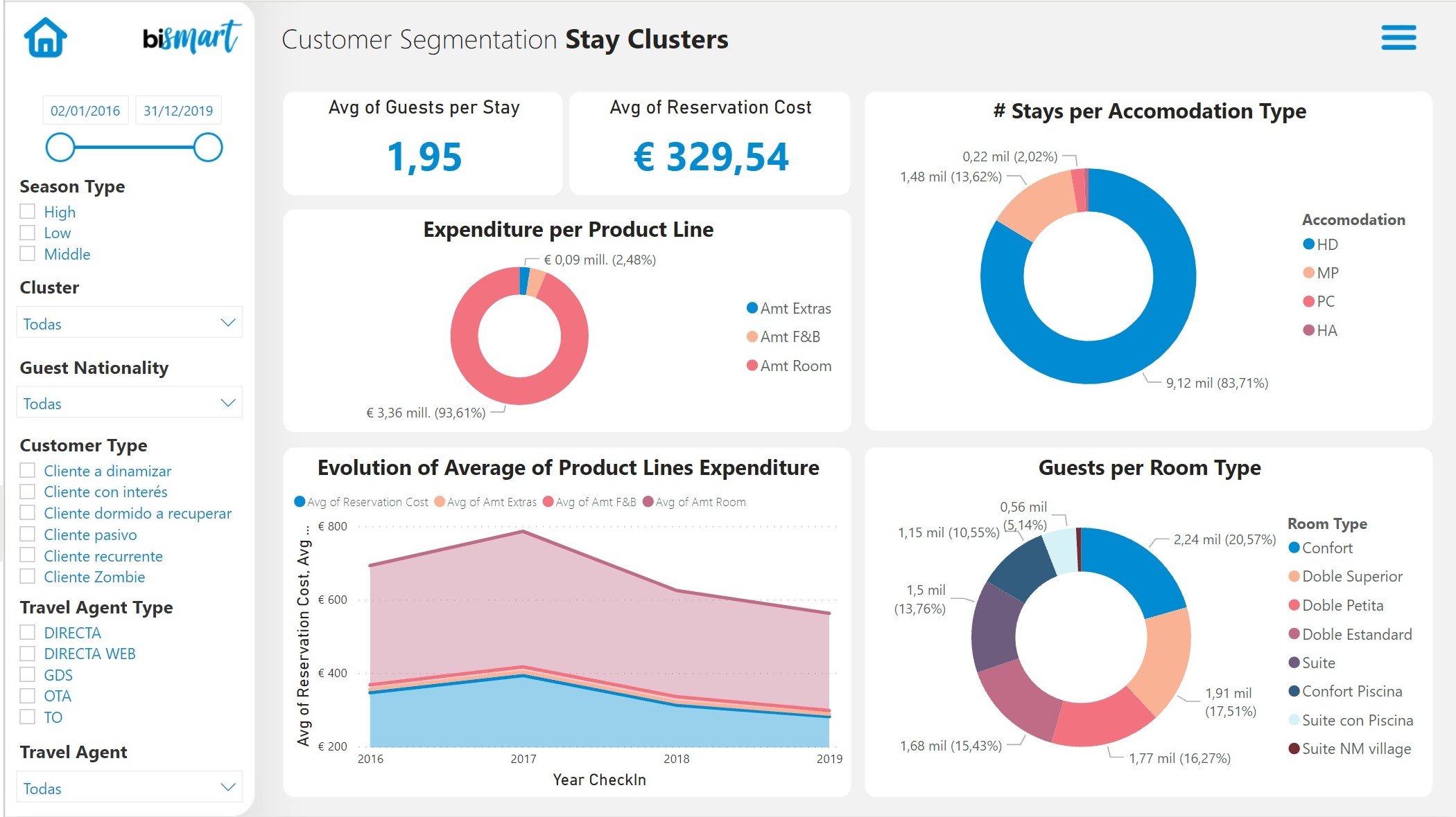
Customer Segmentation Dashboard
Customer segmentation is one of the most important strategies today. Segmentation dashboards allow companies to structure their market and classify customers according to established criteria to offer them personalized solutions, products, service, and experiences.
In recent years, customer segmentation dashboards have gained great relevance and have become an essential tool for virtually every department in the organization. They enable decision-makers to set priorities, decide which customers to focus their efforts on, and better define actions in the market.
Moreover, this type of dashboard is of great help in getting to know our customers better, identifying areas for improvement and business opportunities, as well as understanding any pain points they may have.
-
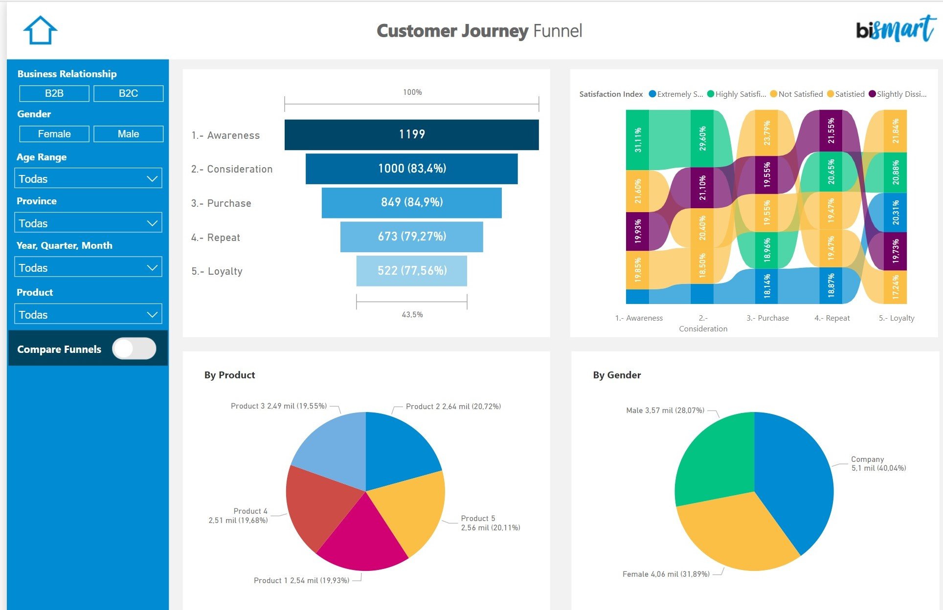
Customer Journey Dashboard
Following trends in customer strategies, more and more organizations pay attention to the customer journey. Having a map that quantifies the customer journey is the best way to improve the customer experience, create personalized acquisition and retention strategies, and ultimately guide customers to the next stage of the purchasing process.
A dashboard dedicated to the customer journey should graphically represent the conversion funnel, map the stages of the customer's buying process, and include the most relevant KPIs of the customer journey.
-
Marketing Analysis Dashboard
Today, almost every organization has a marketing department. With the increasing digitization of the business sector, the importance of marketing has grown. In this regard, marketing dashboards are a fundamental tool in the current year.
These dashboards monitor the performance of marketing efforts, reflected in marketing campaigns, the success of content generation, new contact acquisition, and the performance of segments in each communication channel, among other aspects.
An effective marketing dashboard should include the most relevant insights from the current year's marketing strategy and serves as the primary guide for the company's Chief Marketing Officer (CMO) to measure the success of marketing activities over a specific period.
-
Social Media Analysis Dashboard
Social media has become one of the preferred communication channels for businesses. Currently, organizations without a specific strategic plan for generating content on social media are at a disadvantage.
Social media analysis dashboards include the most relevant metrics related to each company's social media presence. Of course, depending on each business's strategic plan and social media presence, these dashboards will incorporate different performance indicators.
However, any social media analysis dashboard should serve as the optimal environment for analyzing the performance of digital content and communication campaigns. Studying audience behavior and the relationship between the brand and the customer on social media can also be crucial in crisis situations and helps companies better understand their customers and grasp the audience's opinion regarding their products and services.
-
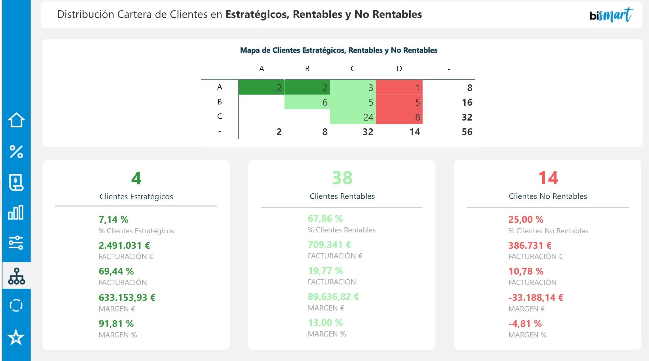
Customer Profitability Dashboard
An intelligent and effective strategy for segmenting our customer portfolio focuses on the profitability of each customer. Instead of copying the content provided above, I can offer you a modified version that retains the essential meaning but with a different focus and wording:
"To maximize the efficiency and outcomes of our business actions, it is crucial to analyze the profitability of our customers and segment them appropriately. In this regard, dashboards oriented towards customer segmentation by profitability are emerging as essential technological tools that assist marketing, sales, and commercial teams in directing their efforts toward the right customers.
These dashboards allow companies to align their business strategies with customer profitability, set market objectives, identify strategic customers, detect high-risk or non-profitable customers, among other limitless possibilities.
The ultimate goal of these dashboards is to provide support to teams responsible for customer strategies, increasing their productivity and helping them make more informed strategic decisions.
-
Hotel Management Dashboards
The Covid-19 pandemic has had a particularly negative impact on companies in the tourism sector, especially those whose primary source of income comes from tourism.
In response to this situation, hotel companies have begun to invest in technological solutions that allow them to monitor the performance of their business activities comprehensively, manage the crisis, and find opportunities despite the complexity.
The Hotel Revenue Management Dashboard is a Power BI-based tool that provides a set of information services in a single environment. This allows hotel chain directors and other executive positions to access indicators for all their hotels and functional areas.
This dashboard integrates information scattered across different systems, providing an integrated view of the hotel business. It provides hotel managers with all the relevant data they need, such as revenue management, purchasing, sales, finance, reputation, personnel, economic activity, web traffic, air traffic, and more. In addition, it incorporates advanced analytics and predictive tools that enable managers to forecast occupancy, optimize purchases, and much more.

The Features of a Useful Dashboard
Today, virtually every company uses dashboards to track its activities. However, most of the dashboards used by organizations are limited to displaying data and information without providing real knowledge.
It's common to confuse the terms data, information, and knowledge, but it's essential to understand the difference between them to ensure that our key performance indicators and dashboards provide significant value.
Let's start by defining what data is. Data is nothing more than a symbolic representation or description of a situation or event. In a business context, data by itself doesn't convey any substantial message.
Imagine a dashboard displaying the following data: "Revenue: 5 million euros." This data, by itself, doesn't convey a clear message because we don't know which company the revenue corresponds to, the time period it refers to, or have a reference for comparison. For data to communicate a relevant message, it must be supplemented with information.
Now, what is information? Information consists of a set of data contextualized in a way that they can provide a message that contributes to the acquisition of knowledge. In other words, information has the ability to communicate knowledge or provide intelligence. In the business context, information can influence our value judgments or our perception of something.
In summary, information is the connection of data with its context, and it should always provide some kind of meaningful knowledge or intelligence.
Finally, knowledge refers to the set of facts and information acquired by a person through their experiences, education, and theoretical or practical understanding of reality. For information to become knowledge, it must be useful for business decision-making, serve as a support tool, and encourage the implementation of effective actions.
In this regard, to create truly useful dashboards, it is essential to go beyond the mere display of data. We must focus on providing information that is adequately contextualized and, in turn, contributes to business knowledge and supports well-founded decision-making.
To create truly useful dashboards, we must meet the following criteria:
- When creating a dashboard, it is essential to invest time in defining what information we want to include and for what purpose.
- Furthermore, we must select the most appropriate management indicators based on what we want to measure and the reason it is relevant to us.
- It is important to implement dashboards that are practical and help us make concrete decisions, whether it is to prevent problems or correct them. This way, we can influence the indicators that show anomalies or could be detrimental in the future.
- A good dashboard should highlight the critical points of the company that are often hidden in the data. An effective dashboard is one that does not require executives to navigate through multiple visual elements or screens to understand the causes of a problem or a negative result. Instead, the dashboard should automatically show why we are not meeting a goal.
In summary, to develop an effective dashboard, we must dedicate time to define relevant information, choose the right indicators, implement a practical approach, and clearly reveal critical points. This way, we will make the most of the dashboard's potential for decision-making and continuous improvement of the company.
Designing a Dashboard: Best Practices
Companies use data to discover valuable information and gain insights into their customers, suppliers, competitors, and their own activities. It is crucial that when making strategic decisions, data presentation promotes understanding, making it easier to reach viable conclusions. If the individuals responsible for decision-making in an organization cannot understand the information on which they need to base their decisions, the collection and analysis of previous data are useless.
In this regard, the creation of dashboards that enhance the understanding and analysis of data sets is becoming increasingly important. In managing and handling data, having technical knowledge is crucial for creating effective charts and visualizations, thereby communicating the information contained in this data to individuals experienced in other fields.
Discover our 12 usability tips for creating optimal dashboards using visual resources and presenting information in the best possible way.
-
Use of common and customized metrics: An effective business dashboard should include both common and general metrics that are relevant to any type of business, regardless of its sector or business model, as well as customized metrics that are specific and meaningful to our own company. These customized metrics allow us to evaluate facts and data relevant to our company's performance accurately.
-
Promote data understanding through visualizations and charts: When designing dashboards, especially those aimed at non-technical individuals or those unfamiliar with data work, it is essential to present information in the most understandable way possible. This involves using graphics and visualizations that represent data visually, making it understandable to anyone.
For example, Power BI offers the ability to create dynamic and interactive visualizations, facilitating data democratization. At Bismart, as a Microsoft Power BI partner company, we develop our solutions using this tool. Additionally, Zebra BI provides advanced visualization options for Power BI and Excel.
-
Consider the target audience: When creating a dashboard, it is crucial to consider who it is intended for. Financial dashboards will differ from those of the marketing department, and internal analysis dashboards are likely to be different from those presented to a client.
Furthermore, it is important to consider the context. Viewing a dashboard calmly in an office is not the same as viewing it on a mobile device between meetings or presenting it to the management team. It is necessary to consider the context in which it will be displayed to highlight relevant data, adapt the mobile version, among other aspects. Understanding the purpose of the dashboard is also essential for choosing the best visualizations and the appropriate layout.
-
Less is more: In a dashboard, clarity and order are paramount. While it may be tempting to use many charts to display all the data, this can result in disorganized panels with text and numbers that are too small and difficult to read. Excess information can lead to confusion and hinder data understanding.
-
Highlight key information: Although all charts in a dashboard provide information, there are data that summarize key information. In these cases, it is recommended to use an appropriate font and size to highlight them at first glance. Additionally, when displaying numbers, it is advisable to round figures as much as possible. For example, if total revenue is €14,089,323.98, simply showing €14.1M€ will be more effective. In case the exact number is needed, the interested user can always access the source of information.
-
Consider the order of reading charts: In Western culture, the default reading direction is from left to right. It is important to keep this in mind when organizing visualizations, both in terms of ease of reading and the order in which information is to be presented.
-
Define a color palette: When creating an effective dashboard, it is necessary to consider visual design. The goal is not only to make it aesthetically appealing but also to make the information understandable and the arrangement of elements conducive to reading. Colors are a powerful tool for improving the understanding of charts. However, using too many or too few colors can be counterproductive and make it difficult to understand and navigate the dashboard. It is important to define a color palette that allows data to be easily understood without becoming overloaded with colors. Additionally, adapting colors to the brand, especially when working for a client, is always a good idea.
-
Maintain consistency in time intervals: Date ranges used in the dashboard must be consistent and make sense based on the data presented. Furthermore, they must be properly labeled, legible, and presented clearly.
-
Use space strategically: Sometimes, it is not possible to reduce the amount of information in the dashboard. In such cases, it is advisable to take advantage of the information expansion capabilities offered by Power BI. This way, the dashboard will not be overloaded, but it will still include all the necessary information.
-
Maintain consistency: For the creation of periodic dashboards that need to be generated at certain intervals, it is advisable to maintain the same metrics as much as possible. For example, in performance business dashboards, frequent changes in indicators would hinder tracking activity evolution and be counterproductive. Additionally, it is important to maintain some consistency in calculations and information presentation.Maintaining consistency in the metrics used, colors, visualizations, charts, titles, and information layout is always more appropriate.
-
Storytelling: An optimal dashboard is one that tells a story. Leveraging the technological capabilities of creation tools to apply storytelling allows us to develop more powerful, emotional, and inspiring dashboards. Ultimately, the goal of a dashboard is not only to represent information but also to inspire others to make informed decisions that drive the business forward. In this sense, storytelling is always in our favor and helps us communicate messages more meaningfully.
To create a dashboard that tells a story, it is essential to have a clear understanding of what we want to convey and to subordinate text, data, and visualizations to our story.Furthermore, each business is unique, and therefore, each dashboard should be unique as well. When creating a dashboard, it is important to consider the logic of the business. Applying business logic to content criteria, visualization, information order, and highlights will help us achieve a more accessible reading experience tailored to the dashboard's target audience.
-
Validate usability with the target audience: The best way to determine whether a dashboard is suitable or not is to validate it with end users or the target audience. No one is better positioned than them to identify areas for improvement, evaluate the readability of information, and provide advice on potential enhancements.
At Bismart, we have a team of experts in creating business dashboards in various thematic areas. We specialize in data analysis and business intelligence to help companies turn data into insights and offer solutions that enhance their productivity. If you need assistance or have any questions, please don't hesitate to contact us!

At Bismart, we implement dashboard solutions that not only address the described challenges but also stand out for the following valuable aspects:
Hotel Management Dashboards
At Bismart, we offer an analytical solution based on a set of dashboards specifically designed for hotel chains. This environment provides a 360-degree view of a hotel's activity, operations, processes, and other performance indicators.
It's an adaptable and scalable solution tailored to the specific needs of each hotel. Built upon a data model and a set of preconfigured reports, it can be integrated and customized with internal and external data sources, offering a comprehensive view of hotel operations. This comprehensive solution is known for its high level of customization, rapid implementation, and low acquisition cost.
The solution consists of several modules that cover all areas of the business:
-
Revenue: It allows for the analysis of historical hotel data, interpretation of trends, and calculation of forecasts to effectively sell hotel units through the appropriate channels, taking into account price, occupancy, and revenue. It also offers the possibility of enriching data with information such as weather, holidays, events, etc.
-
Sales: This module facilitates more precise tracking of the budget and sales analysis, including price, occupancy, and revenue. It allows monitoring of sales performance, comparisons with the previous year and the budget, broken down by hotel, customer segments, season, distribution channel, among others.
-
Finance: Provides tracking of financial statements through profit and loss reports, balance sheets, cash flows, and financial and operational indicators. This allows for a deeper analysis of operational and structural finances.
-
Purchasing: With this module, you can track and control purchases, costs, and inventory levels for better forecasting of needs, cost efficiency, and negotiating power with suppliers. It enables analysis by hotel, supplier, or cost center.
-
Human Resources: This module tracks and analyzes key personnel-related indicators, such as employees per hotel, room, department, type of contract, etc. It also provides information on salary costs, employee turnover, absenteeism, and productivity.
-
Reputation Management: The reputation module allows for the analysis of hotels' reputation and digital media presence, including overall ratings and ratings by areas or departments, comparisons between hotels, and reputation evolution.
-
Marketing: This module allows for customer segmentation and includes data analysis such as an overview, RFM analysis (Recency, Frequency, Monetization), comparisons, acquisition channels, and Key Performance Indicators (KPIs).
These dashboards offer a comprehensive solution for the management of the hotel industry, providing relevant information and aiding in strategic decision-making.
👉 If you want more information about Hotel Management Dashboards, don't miss the webinar in which Víctor Rocabert, Bismart's Commercial Director, explains how the solution works:
Next Generation Dashboards: Smarter Dashboards
Currently, dashboards have evolved significantly since the Balanced Scorecard revolution proposed by Kaplan and Norton in the 1990s. Business needs have changed, and next-generation dashboards have become an essential tool for the successful operation of any business. These new dashboards go beyond simply monitoring business activity and leverage current technological capabilities such as artificial intelligence, machine learning, and predictive analysis.
We refer to a "next-generation dashboard" as one that adapts to the informational and control demands of contemporary organizations. These dashboards have advanced analytical capabilities, with a particular focus on real-time analysis and predictive analysis. They harness the potential of Big Data to manage large volumes of information and provide a strategic view of the business reality. In addition to displaying performance indicators, these dashboards allow executives to delve into data through discovery features.
At Bismart, we focus on developing dashboards that provide business leaders with the ability to make informed strategic decisions easily, quickly, and securely. Our dashboards offer a comprehensive view of the state of the business through a top-down approach, where key information is prominently presented. We also incorporate inquiry dynamics that generate insights and intelligence, enabling executives to delve into the core of their activity, discover reasons behind the data, and conduct precise searches for specific information.
Our dashboards update automatically, ensuring that data, insights, and performance indicators are always up-to-date to support real-time data-driven decision-making. Furthermore, we consider both the past and the present, allowing data analysis professionals to access historical information and make comparisons between time periods. The application of artificial intelligence enables us to offer predictive analysis capabilities, helping businesses make decisions based on future trends, optimize planning, react quickly to changes, identify and address potential issues, and anticipate business opportunities.
In addition, our dashboards integrate with machine learning platforms to enhance decision-making efficiency. We are committed to meeting the informational needs of future organizations and providing advanced dashboards that drive business success.
The Advanced Capabilities and Functions of Next-Generation Dashboards
At Bismart, as experts in the development of business intelligence solutions and Microsoft collaborators as a Power BI partner company, we are dedicated to creating dashboards that adapt to the specific needs of the new era of business knowledge. Our dashboards and business intelligence solutions meet the following criteria:
-
Comprehensive Solution: Our dashboards are implemented along with a complete set of services that ensure proper deployment, cohesion, optimal use, and maintenance of the tool.
-
Usability: At Bismart, we apply efficient design criteria to ensure optimal usability of our dashboards. This means that any member of a company can view, navigate, perform detailed searches, draw conclusions, and make decisions based on the dashboard.
-
Business-Centric Data Model: Nowadays, data models are no longer exclusive to technical profiles. At Bismart, we ensure that any user can use data models for analysis or report creation. Our methodology and approach ensure that data model elements (dimensions, tables, indicators, measures, results, etc.) are understandable from a business perspective.
-
Top-Down Approach: We design and develop our dashboards in such a way that, first and foremost, it is possible to track and analyze the most relevant facts of business activity. Then, we facilitate in-depth analysis with a diagnostic focus.
-
Real-Time Intelligence: Our dashboards are automatically updated with the latest data to facilitate real-time decision-making. In addition, we incorporate a system of notifications and alarms that alert users to unusual results or important events.
-
Predictive Analysis: Our dashboards integrate predictive analysis capabilities, allowing them to report on projections and future trends in business results. This enables senior executives to anticipate potential issues and take appropriate preventive measures.
-
Integration of Unstructured Data: Our dashboards have the ability to integrate unstructured data, such as business objectives or budgets, to provide a comprehensive view of the business reality.
In summary, today's increasingly complex business environment demands dashboards with advanced functionalities and capabilities. Through business-centric data modeling, the top-down approach, automatic updates, and the integration of artificial intelligence, our next-generation dashboards meet the business needs of the new era.
How to Integrate the Balanced Scorecard with Agile Methodologies in Dynamic Environments
In today’s fast-changing business landscape, integrating the Balanced Scorecard (BSC) with agile methodologies has become a strategic necessity. This combination allows organizations to maintain strategic alignment while gaining operational flexibility and the ability to adapt quickly to shifting market demands.
The Balanced Scorecard is a management tool that translates corporate strategy into a system of indicators distributed across four perspectives: financial, customer, internal processes, and learning and growth. Traditionally used in medium- to long-term planning, it can be enhanced by agile principles to support shorter review cycles, continuous adjustments, and a culture of ongoing improvement.
Agile methodologies, such as Scrum, Kanban, and Lean, bring lightweight, collaborative structures that encourage incremental value delivery, transparency, and team autonomy. By applying these principles to the BSC, organizations can create a strategic management system that evolves iteratively while staying aligned with long-term goals.
Some key benefits of this integration include:
- Better alignment between strategic vision and daily operations
- Improved ability to respond quickly to deviations or market shifts
- A culture driven by data, performance, and ongoing impact
- Clear links between KPIs and tactical actions
- Stronger team engagement with strategy
Ultimately, blending the Balanced Scorecard with agile thinking empowers businesses to make better decisions, track performance effectively, and maintain a clear strategic course in a constantly evolving environment.
Are you interested in harnessing the capabilities of a next-generation dashboard?