Power BI is one of the most powerful data analysis and visualization tools on the market, as it offers numerous possibilities for creating charts and visuals from data. In fact, Power BI has been recognized by prestigious consulting and technology analysis entities such as Forrester, Gartner, and PCMAG.COM — to name a few — as one of the leading data analysis and representation solutions in the market. Still not familiar with it? Don't worry, you're in the right place. Let's talk about Power BI! What is Power BI?

What is Power BI?
Power BI is a suite of cloud-integrated systems dedicated to business-oriented data analysis. It's essentially a business analysis tool that enables access, analysis, and understanding of data, ultimately helping companies make better business decisions.
This tool offers advantages over other similar applications on the market. For example, Power BI allows you to access data from any device, the data is updated in real-time, and it can be shared by any employee in the company from any device.
Power BI includes three applications:
-
Power BI Desktop: This desktop application is free and allows for data transformation and visualization, as well as the development of reports.
-
Power BI Service: This is an online (SaaS) service similar to the desktop application but also enables real-time data updates. This allows users to know the current state of the business at any given moment.
-
Power BI Mobile: The mobile application for iOS, Android, and Windows devices allows for the online visualization of dashboards and reports.
These three programs perform common data analysis techniques such as forecasting, grouping, and quick measures, as well as more advanced techniques like the DAX formula language. Additionally, Power BI has artificial intelligence capabilities that can be developed without the need for coding, allowing companies to access hidden insights.
What can I do with Power BI?
Some of the standout features of Power BI include:
-
Transforming data into visually appealing, engaging, and easily understandable elements.
-
Visual data analysis, both in a local and cloud environment, all in a single view.
-
Customization of interactive dashboards and reports.
-
The ability to share reports from and to any device.
-
Integrated data governance and security systems.
Power BI: License Types and Services
Interested in purchasing Power BI for your business? Then it's time to talk about licensing.
In this section we will explain the different types of licenses and services available for Power BI and some tips to help you make the best decision for your organization.
Power BI is the market-leading analytics and visualization platform, which means it offers a wide variety of licensing options. This can be overwhelming for IT buyers faced with the task of choosing the right license for their needs.
Power BI licenses can be divided into three main groups: free licenses, subscription licenses, and enterprise-level licenses.
Free licenses allow users to use Power BI with limited features at no cost. This option is a good starting point for casual users, but it's important to note that the capabilities of free licenses are limited.
Subscription licenses offer more features and capabilities, but at a cost. These licenses vary in terms of features and prices, so it's important to choose one that suits your needs.
Lastly, enterprise-level licenses are the most comprehensive option for those who require advanced Power BI features. These licenses can be tailored to fit almost any budget and offer personalized support and services for advanced users. In conclusion, there is a wide range of license options for Power BI, meaning there is an option for almost every budget and user's needs. If you're interested in acquiring Power BI for your business, it's important to take the time to review all the options and choose the license that best suits your needs.
Enterprise-level licenses: Power BI Pro, Power BI Premium, and Power BI Embedded
- Power BI Pro: The Pro option of Power BI is a user-based license. If this option is chosen for an organization, a Pro license will be required for each employee who wants to use Power BI. This license includes most of the platform's functionalities and allows you to create content and share it with others who also have a Pro license. Premium licensing offers some additional benefits, as shown in the comparison between both licenses.
- Power BI Premium: Power BI Premium is a more comprehensive licensing type that offers many advantages. There are two options to use it: Premium Per User (PPU) and Premium Per Capacity (PPC). With Premium Per User, each user needs a license, whereas with Premium Per Capacity, a Premium capacity is contracted, and all company users can enjoy its capabilities. The primary advantage of Premium Per Capacity is the ability to grant access to workspaces and reports to users without licenses. Content generated and its processing are stored in a dedicated cloud with Premium Per Capacity, providing greater processing capabilities and faster processing speeds.
The Power BI Embedded Case: What is it and how to enjoy the benefits of Power BI Embedded?
Power BI Embedded provides businesses with the opportunity to seamlessly integrate Power BI reports into their applications, saving costs and optimizing resources. This option is particularly valuable for companies looking to enhance their analytical tools and provide their users with high-quality information.
Power BI Embedded is not simply a license, but an Azure service that enables companies to integrate Power BI's analytical capabilities into their own applications, portals, or web pages. This option is designed for those who want to add reports to their projects without the need to purchase a license for each user.
Unlike traditional licensing models, Power BI Embedded operates on a capacity basis, meaning the license cost is determined by the amount of time the service is used, rather than the number of users. The basic license starts at 600 euros per month, which can be reduced to 200 euros per month by aligning with regular working hours. Compared to Power BI Premium, this option is much more cost-effective as it does not require a license for each user. Furthermore, it is more economical than obtaining a Power BI Pro license for each employee once you exceed 24 Pro licenses.
Power BI Embedded offers businesses the opportunity to include Power BI reports in their applications without incurring excessive costs. This option is highly beneficial for companies seeking to enhance their analytical tools and provide their users with top-quality information.
You can enjoy all the capabilities of Power BI Premium with Power BI Viewer!
Bismart has created a unique platform that combines all the features of Power BI Embedded with those of Power BI Pro, allowing licensed embedded users to enjoy a report visualization environment without having to acquire Pro licenses.
Power BI Viewer is an ideal solution for companies looking to visualize, manage, and control their Power BI reports without the need for Pro licenses. Furthermore, it makes it easy to securely share reports with both internal and external users within the organization, without requiring them to have a Power BI license.
Power BI: The market-leading BI and analytics tool according to Gartner's Magic Quadrant
Microsoft Power BI has been chosen as the top leading platform for analytics and business intelligence for four consecutive years according to the international consultancy Gartner. Power BI was selected as the leader in Gartner's Magic Quadrant in 2019, in 2020, in 2021, and has once again been chosen in 2022 and in 2023.
Gartner's magical quadrants provide a visual representation of the competitive position of four types of technology providers in high-growth markets where provider differentiation is essential. According to Gartner's latest evaluation, enhanced capabilities are the key differentiators for these platforms at a time when cloud ecosystems are on the rise. Assisted data preparation, knowledge generation and explanation in machine learning and artificial intelligence are rapidly becoming important sources of competitive differentiation and therefore crucial investments for providers.
The analysis suggests that in 2022, augmented analytics technology will be widely available, but only 10% of analysts will utilize it to its fullest potential. Additionally, it indicates that 40% of machine learning and scoring models will be developed in products whose primary objective is not machine learning. According to the consultancy, by 2025, 80% of consumer or industrial products containing electronics will include analytics within the same device.
Taking these factors into account, the consultancy has created the magical quadrant for analytics and business intelligence platforms. Gartner's Magic Quadrant groups technology companies into four categories: Leaders, Visionaries, Niche Players, and Challengers, based on their vision and ability to execute. The American consultancy evaluates companies based on these two basic criteria to classify them: vision and ability to execute.
Microsoft Power BI has been named a leader in Gartner's 2022 Magic Quadrant for "Data Analytics and Business Intelligence Platforms." This recognition comes from the prestigious research firm's evaluation, which focuses on identifying the leading companies in the technology market.

This recognition showcases its ability to meet the expectations and needs of users, as well as its capability to execute and deliver enterprise-level BI solutions. Furthermore, Microsoft Power BI offers a wide range of features and tools to cater to user requirements, including seamless integration with other Microsoft tools, the ability to work in the cloud or on-premises, and the option to customize and expand the platform according to individual organizational needs.
In 2022, Gartner highlights the ability of analytics and business intelligence tools to provide automated insights and enable the ideal user to make data-driven decisions instead of relying solely on data analysts or scientists. Many platforms are incorporating capabilities that allow users to easily compose workflows and automation applications with little to no code. This combination of capabilities is contributing to expanding the scope of analytics beyond merely providing datasets and dashboards to offer contextualized and enriched perspectives, refocusing attention towards decision-making processes, and ultimately taking actions that bring value to the company.
The 2022 ABI platform ranking is based on 12 critical capabilities, which have been updated from 2021 to reflect changes and differences among providers, with a greater emphasis on augmented analytics.
- Data security
- Data governance
- Cloud analytics
- Data source connectivity
- Data preparation
- Data catalog
- Automated information
- Data visualization
- Natural language queries
- Storytelling
- Natural language generation
- Reporting
Microsoft Power BI is positioned as the leader in Gartner's 2022 Magic Quadrant for its ability to perform visual data queries and exploration, interactive dashboards, and augmented analytics. Its alignment with Office 365, Teams, and Azure Synapse, along with its strong value proposition and enterprise focus, are also highlighted as strengths by Gartner.
The use of Power BI in the business environment is rapidly expanding due to the importance of Business Intelligence in making informed, data-driven decisions and improving organizational efficiency and performance. Access to accurate and up-to-date data is crucial, and Microsoft Power BI stands out as a valuable tool for those looking to enhance their data analysis and decision-making capabilities.
Microsoft Power BI continues to dominate the Gartner Magic Quadrant for Analytical and BI Platforms in 2023
In its latest report, renowned technology consulting firm Gartner has once again highlighted Microsoft as a leader in the market, thanks to its popular tool Power BI. For the sixteenth consecutive year, Gartner has awarded Microsoft this top position in the Gartner Magic Quadrant for Analytics and Business Intelligence (ABI).

Analytics and business intelligence (ABI) platforms are defined as tools that enable non-technical users, including business personnel, to model, analyze, explore, share, and manage data, as well as collaborate and share insights, leveraging information technology and artificial intelligence (AI).
In recent years, the focus of analytics and business intelligence platforms has been on providing a visual self-service BI experience to end users, powered by AI to offer automated insights.
However, Gartner points out that ABI platforms must increasingly pay attention to the needs of consumers of analytical content and the professional profiles making business decisions. In other words, this report focuses on the ability of tools to meet the strategic needs of business users, beyond technical profiles. According to Gartner, the analytics and business intelligence platform market should focus on providing relevant automated information in the context of business goals and actions, as well as user workflows. Platforms are increasingly incorporating capabilities that allow users to easily create workflows and automation applications with little or no code, thus expanding the vision of analytics beyond delivering datasets and dashboards.
Current analytics and business intelligence tools have the ability to transform data into enriched and contextualized information, generating business value for users to make data-driven decisions.
Gartner also highlights other key trends in the ABI market, such as improving data governance in the processes of creating and disseminating analytical content, as well as the demand for open and unrestricted architectures.
Gartner's Magic Quadrant for Analytics and Business Intelligence Platforms is the result of ranking tools from 20 different software vendors. Gartner relies on 12 critical requirements to select these providers.
The critical capabilities of Analytics and Business Intelligence (ABI) platforms include automated insights, analytical catalog, data preparation, data source connectivity, data storytelling, data visualization, data governance, natural language querying, reporting, data science integration, metric store, and collaboration.
Microsoft Power BI leads the Gartner Magic Quadrant due to its unique capabilities
Gartner has praised Power BI's extensive market reach and its integration with other Microsoft ecosystem platforms such as Microsoft 365, Azure, and Teams. Additionally, Microsoft has been recognized as a market leader by Gartner for its flexible pricing, superior functionality, and ambitious product roadmap.
When it comes to strengths, Gartner highlights the following positive points about Microsoft Power BI:
-
Alineación con Microsoft 365, Teams y Azure Synapse: The inclusion of Power BI in Microsoft 365 E5 has expanded the reach of the platform. The integration of Power BI with Teams allows users to access the tool within the Teams interface, which is compelling for business users who use Teams for remote collaboration. Furthermore, the alignment of Power BI with Azure Synapse addresses various use cases and data analysis needs.
-
Price-value relationship: Power BI provides an enticing option for smaller organizations with 300 employees or less, offering a per-user pricing model. On the other hand, larger organizations can choose the capacity option, which becomes more cost-effective as the number of users increases. Unlike many other analytics and business intelligence platform providers, Microsoft does not employ an aggressive cross-selling strategy to increase customer revenue.
-
Wide product portfolio and ambition: Microsoft has a clear vision of how to harness the combined power of Power BI, Power Apps, and Power Automate to drive business value. Power Apps can be seamlessly integrated into Power BI dashboards or access Power BI datasets. Meanwhile, Power Automate allows for the creation of flows that take actions based on data. With Power BI Premium, businesses can leverage AI-based services such as text analysis, sentiment analysis, and image analysis.
When it comes to precautions, Gartner highlights the following weaknesses of Power BI:
Governance of content creation and publication: Gartner has received inquiries from clients who struggle with governing the process of creating and publishing analytical content in Power BI. Clients express concern over the various ways tasks such as data modeling or content promotion can be done. The ease of implementation of Power BI sometimes leads to a proliferation of deployments without solid governance.
Limitations of open architecture: While many Power BI clients appreciate its close integration with the Microsoft ecosystem, there is a growing demand for greater interoperability with other analytics and business intelligence platforms. Clients desire more open integration with competitor products, especially when it comes to analysis catalogs and metric stores.
Restriction to Azure as the only deployment option: Microsoft does not provide customers with the flexibility to choose an Infrastructure-as-a-Service (IaaS) offering in the cloud.
The Top Business Intelligence Tools in the Market
Business intelligence tools assist companies in making informed decisions by providing them with detailed information and analysis. These BI programs and software enable businesses to assess their performance accurately, identify trends, predict future outcomes, examine customer behavior, and compare data from different sources. By gathering and storing information from various sources such as internal databases, cloud services, and external applications, business intelligence tools provide data-driven insights to help companies make strategic decisions, improve their processes, reduce costs, identify growth opportunities, and optimize the customer experience.
Today, choosing the right business intelligence tool for each company is a challenge due to the wide variety of options available in the market. However, most leading technologies offer sufficient capabilities to enhance business performance. The effectiveness of one software over another will depend on the specific features and needs of each business. That's why there are many types of business intelligence tools with unique features and capabilities to meet specific requirements.
To assist you in finding the perfect fit for your needs, we showcase some of the most powerful business intelligence programs on the market.
1. Power BI

Microsoft Power BI provides powerful self-service analysis features that allow users to explore their data without relying on technical assistance or specialized knowledge. It offers a wide range of data visualization options along with natural language query (NLQ) functionality, enabling users to easily ask questions about their data in their own language without having to resort to complex SQL queries.
Power BI seamlessly integrates with other Microsoft services such as Excel and SharePoint, giving large enterprises complete visibility into all departments of their organization.
With a comprehensive and user-friendly platform, Power BI allows users to build, analyze, and visualize their data. This enables users to quickly generate visuals such as tables and charts from their datasets, helping them make informed decisions.
In addition, Power BI offers a range of features designed to help organizations collaborate efficiently between teams while providing secure access to private and confidential information.
Top Features of Power BI
-
Interactive Visualizations: Power BI offers interactive visualizations such as maps, tables, cards, and charts, allowing users to explore their data quickly and gain insights from their visualizations.
-
Natural Language Queries: Natural Language Queries (NLQ) enable users to ask questions in their language instead of using SQL queries on their data and get immediate answers. This feature reduces the time spent searching for answers in complex datasets and allows users to discover new insights at lightning speed.
-
Robust Data Connectivity: Power BI comes equipped with powerful connectivity tools that allow you to connect to virtually any type of data source, from traditional databases like SQL Server or Oracle to cloud-based services like Salesforce or Google Analytics. This makes it easy to access all the necessary information for analysis without manual data entry.
-
Automated Insights and Alerts: Power BI's automated insights enable users to detect patterns in their data and make predictions based on them, providing a better understanding of current and future developments so that they can take immediate action. It also sends alerts when unexpected events occur, ensuring that organizations don't miss important opportunities or face performance-related risks.
2. Google Analytics

Google Analytics is one of the oldest Business Intelligence service providers, having been launched in November 2005 after Google's acquisition of Urchin. It allows users to evaluate online advertising campaigns and monitor their website's performance, tracking conversion rates and the quality of landing pages. Conversions can include sales, generated leads, specific page views, file downloads, among others. Casual users can obtain general information on a free and user-friendly intuitive dashboard. As users delve deeper into the site, more detailed data will be available. According to TechCrunch, it is the most widely used website statistics service, with around 55% of the top 10,000 websites on the World Wide Web utilizing it.
Discover how to apply the time comparison filter from Google Analytics in Power BI
If you work in marketing or are a data analyst, you have probably used Google Analytics' date comparison filter to analyze your web traffic data. This filter, which allows you to compare two custom time periods, is one of the most appreciated features of Google Analytics because it provides the opportunity to analyze metrics over unrelated custom time intervals, which is extremely useful for understanding how a company's data evolves over time.
At Bismart, we are always looking for new ways to use Power BI to take our reports to the next level and get the most out of our data. In this video, Ricardo Rincón, our Senior BI Consultant, explains how to apply this filter in Power BI so that anyone in the company can compare two time periods of their choice, just like they would in Google Analytics, but directly in Power BI.
While Power BI allows you to compare specific periods, such as the current week with the previous week or one month with the previous month, it does not allow comparisons between custom periods. This functionality could be very useful for analyzing metrics on specific dates, such as Easter week. Discover how to add it!
To make the time filter in Power BI work the same way as in Google Analytics, it is essential to ensure that the values of both intervals are comparable. This can be achieved by equalizing and normalizing the values to avoid any errors or malfunctions during the comparison process.
To accomplish this, you only need to follow two simple steps:
1. Build a model that allows the user to select two different time periods within the same date field.
2. Write a DAX formula that calculates the same value in both periods.
3. Tableau
Tableau is a user-friendly business intelligence tool known for its intuitive interface that allows for the creation of interactive dashboards and visualizations from multiple data sources. It also offers advanced analytical capabilities, integration with various data sources, customizable dashboards and reports, collaboration tools, and artificial intelligence technology. These features enable users to quickly analyze large datasets, identify patterns, and make faster decisions.
Strengths:
- Easy visual exploration and manipulation of data during visualization.
- Customers have a favorable opinion of the tool.
- The company is experiencing an increase in revenue.
Disadvantages:
- Tableau has limitations in supporting queries on multiple data tables and complex schemas in a single source.
- It lacks compatibility with scheduled and distributed reports in different output formats.
- Support quality has decreased and there are increasing difficulties with updates.
4. QlikSense

QlikSense is a leading alternative in the Business Intelligence (BI) market, designed for companies seeking advanced reporting capabilities without the need for expensive IT infrastructure or complex technical skills. This cloud-based solution allows users to easily create dynamic dashboards that combine multiple datasets from different sources, providing them with a comprehensive overview at any given moment and enabling secure collaboration among team members.
With its intuitive user interface that allows for drag and drop functionality and interactive charts, QlikSense empowers users to explore their data in real-time. Furthermore, it offers advanced analysis features such as predictive analytics, natural language processing, machine learning algorithms, and much more. This makes it the ideal choice for organizations looking for a solution that provides deeper insights into their data and helps them make better business decisions.
Strengths
Advanced product features and extensibility: Cognitive Engine, Insight Advisor, automatic chart generation, etc.
Active user community.
Product vision: expanding and improving the platform to adapt to market changes.
Weaknesses
QlikView and Qlik Sense require different products to complete their offering.
Unsatisfactory migration experiences and room for improvement in support services.
Declining interest in Qlik.
5. Sisense

Sisense, founded in Tel Aviv in 2004, has received numerous awards and accolades, including the "Take the H.E.L.M." competition in New York and the Gartner Cool Vendor in Analytics award in 2014. Recently, the company was included in Forbes' 2017 Cloud 100, a list of the top private cloud companies in the world. Sisense has an impressive client base, which includes Wix, Airbus, NASDAQ, The Salvation Army, and Hewlett Packard. The company's website showcases how their product has enhanced customer experience. For instance, Wix, a leading website development platform, used Sisense to create a Business Intelligence solution that enabled them to track conversations, monitor the effectiveness of their marketing campaigns, and analyze user behavior more quickly. With Sisense, users can easily load and connect any type of data and have direct access to Google AdWords and Google Analytics data.
6. IBM Cognos Analytics
![]()
IBM Cognos Analytics is a powerful Business Intelligence tool that empowers users to discover, explore, and share data-driven insights in a governed environment. Its latest version, released in December 2015, made a significant impact on the industry. The new version focuses on enhancing ease of use, addressing previous challenges. With Cognos, users can conduct self-service analysis through an intuitive web interface. Cognos Analytics collaborates with IBM Watson, an advanced Artificial Intelligence platform for businesses. Working with Watson offers the advantage of keeping company data securely stored in IBM's cloud, enabling autonomous data management, knowledge sharing, training, and IP protection.
7. Tibco Spotfire

Tibco Spotfire takes pride in offering unparalleled data processing capabilities, combined with highly customizable visuals that allow end users to explore interactions between variables, correlations, and outliers - all within an integrated environment. By using Tibco, there is no need to switch between different applications throughout the analysis process, and it supports real-time updates to keep stakeholders informed in a timely manner. Additionally, its self-service dashboard design options enable users to access data quickly, while its predictive insights provide deeper understanding of customer trends and behaviors. Tibco also provides advanced data visualization tools that allow users to create customized charts and tables for more in-depth analysis, along with a robust data security model to keep confidential information safe from unauthorized access. Lastly, the scalability of Tibco makes it an attractive choice for businesses of all sizes seeking a robust business intelligence solution.
8. Domo

Domo, an American BI company, specializes in providing business intelligence and data visualization tools. Founded in 2010 by Josh James, who also founded the web analytics software company Omniture, Domo offers BI as an exclusive service for CEOs and executives. This service is designed to provide direct, simple, and real-time access to business data without the need for IT involvement.
With this innovative Software as a Service (SaaS) approach, business owners can focus on their results and decision-making without the burden of data overload. They can ask a question and trust that Domo will provide the necessary data, offering them an informed decision based on all relevant factors.
9. Board
![]()
Board is a leading provider of Business Intelligence and Corporate Performance Management software, offering a powerful toolkit called BOARD. Founded in Lugano, Switzerland in 1994, Board delivers BI solutions for key areas such as sales, marketing, supply chain management, human resources, and finance. Renowned clients including KPMG, Volkswagen, the US Department of the Navy, Toyota, and PUMA trust Board for its agile approach in creating customized analytical and planning applications. Board takes pride in providing fully tailored tools to meet the specific needs of its clients, setting it apart in the industry.
Benefits of Power BI compared to other similar tools
One of the standout advantages of Power BI is its ability to enhance the design and presentation of information, while also offering comprehensive integration capabilities and ensuring data security.
Another benefit of Power BI is its ability to facilitate data integration by extracting information from various formats and sources. For instance, it can access Excel files, CRM systems, Azure, SQL databases, as well as web applications like Google Analytics, and databases of all types.
Other benefits of Power BI include:
Connectivity: Import data in any format and from any data source. Transform and combine the data into a single view.
Sharing: Being a cloud-based application, Power BI is ideal for sharing reports with both internal and external stakeholders. This ensures that all employees are informed about the business situation across all departments, promoting the creation of comprehensive business strategies and collaboration.
Cross-departmental utility: Customizable dashboards can be created to meet the specific needs and objectives of each department in the organization.
Real-time updates: Power BI automatically updates data, enabling companies to make real-time decisions.
Price: Power BI Desktop and Power BI Mobile are free tools. On the other hand, Power BI Pro is a monthly paid subscription that offers additional features such as collaborative spaces, increased storage capacity, and advanced security measures.
Why is Power BI the perfect tool for businesses?
Power BI was designed as a tool to help businesses progress through data analysis and is now a competitive advantage for organizations that use it. It ensures data quality and enables the development of powerful analyses in the simplest way possible. Additionally, it boasts excellent interactive graphical capabilities.
Power BI facilitates the discovery of strengths, inefficiencies, and opportunities, while also promoting data-driven decisions and the prediction of future scenarios. It is a useful application that can be easily used by all departments within an organization.
Furthermore, Power BI enables data governance strategies that companies often struggle to execute correctly due to their complexity. By significantly speeding up data analysis, Power BI helps companies carry out data governance plans in a much simpler, safer, and faster manner. Moreover, data governance and data quality are closely linked, and Power BI includes security systems that ensure the quality of all data.
Companies around the world trust Power BI because it helps accelerate their business and achieve better results.
How can Power BI be used to enhance data governance?
Data governance is a crucial aspect for companies working with data, although it is often perceived as a complicated task. However, by changing the approach, it is possible to achieve synergy between data governance and data analysis. To achieve this collaboration, it is important for data governance policies to support analysis tasks and integrate into the Business Intelligence (BI) workflow. Recently, Microsoft Power BI has introduced data governance features that facilitate this collaboration.
By improving the quality and protection of our data from the moment we obtain and analyze it, and by ensuring its security even when shared through other channels, we can increase efficiency and quality in our Business Intelligence workflow.
Microsoft Power BI has recently introduced features that enhance data governance capabilities in BI workflows. These features are user-friendly and do not interfere too much with the process.
These features allow us to maintain security without having to abandon the analytics platform if we use Power BI. By working with Power BI, we can provide a better user experience and have the peace of mind that our company complies with regulations. The Microsoft platform ensures the quality and protection of data, its origin, and reduces distractions through simple and non-intrusive data governance features. Furthermore, the new platform options eliminate the need to use multiple platforms to include data governance in BI workflows, as these features are integrated into data acquisition and preparation experiences, management interfaces, and delivery experiences for end users.
As a Power BI partner, we at Bismart trust this tool because it offers guarantees and stands out from traditional approaches in the industry, which required consumers to use multiple platforms to include data governance in their BI workflows.
Some of the exciting new data governance features of Power BI include:
- Endorsed datasets: This feature allows users to have datasets backed by their owners, who are registered in the cloud service and located in a restricted space. Owners can indicate which datasets are important for the rest of the team. Additionally, authorized users can mark certain datasets as certified, giving them greater authority.
- Lineage and impact analysis: Another set of features includes the visualization of data lineage and age in a workspace. These features are simpler to use than dataset approval functionalities. By navigating through objects in the workspace, users can switch to the new lineage view to see data sources, data flows, datasets, reports, and dashboards in a network diagram.
- Data protection: Through the protection resources available in Microsoft platforms, Power BI allows users to add confidentiality and ownership labels to datasets, reports, dashboards, visualizations, and data flows. These labels are defined by security administrators in the Microsoft Security and Compliance Center and are applied to all Microsoft 365 applications. This ensures that when data is exported to PowerPoint, Excel, or PDF, confidentiality labels are maintained, granting access only to authenticated users.
- Power BI offers many more data governance functionalities at all stages, including data acquisition and preparation, which help comply with privacy regulations. However, Power BI also allows traditional work with other external platforms.
These new features are useful, user-friendly, and of high quality, but the biggest advantage of Power BI is its ability to tailor its features to the specific needs of each company, focusing on essential functionalities.
How can Power BI help boost your business?
Power BI is a powerful tool for data management and analysis that can help accelerate your business in several ways:
-
-
Custom Report and Dashboard Creation: With Power BI, you can create reports and dashboards tailored to your specific needs, allowing you to visualize your data more clearly and effectively.
-
Integration with Other Applications and Business Tools: Power BI easily integrates with other applications and business tools, meaning you can access all your data from a single location.
-
Trend Analysis: With Power BI, you can conduct trend analysis to identify patterns and trends in your data. This will help you make informed decisions and improve your business processes.
-
Correlation Analysis: Power BI offers correlation analysis tools that enable you to identify relationships between different variables in your data.
-
Predictive Analysis: With Power BI, you can perform predictive analysis to help you make informed decisions in the future.
-
Real-Time Data Visualization: Power BI allows you to visualize your data in real-time, enabling you to make informed decisions more quickly and efficiently.
-
Key Metric Monitoring: With Power BI, you can monitor key metrics to gain a detailed view of how your business is performing.
-
Identification of Improvement Opportunities: Power BI helps you identify improvement opportunities in your business processes.
-
Geographic Data Analysis: With Power BI, you can perform geographic analysis to gain a detailed view of how your businesses are performing in different locations.
-
Sales Data Analysis: Power BI allows you to analyze your sales data to help you identify trends and patterns in your data, improve sales forecasting, identify trends, and allocate resources to each customer more effectively.
-
Other ways in which a company can use Power BI
Power BI stands out for its ability to gather and analyze large amounts of data and present them in clear and concise reports. With its advanced data visualization technology, Power BI transforms data into attractive and easy-to-understand charts, making it easier for businesses to comprehend information.
In addition to being a fundamental tool for monitoring and analyzing business activity, Power BI can also help improve your SEO strategy.
In the world of SEO, data analysis is essential for developing effective strategies. Power BI is the perfect tool for gathering all relevant data and gaining a comprehensive view of website performance effortlessly. Having a holistic view is crucial for SEO, as it allows you to identify potential issues in performance.
For example, using Power BI, we can export relevant keywords and create charts that show how each keyword affects website traffic. This enables us to carefully select keywords that we consider most effective in attracting traffic and converting those visits into sales. We can also compare two different sets of data, such as page load speed and bounce rate, to understand how website
In summary, Power BI is a valuable tool to enhance your business's SEO strategy. It will help you identify areas for improvement in content creation and fine-tune your web pages for better results. Experience the effectiveness of Power BI in data collection and presentation by giving it a try! There's no excuse anymore not to optimize your SEO strategies with large amounts of data.
Excel or Power BI?
Excel and Power BI are two very useful tools for data analysis. Although both are produced by Microsoft, there are some important differences between them. In this article, we will explain the differences and compare the functionalities of both tools to help users choose the one that best suits their needs.
Excel is a versatile spreadsheet that has been used for a long time. It allows users to perform complex calculations, create tables and charts, and automate tasks using formulas and macros. In addition, Excel is user-friendly and widely available on most devices.
On the other hand, Power BI is a data analysis tool that provides a more visual and user-friendly experience than Excel. Power BI enables users to create attractive dashboards and visualizations that summarize and present information in a clearer and more concise manner than Excel. Moreover, Power BI has native integration with other Microsoft services such as Azure and Office 365, and it allows connections to a wide variety of data sources.
Another advantage of Power BI is its scalability, which means it can handle large amounts of data with ease. This makes it ideal for companies with a vast amount of information or for those that need to analyze real-time data. Additionally, Power BI has a thriving community of users and developers, providing a wealth of online resources.
In summary, Excel is an excellent tool for basic data analysis tasks and for users seeking a versatile and user-friendly spreadsheet tool. On the other hand, Power BI is a more advanced tool that focuses on data visualization and is ideal for companies seeking a scalable solution that connects to a wide variety of data sources.
Comparison of Capabilities: Excel vs Power BI

In summary, Excel is an excellent tool for performing basic data analysis tasks and for users looking for a versatile and easy-to-use spreadsheet tool. On the other hand, Power BI is a more advanced tool that focuses on data visualization and is ideal for businesses seeking a scalable solution that allows connection to a wide variety of data sources.
Ultimately, the choice between Excel and Power BI will depend on the specific needs of each user. If a versatile and easy-to-use spreadsheet tool is needed, Excel is a good option.
Excel and Power BI are two different tools with different purposes. Excel is used to organize, transform, and perform calculations with data, while Power BI is a business intelligence and data visualization tool. Power BI can handle much larger amounts of data than Excel and is also faster. Power BI also connects to a wide variety of data sources and can be accessed from mobile devices, which is not possible in Excel. Power BI dashboards are more attractive and customizable than those in Excel and are easier to use. In terms of data comparison, Power BI is more powerful than Excel.
Do you want to transform your Excel file into a Power BI Report?

Converting an Excel file into a Power BI report is not a complex task, but it is crucial to follow the correct steps to avoid any confusion.
You can download our guide on how to convert an Excel file into a Power BI report: a free 6-step guide is available, which includes detailed descriptions in visual format, so you can easily follow the process. Download the guide now

Data Analysis with Power BI
Power BI is a cutting-edge data analysis tool that helps businesses visualize and understand their data in a more clear and effective way. With Power BI, users can create personalized reports and dashboards that enable them to identify trends, patterns, and opportunities within their data. The best part is that Power BI is incredibly intuitive and user-friendly, making it accessible to both IT professionals and non-technical users who want to gain valuable insights from their data.
One of the greatest advantages of Power BI is its seamless integration with other business applications and tools, allowing users to access all their data in one place. This enables them to gain a more comprehensive and detailed view of their data, empowering them to make informed decisions and enhance their business processes.
Moreover, Power BI offers a wide range of advanced analysis possibilities, including trend analysis, correlation analysis, and regression analysis. With these tools, users can delve deeper into their data and gain a more complete understanding of their trends and patterns. They can also create advanced data models and perform predictive analysis to aid them in making informed decisions for the future.
The standout advantages of using Power BI for data analysis are:
Data Connection and Integration: Power BI stands out for its extensive connectivity and integration capabilities with various tabular databases, as well as corporate tools and systems. This makes importing and exporting data, dashboards, and reports quick and easy.
Data Visualization: Power BI is renowned for being a comprehensive platform in terms of data visualization. In its appsource, you'll find a wide selection of Microsoft-validated Power BI visuals, and you also have the option to create your own custom visualizations. Additionally, the tool is regularly updated with new visuals, and you can further expand its visualization capabilities with tools like Zebra BI, which extend the range of visuals available in both Power BI and Excel.
Advanced Analytics: Power BI is ideal for performing more advanced data analysis than what can be done in tools like Excel. With Power BI, you can enhance business data by ingesting, transforming, and integrating data services embedded in other Microsoft suite tools.
Data Governance: Data governance is crucial for ensuring the smooth operation of data-related operations. Power BI includes functionalities that promote data control, authority, and management. However, it's important to note that the data governance capabilities of the tool are limited, and some organizations may require specialized data governance solutions to work with Power BI.
Data Exploration: Power BI offers extensive options for in-depth data exploration and automated queries. With this tool, uncovering insights from data becomes much easier. Additionally, it is an ideal platform for working with the top-down methodology.
User Experience (UX) and User Interface (UI): Power BI was designed as a business tool to be used by users with business profiles. While the main users are data analysts and BI consultants, the business orientation of the platform makes it one of the most user-friendly and intuitive business intelligence tools. Furthermore, with Power BI, you can customize your reports to align with your organization's corporate image and automate the process by designing themes that can be applied to all your reports.
In summary, Power BI is an effective and powerful solution for data management and analysis that offers a clearer and more detailed view of data. With its ability to integrate with other business tools, advanced analysis capabilities, and ease of use, Power BI is an excellent choice for any company looking to improve its data management.
Data Visualization with Power BI
Beyond data analysis, Power BI is a data visualization tool developed to allow users to transform large amounts of complex data into easy-to-read and comprehendible information. Power BI's ability to create attractive and effective visualizations is one of its most valued features, as it enables stakeholders to make informed decisions based on data.
There are many ways to visualize data with Power BI, ranging from simple tables and charts to interactive maps and dashboards. Moreover, Power BI easily integrates with other information systems, allowing users to combine and analyze data from different sources within a single tool.
One of the most intriguing aspects of Power BI is how easily users can create custom dashboards. With just drag-and-drop functionality, users can create appealing and effective visualizations that summarize data in a clear and concise manner. Additionally, Power BI allows users to create dynamic dashboards that automatically update with the latest data.
Another highly regarded feature of Power BI is its ability to create interactive maps. Users can visualize data on a map and explore different relationships and patterns that exist within it. This is especially useful for geographic analysis, as it enables users to easily see how data varies in different regions.
In summary, Power BI is a comprehensive data visualization solution that offers a wide range of options to transform data into valuable and accessible information for users. From creating customized dashboards to integrating with other information systems, Power BI is a versatile and powerful tool that adapts to the needs of any organization.
Data visualization is a complex process. However, Power BI enables the creation of personalized themes that can accelerate the process and lay the foundation for creating a unified and cohesive company image.
Do you want to learn how to create Power BI themes? Get started now with our e-book: "How to Create Themes in Power BI!

The best Power BI visuals
The Visual Vocabulary is a powerful tool used to enhance the presentation of graphics and data visualizations. Its purpose is not to dictate how graphics should be created, but rather to harness the potential of combining visuals with words. By utilizing the Visual Vocabulary, we can bridge the gap between those who struggle to understand simple graphics and the importance of critical thinking in the age of misinformation. It is essential to have the ability to navigate data and information to form informed opinions. Often, information conveyed through graphics cannot be substituted by verbal explanations.
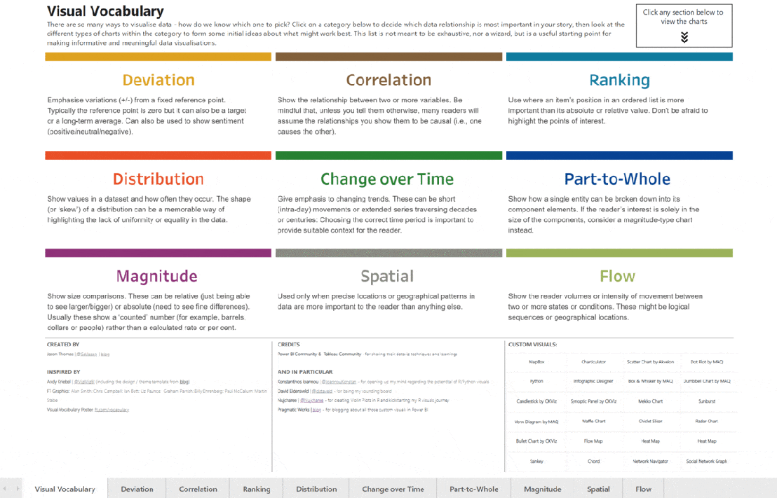
The reason for its creation is because a significant portion of society is unable to comprehend simple graphs, which poses a serious problem in the era of post-truth, where it is essential to know how to navigate data and information to form critical opinions. Additionally, often the information conveyed through graphs cannot be substituted by verbal explanations.
In this regard, many companies that create dashboards are often experts in data processing, but they are not equipped to share complex information with non-expert audiences. At Bismart, we train our statisticians to work alongside expert consultants in conveying complex information to address this issue.
The use of this Visual Vocabulary helps improve the selection of graphs and, ultimately, brings data experts closer to individuals with basic statistical knowledge. Inspired by the work of the Financial Times, SQLJason has created the Power BI version of the Visual Vocabulary, along with some additional custom visuals that he deems relevant.
You can download the complete Visual Vocabulary report below.

Visual Vocabulary encompasses various categories of graphics, each of which is best suited for different types of data. Some of these categories include:
Deviation: Emphasizes variations (+/-) from a fixed reference point, such as zero or a long-term average. It can also be used to depict sentiment (positive/neutral/negative). Examples of use: surplus/deficit, climate change.
Correlation: Displays the relationship between two or more variables, considering that many readers may assume that the shown relationships are causal. Example of use: inflation and unemployment, income and life expectancy.
Ranking: Used when the position of an element in an ordered list is more important than its absolute or relative value.
Distribution: Illustrates the frequency at which values occur in a dataset, highlighting any lack of uniformity. Examples: income distribution, population distribution (age/gender).
Change over time: Highlights changing trends, which can be short-term movements (in a day) or long-term series spanning decades or centuries. It is important to choose the appropriate time period to provide the reader with the relevant context. Examples: stock price evolution, economic time series.
Part-to-whole relationship: Shows how a single entity can be broken down into its constituent elements. Examples: fiscal budgets, business structures, national election results.
Magnitude: Illustrates size comparisons, which can be relative or absolute, and typically display a "counted" number rather than a calculated rate or percentage. Examples: raw material production, market capitalization.
Spatial: Used when precise locations or geographic patterns are more important to the reader than any other aspect. Examples: location maps, population density, natural resource distribution, risk/impact of natural disasters, catchment areas, variation in election results.
Flow: Shows the reader the volumes or intensity of movement between two or more states or conditions, which can be logical sequences or geographic locations. Examples: fund movement, trade, migration, demands.
Enhance your Power BI data visualization with Zebra BI visuals!

At Bismart, we specialize in developing cutting-edge technology solutions for businesses. Our main goal is to empower companies to harness the power of their stored data, enabling them to make informed decisions and accurate predictions. As one of Spain's preferred Power BI partners, we have been at the forefront of utilizing this tool since its early versions, and we have also worked extensively with Excel's Power Query, Power Pivot, and Power View solutions.
At Bismart, we ensure that our Power BI solutions embody three key aspects: business, communication, and technical quality. To achieve this, we collaborate with top platforms and providers such as Microsoft and Zebra BI.
Zebra BI is a leading provider of visuals for Power BI and Excel, offering clear, concise, simple, and visually appealing data visualization capabilities. Even Microsoft relies on Zebra BI for their internal reporting.
Zebra BI visuals are particularly beneficial for finance, marketing, and sales areas. They enable the creation of comprehensive graphical representations that financial experts need to explain a company's performance in detail, including income statements, subtotals, cost investment functions, automatic deviation charts, and more. Undoubtedly, Zebra BI Tables is the most powerful visual table/matrix in Power BI, allowing for the construction of highly flexible tables with embedded charts, expandable and collapsible rows, column reordering, profit and loss calculations, top N analysis, and much more.
By incorporating Zebra BI visuals into our solutions, we further enhance data visualization and reporting, particularly in the finance sector.
Zebra BI offers our solutions the following advantages:
- User-friendly, relevant, and easy-to-use visuals and reports.
- Allows for unlimited levels to be added to hierarchical tables and breaks down to the smallest detail.
- Microsoft-certified visuals, ensuring their smooth operation, security, and compatibility with Microsoft platforms.
- Flexibility in designing table-based reports with complete control over the design and behavior of Zebra BI visuals in Power BI reports and dashboards.
- Intuitive reports thanks to the user-friendly nature of Zebra BI.
- Zebra BI visuals are the first to be fully responsive: flexible and intuitive business charts and tables that automatically adapt to the available space.
Furthermore, Zebra has recently introduced Zebra BI Office, which enables the use of Zebra BI visuals in Excel and PowerPoint.
Zebra BI Office: Zebra BI's Stunning Visuals in Excel and PowerPoint
On Tuesday, October 18, 2022, Zebra BI hosted a live event to unveil a groundbreaking innovation that promises to revolutionize the world of data: Zebra BI Office. This game-changing solution integrates Zebra BI with Excel and PowerPoint, fulfilling the long-awaited desires of users, especially those who rely on Excel.
Zebra BI Office is not just another solution, but a giant leap towards democratizing business analytics and data visualization.
With Zebra BI Office, the powerful visuals of Zebra BI, previously exclusive to Power BI, can now be utilized on two of Microsoft's most popular platforms worldwide: Excel and PowerPoint.
Discover the endless possibilities of Zebra BI Office for Excel by downloading the official Zebra BI templates. These templates include reports such as:
- Annual Sales Deviation Table (PY, AC, PL, FC)
- Monthly Sales Deviation Table (PY, AC, PL, FC)
- Profit and Loss Statement
- Cash Flow Statement
- EBIT Contribution Analysis
- Price and Volume Mix
- Subscription Business Model
- Marketing Budget Deviations
Zebra BI Office transforms the way data is visualized in Excel, addressing one of its major weaknesses.
Excel is currently the most widely used analytical tool in organizations. Although not originally designed as a business intelligence tool, many companies rely on it as such.
Despite Microsoft's efforts to update Excel and bring it closer to the realm of business intelligence, advancements in terms of visualization have been minimal. While Excel remains a fundamental and highly necessary tool, its data visualization capabilities are lacking. Excel visuals are not designed to facilitate business decision-making, data comprehension, effective communication of information, or quick conclusion generation. In short, Excel is not the ideal tool for creating actionable reports.
But all that changes now with Zebra BI Office.
Zebra BI Office for Excel overcomes one of the major limitations faced by Excel users through two add-ins: Zebra BI Charts and Zebra BI Tables.
Zebra BI Charts: This add-in includes all the Zebra BI visuals and charts from Power BI, retaining the features of automatic responsiveness, interactivity, and adaptability. Zebra BI Charts visuals for Excel enable automatic deviation calculations compared to previous periods, plans, or forecasts, as well as growth rates and totals. Moreover, they are interactive and intelligent visuals that adjust the displayed data based on the visual's size. This means that when the visual size is reduced, the information contracts, and when it is enlarged, more detailed information is shown.
Zebra BI Tables: This add-in enables the visualization of structured data in both tabular and chart formats with integrated deviations, similar to what is found in Power BI.
Both the visuals and charts from both add-ins include the exclusive Zebra BI toolbar, which provides users with total design and creation freedom. Zebra BI visuals allow for layout modifications, formula additions and edits, rendering of deviations, and direct comments within the visual.
Zebra BI Office for PowerPoint offers the same functionalities as Zebra BI for Excel but now available in PowerPoint.
The integration of Zebra BI with PowerPoint aims to enhance both commercial and internal presentations within companies. With the power of Zebra BI visuals on a useful platform like PowerPoint, data can be communicated in a more visual, appealing, and understandable manner.
Highlights of Zebra BI Office:
Transform numbers into interactive visuals with just one click: With Zebra BI for Excel, you can automatically convert numbers from your Excel files into advanced charts and tables. These visuals are interactive, dynamic, visually appealing, and adapt to the visual's size. They also include features such as small multiples to display multiple charts in one, dynamic comments within the charts, and KPI cards that allow for multiple indicators in a single visual.
Deviation visualization: Zebra BI visuals and tables automatically calculate absolute and relative deviations, providing context to the data and helping generate insights. This enriches presentations and reports by showcasing data in its context and assisting users in quickly drawing conclusions.
Creation of advanced analytics reports: Zebra BI for Excel simplifies the creation of advanced reports with the ability to design multiple charts within a single visual. It also allows for the importation of complex Power BI pivot tables to Excel and PowerPoint, bridging the gap between both business intelligence tools.
Making the right decisions: The option to add comments to visuals is ideal for top executives to quickly grasp the data and avoid drawing incorrect conclusions. Zebra BI's dynamic comments automatically update when data changes occur.
Zebra BI in Excel for Power BI users: The rivalry between Excel and Power BI is more of a myth than a practical competition. Microsoft recommends using both tools together in the business intelligence hub. Power BI users also benefit from Zebra BI's integration with Excel and PowerPoint, as they can now directly import their Power BI datasets into Excel. This promotes data security and ensures a single version of the truth across all business tools.

These templates include reports such as:
Annual sales deviation table (PY, AC, PL, FC)
Monthly sales deviation table (PY, AC, PL, FC)
Income statement
Cash flow statement
EBIT contribution analysis
Price and volume mix
Subscription business model
Marketing budget deviations
Zebra BI Visuals in Excel
The integration between Zebra BI and Excel tackles one of Excel's weakest points: data visualization.
Currently, Excel is the most widely used analytical tool by organizations. Although it was not specifically designed as a business intelligence tool, many companies use it as such.
Despite Microsoft's efforts to update Excel and bring it closer to the realm of business intelligence, there have been minimal advancements in terms of visualization. While Excel is a fundamental and widely necessary tool, its data visualization capabilities fall short. Excel visuals are not designed to foster business decision-making, data understanding, effective communication of information, or the generation of insights in short periods of time. In summary, Excel is not the suitable tool for creating actionable reports.
However, all of this changes now with Zebra BI Office.
Zebra BI Office for Excel solves one of the main limitations faced by Excel users through two add-ons: Zebra BI Charts and Zebra BI Tables.
- Zebra BI Charts: This add-on includes all the visualizations and graphics of Zebra BI for Power BI, while maintaining the features of automatic responsiveness, interactivity, and adaptability. Zebra BI Charts for Excel visuals enable automatic calculation of deviations compared to previous periods, the plan, or forecasts, as well as growth rates and totals. Additionally, they are interactive and intelligent visuals that adjust the displayed data based on the visual's size. This means that when the visual is reduced in size, the information contracts, and when it is increased, more detailed information is displayed.
- Zebra BI Tables: This plugin enables the display of structured data in both table and integrated deviation charts, similar to what is found in Power BI.
Both the visuals and graphics of both add-ons include Zebra BI's exclusive toolbar, which provides users with complete design and creation freedom. Zebra BI visuals allow for modifying the design, adding and editing formulas, rendering deviations, and adding comments directly from the visual.
Zebra BI Office for PowerPoint offers the same functionalities as Zebra BI for Excel, but now available in PowerPoint.
The integration of Zebra BI with PowerPoint aims to enhance business and internal presentations. With the power of Zebra BI visuals on a useful platform like PowerPoint, data can be communicated in a more visual, appealing, and understandable way.
Experience the highlights of Zebra BI Office:
- Transform your numbers into interactive visuals with just one click: With Zebra BI for Excel, you can automatically convert the numbers in your Excel files into advanced charts and tables. These visuals are interactive, dynamic, visually appealing, and adapt to the size of the visualization. They also include features such as "small multiples" to display multiple charts in one, dynamic comments within the charts, and KPI cards that allow you to add multiple indicators in a single visual.
Deviation visualization: Zebra BI visuals and tables automatically calculate absolute and relative deviations, contextualizing the data and helping to generate insights. This enriches presentations and reports by showing the data in its context and helping users draw conclusions quickly.
Advanced analytics reporting: Zebra BI for Excel makes it easy to create advanced reports with the ability to design multiple charts in a single visual. It also allows you to import complex Power BI pivot tables into Excel and PowerPoint, bringing both tools closer to the world of business intelligence.
Making the right decisions: The option to add comments to visuals is ideal for senior executives to quickly understand the data and avoid reaching incorrect conclusions. Zebra BI's dynamic comments update automatically when changes are made to the data.
Zebra BI in Excel for Power BI users: The rivalry between Excel and Power BI is more of a myth than a practical competition. Microsoft recommends using both tools together in the business intelligence hub. Power BI users also benefit from the integration of Zebra BI with Excel and PowerPoint, as they can now import their Power BI datasets directly into Excel. This promotes data security and ensures a single version of the truth across all business tools.
Democratizing prescriptive analytics and actionable reporting in the business world: Prescriptive analytics, which allows for data-driven decision-making, requires effective visualization. Zebra BI for Excel and PowerPoint promises to change the game by providing advanced data visualization tools. While Excel remains the most widely used tool in organizations, many companies are still not truly data-driven and face time and money loss by copying and pasting Excel tables into PowerPoint presentations. Zebra BI allows users to create meaningful visuals and make data-driven decisions with just one click.
The availability of Zebra BI visuals in Excel and PowerPoint brings data analysis, business intelligence, and data visualization closer to users who are less familiar with these tools.
How to Embed a Power BI Report in PowerPoint?
Microsoft has released an exciting update for Power BI that allows you to integrate Power BI reports into PowerPoint presentations. This integration offers numerous advantages and represents a significant step towards democratizing data. Maya Shenhav, Project Manager for Power BI Mobile and Storytelling at Microsoft, explains that this update addresses a user need: "The data-driven culture involves putting data in the hands of those who need it to make business decisions. When these users need to make joint decisions, they often use PowerPoint presentations to guide the conversation. However, even though the data in Power BI is up-to-date and interactive, it is often incorporated into presentations as static screenshots. As a result, they lack interactivity and do not update automatically, which means you must manually create new screenshots to keep your presentations up-to-date.
On Tuesday, May 24th, Microsoft unveiled a preview of the add-on known as Power BI data storytelling in PowerPoint.

Now, you have the opportunity to download our guide that will provide you with a step-by-step process on how to insert Power BI reports into PowerPoint, along with other valuable information related to this new functionality.

This integration offers a seamless and efficient way to present and share data-driven information, providing an interactive and up-to-date experience in your PowerPoint presentations.
What benefits does the integration between Power BI and PowerPoint offer?
The new integration allows users to insert their Power BI reports and dashboards into PowerPoint presentations, while maintaining the interactivity and navigation of the reports and dashboards.
Previously, users had to use screenshots to insert reports or parts of reports into PowerPoint. However, these screenshots did not allow for interaction with the data.
In addition, Power BI reports are dynamic and automatically update whenever the data changes. With this new add-in, we can display complete reports in PowerPoint without losing the interactivity of Power BI, eliminating the need to replace screenshots every time the data is updated. As a result, "with data storytelling, the data on your slides will always be up to date, whether you are creating a presentation or delivering it live to others."
Furthermore, this integration expands the possibilities of storytelling with data, as it allows for the complementation of Power BI reports with textual and visual explanations in PowerPoint in a single view, without having to switch screens. This means that during a meeting, if attendees want to explore the data in detail, they can do so without leaving the PowerPoint presentation, allowing for a seamless flow of conversation.
Best Reporting Practices for Power BI
At Bismart, as Microsoft's preferred partner in Power BI, we have a team of experts specialized in creating corporate reports using this powerful tool. Our team of Power BI experts has identified a set of efficient practices that make a difference in the creation of Power BI Reports.
If you're looking to enhance your reporting skills in Power BI, you can download our guide containing the top 21 best practices for creating efficient reports in Power BI.
Maintaining a Balance in the Use of Visualizations
Power BI is renowned for its data visualization capabilities. Charts and visuals are invaluable tools for data democratization, understanding information, and making data-driven decisions.
However, an excess of visualizations in a report can be counterproductive, leading to confusion and diminishing report performance.
According to Microsoft's Power BI optimization guide, reports should not include more than 8 visualizations, and there should be a maximum of one table per page.
Reducing Unnecessary Interactions between Visualizations
When adding visualizations to Power BI, the tool enables interaction between all visualizations on the same page by default. However, this interaction can consume resources and slow down report performance.
How can you solve this issue? Minimize the number of automatic queries in the back-end and improve report performance by disabling unnecessary interactions.
Prioritizing the Use of Microsoft-Approved Visuals
In Microsoft's AppSource app store, you will find a list of all visuals that have been certified by the company and have successfully passed quality tests. These visuals offer superior performance, comply with Microsoft's code standards, and are the only ones that can be viewed in PowerPoint exports or email subscriptions. Optimize your report creation experience with these approved visuals!
Verifying the Performance of Custom Visuals
Custom visuals are not verified by Microsoft, so their performance and loading capacity may be limited. Although they offer the opportunity to customize data visualization to suit specific business needs, they can have a negative impact on report performance.
To ensure optimal performance, regularly check the performance of custom visuals. If a custom visual is significantly decreasing report performance, it is recommended to replace it.
You can do this by accessing the Menu > Performance Analyzer.
Offering Users the Option to Customize Visuals
To provide a personalized experience to users, it is necessary to enable personal bookmarks and allow them to explore more information through the report's visuals.
However, it's important to note that Power BI has a limit of 20 personal bookmarks per report.
How can you do this? Menu > View > Bookmarks > Add > Personal bookmark.
Implement data management and security measures in Power BI
Sharing corporate reports with partners and clients and allowing employees from different departments with varying needs to access and work with the same report in Power BI is essential. Therefore, it is vital to implement data ecurity measures, assign roles to users, and securely share reports.
Import only the necessary data
To improve the speed and comprehension of the report, it is recommended to import only the necessary data and limit the tables to a minimum without affecting their usability.
Use the hierarchy functionality in the slicer instead of custom visuals
If it is necessary to display hierarchy in the slicers, it is recommended to use the built-in functionality in Power BI Desktop instead of custom visuals.
Reduce the use of separators
Separators facilitate navigation for users, but each one requires two queries, which can affect the performance and capacity of the report. Therefore, it is recommended to remove separators that are used infrequently.
How? You can evaluate the separators and remove the least used ones through the filtering panel.
Limit complex aggregations in Power BI data models
If it is necessary to perform complex calculations and aggregations, it is more recommended to do them as close to the original data source as possible, instead of doing them in the Power BI visualization environment. By doing so, you will avoid overloading the report and reduce loading time.
Proper modeling
Designing data models with a star schema is more effective than using calculated columns.
Joint storage of Power BI report and data source
If you store both the Power BI report and the data source in the same location, you can speed up queries and improve data transfer.
If you need to print reports, use white or light-colored backgrounds
Printing reports will have better resolution if the page background is white or light-colored.
Make sure the cache refresh frequency matches that of the data source
By default, the cache refresh frequency in Power BI is once every hour. However, it is recommended that the cache refresh frequency be the same as that of the data source.
How? Dataset settings > Refresh frequency
Avoid the need for multiple scrolling within the visual and on the page
Having to scroll multiple times to navigate through a visual or page in the report worsens the user experience.
Reduce the number of queries
Queries are one of the elements that can slow down a report and consume loading resources. Therefore, it is recommended to reduce the number of queries sent by Power BI.
How? Options > Power Query Editor > Reduce the number of queries sent
Use exploration buttons
Exploration buttons in Power BI create a more intuitive and pleasant user experience than having to right-click on visual objects or datasets.
Row-level security
Power BI offers options to apply security measures to datasets. Row-level security (RLS) allows restricting access to certain rows of data for specific users.
Data categorization
For easier navigation and better understanding of the data, it is recommended to add explanatory categories to the data.
How? Select the table > Advanced options > Category of data
Avoid long numbers
Numbers with more than four digits can be difficult to read and understand. Therefore, it is recommended to round numbers whenever possible.
Innovate and apply advanced analysis measures
Innovation is always welcome and contributes to progress in all aspects of life, including Power BI. In addition to using the basic capabilities of Power BI, there are some advanced techniques and options that only experts know.
Tips to Speed Up Your Power BI Reports
Power BI is an efficient tool for presenting data in various charts and visualizations. While it can handle large databases, reports can sometimes take a while to load. Factors such as excessive use of graphics, the volume of data, the use of uncertified custom visuals, and a lack of optimization of default settings can contribute to poor performance, making your Power BI report excessively slow.
A slow report is not only inconvenient for users but can also result in excessively long loading times and the failure to display the report. To identify these issues, it is advisable to consult with users about their experience with the report and their usage habits. This way, reports can be better tailored to their needs.
If a speed issue is detected in the report, there are best practices that can help optimize the loading of graphics, reducing the load on the machine and speeding up processes.
Discover our tips to make your Power BI reports load faster
There are various reasons why a Power BI report may experience poor performance. At Bismart, one of the leading Power BI partners in Spain, we have experts who understand the best ways to optimize this tool.
Some practices that can lead to poor performance in Power BI include excessive use of graphics or data, the use of uncertified custom visuals, and leaving options at their default settings. These practices can require additional effort from Power BI to load the report, resulting in longer loading times.
A slow report in Power BI is not only inconvenient for end users but can also cause the loading time to expire and the report to not display correctly. To identify these types of issues, it is helpful to seek feedback from end users and understand their experiences and habits when interacting with the report. This way, adjustments can be made to better suit their specific needs.
If speed issues are indeed detected in the report, there are recommended practices that can help improve performance and speed up the loading of graphics. These best practices focus on optimizing the work performed by the machine, which contributes to streamlining processes in Power BI.
- Avoid excessive use of visuals: Power BI's strength lies in data visualization, but it's not about filling a report with visuals. In fact, Microsoft recommends having no more than 8 visuals in a report. By limiting the number of visuals, you not only improve design and readability but also accelerate the report's loading time.
- Use Microsoft-certified visuals: Microsoft-certified Power BI visuals are high-performance and load faster than custom visuals. These visuals adhere to Microsoft's coding standards and undergo quality testing. Only these visuals can be viewed when exported to PowerPoint.
- Remove unnecessary interactions between visuals: When you have multiple visuals on a page, Power BI automatically creates interactions between them. These interactions require loading capacity and slow down report loading. It is advisable to eliminate unnecessary interactions.
- Take care of the data model: The way you model the data also affects report loading. It is important to have strictly necessary columns and simple data in each column. Separate date/time into two fields and use dimension tables instead of tables with dimensional fields.
- Reduce queries: Each visual launches at least one query per interactive filter. These queries require capacity and weaken performance. It is recommended to reduce the number of queries.
- Store reports in the same folder as the data source: Storing the report in the same location as the data source speeds up queries and data transfer.
- Perform calculated measures close to the data source: Complex and calculated measures also affect loading time. It is better to perform them close to the data source rather than in Power BI.
- Avoid excessive use of separators: Separators or slicers also require capacity and can slow down report loading. It is recommended to limit their use.
- Don't use excessive data: In summary, to optimize the loading speed of visuals in Power BI, it is recommended to reduce the amount of data to only what is necessary. This can be achieved by discarding the default option that keeps complete data sets. By reducing the amount of data, you will increase loading speed and improve the user experience.
How to plan a Power BI project?
When planning Power BI projects, it is crucial to consider several key factors to achieve a successful outcome. Proper planning ensures that the project stays within budget and timeline while also ensuring that the intended objectives are met.
First and foremost, it is essential to clearly identify and define the project's objectives and establish an action plan to achieve them. Additionally, it is important to take into account the available budget, infrastructure, and resources necessary for project development, as well as time planning.
Another factor to consider is selecting the appropriate tools for project development, such as Power BI, which offers a wide range of data visualization functions and tools that will help achieve a more effective and efficient outcome.
Lastly, establishing effective communication among team members and regularly monitoring project progress is fundamental to ensure that objectives and deadlines are met.
In summary, proper planning of Power BI projects is essential for a successful outcome. Clear objective identification, careful budget and time planning, selecting the right tools, and effective communication are key factors in Power BI project planning.
It is crucial to approach Power BI projects with the right perspective. Power BI is a technology that helps us achieve something, meaning it is a means to an end and not an end in itself. The primary goal of any Power BI project is not simply making the technology work but rather solving underlying business needs and meeting established objectives once the technology is implemented.
The following explores the necessary steps and requirements to carry out a Power BI project.
- Defining Needs and Objectives: The first step in any Power BI project is to reflect on what you want to achieve. This involves analyzing information needs and transforming them into business objectives and key performance indicators (KPIs) that will structure the Power BI project.
At Bismart, we have experience in analyzing business information needs and defining these types of projects. In our guide "Guide to Performance Evaluation and Strategic Planning for a Company," you will find all the necessary information about the relationship between business reports and dashboards, business objectives, and key performance indicators.
Properly defining the project's objectives is crucial to achieving the desired results. If information needs and business objectives are not correctly defined in the early stages, the project will not function properly.
- Project Planning: Objectives, Scope, and Planning: Once there is clarity on what needs to be achieved, it is necessary to plan the project. In this stage, in addition to considering the needs, other factors that impact the project, such as timelines (when the solution needs to be ready) and budget, must be taken into account.
Defining the project scope, objectives, timelines, a roadmap with project stages, and the available budget is important. This stage of project planning and focus, in relation to the needs and objectives of the strategy, is crucial and often requires the assistance of specialized consultants.
- Data Localization, Preparation, Definition, and Transformation: Power BI operates by ingesting data, making it crucial to locate and evaluate the necessary data, considering its format, quality, reliability, and accessibility, as well as the possibilities for integrating data sources.
To ensure the data is ready for use, it may need to be transformed, such as dividing it into tables, views, or normalizing it. This step is crucial for Power BI to process the data effectively.
It is important to note that the quality of our decisions relies on the quality of our data. Therefore, the data preparation stage has a significant impact on the success of the Power BI project.
- Transforming data into knowledge: Once the data is prepared, it can be converted into valuable insights. This involves contextualizing, categorizing, processing, and rectifying any potential errors in the data. These operations can be conducted using various processes and technologies, depending on the project's scope, the volume and format of the data, and the number of transformations required.
Transforming data into knowledge involves data management processes, dimension definition, establishing relationships between them, and identifying key performance indicators (KPIs).
- Technical Implementation: Once the project roadmap has been defined and the data is prepared, the technical implementation of the project can take place. This involves activities such as technical design, construction, quality control, and the launch of each phase's results.
This stage is where Power BI takes center stage and where all the previous work makes sense within the Power BI environment.
-
Results Evaluation: After the project has been launched, it is crucial to assess whether the established goals have been achieved and if the implementation of the solution meets the needs. Conducting a results evaluation is essential to avoid long-term disappointments and to address any issues in a timely manner.
-
User Training: Power BI plays a crucial role in democratizing data in corporate environments, enabling users without experience in data analysis and BI to work with and leverage data for business intelligence. However, if a Power BI project involves users who are not familiar with the tool, it may be necessary to provide training to teach them how to use it effectively and share best practices.
-
Maintenance and change management: The business strategy of companies evolves over time, leading to changes in information needs, business objectives, and key performance indicators (KPIs). As a result, most Power BI projects require maintenance (corrective and/or evolutionary) and a change management strategy. This involves monitoring project progress in terms of time and quality, and making the necessary changes to ensure long-term usefulness.
At Bismart, we have extensive expertise in developing and implementing Power BI projects, providing comprehensive coverage throughout every stage of the project.
If you require assistance, have any questions, or would like to learn more about Power BI projects, do not hesitate to reach out to us. We are here to support you and provide the help you need.
Power BI Dashboards: Visualize Data with Power BI
Creating a dashboard in Power BI is a common task, but for those who are not accustomed to working on the platform, it can be challenging. It is important to have a clear understanding of what a dashboard is and how it is used before starting to create one in Power BI. A dashboard is different from a report.
To create a dashboard in Power BI, we first need to select the data we want to represent. Then, we need to connect our data source with Power BI and, if necessary, create a data model to ensure that the data is in the same format. Next, we need to establish relationships between tables and adjust them if needed. Finally, we can start creating visualizations and organizing them in our dashboard.
Power BI offers users the ability to create dashboards from datasets, which is one of its main advantages. These dashboards allow businesses to track their business activity and make data-driven decisions.
Creating dashboards is a common practice in the business world, and Power BI makes this process easier by allowing the creation of themes. This means that analysts and data scientists can apply the same design to multiple dashboards, avoiding the need to build each dashboard from scratch. Additionally, dashboards can be customized to match the company's corporate image.
However, for someone who is not familiar with Power BI, creating a dashboard can be confusing. It is essential to understand what a dashboard is and how it is used.
If you want to learn more about dashboards, we invite you to watch our webinar: "Dashboards - Clarifying Concepts".
It is important to note that a dashboard is not the same as a report. Each has its own purpose and distinct characteristics.
So, what is the difference between a dashboard and a report in terms of presenting information? A dashboard typically provides a condensed view of essential information through visualizations and widgets, offering a quick and easily understandable overview of key performance indicators (KPIs) and crucial data. Its focus is on a high-level overview.
On the other hand, a report provides a more thorough and extensive presentation of information. It includes a deeper analysis of data, explanations, and often text descriptions, tables, and charts that enable a deep understanding of a specific topic or dataset.
In summary, the key difference in terms of presenting information is that a dashboard offers concise and summarized data, while a report provides detailed and extensive information.
Now, let's talk about the difference between a dashboard and a report in terms of design. When it comes to design, dashboards usually have visually appealing and concise layouts. They prioritize the use of visualizations, boxes, charts, and widgets to represent data. Dashboards aim for simplicity and provide a quick and high-level view of key metrics. They are often designed to be interactive, allowing users to explore data through filtering or diving into details.
On the other hand, Power BI reports have a more detailed and comprehensive design. They can contain multiple pages or sections, each with various visual elements, tables, text descriptions, and detailed analysis. Reports tend to be less visual and more content-focused. They are designed to present information and insights in-depth, making them suitable for thorough analysis.
Power BI Dashboard vs Report
The same applies to Power BI. The process of creating a Power BI Dashboard is different from creating a report.
In the context of Power BI, it is evident that there are notable differences between a report and a dashboard. Although both serve as tools for data visualization and analysis, their purposes and characteristics differ significantly.
Power BI Report
A Power BI report is a compilation of data visualizations, tables, and charts created from one or more datasets.
Reports are designed to provide detailed and interactive data analysis, allowing users to delve into specific data points and explore information thoroughly.
Typically, reports consist of multiple pages or tabs, each housing various visual elements that address different aspects of the data.
Users have the ability to create, edit, and customize reports to tailor them to their specific analytical needs.
Reports are ideal for data analysts and advanced users who want to perform thorough data analysis and create interactive and enriching visualizations.
Power BI Dashboard
A Power BI dashboard provides a quick and concise single-page view that highlights crucial information and key performance indicators (KPIs).
Dashboards are designed to provide a high-level overview of the data and focus on conveying specific information in a clear and simple manner.
Typically, dashboards include visual elements such as tiles, charts, and cards that visually present summarized data and KPIs in an appealing way.
Dashboards are not intended for in-depth data analysis but rather to provide quick access to critical information.
Users have the ability to pin visual elements from reports to dashboards to create a consolidated view of key metrics.
Dashboards are suitable for business users, managers, and executives who require quick and simplified access to relevant data.
In summary, reports in Power BI are more comprehensive and offer advanced data analysis capabilities, while dashboards are designed to provide a quick and concise monitoring of data, making them suitable for decision-makers who need an immediate summary of key metrics. It is common to use both reports and dashboards together to obtain a complete solution for data analysis and monitoring.
If you're interested in creating your own Power BI dashboard, we highly recommend downloading our e-book. In this guide, we will walk you through 5 simple steps to help you create your first Power BI dashboard.

At Bismart, as a Microsoft Power BI partner, we leverage this powerful tool to create many of our solutions.
Don't wait any longer and start transforming your data into compelling stories with Power BI!
Step 1: Dataset Selection Before creating a dashboard in Power BI, it's crucial to carefully select the dataset you want to visually represent. The dashboard should align with your business objectives and fit your organization's logic.
Step 2: Connecting to Data Sources If your data is spread across multiple sources and formats, you'll need to connect them and create a data model to ensure they are in a unified format. If your data is from a single source and already in the same format, simply connect it with Power BI.
Step 3: Establishing Relationships Between Tables Once your data is in a compatible format, review the relationships generated by Power BI and make any necessary modifications.
Step 4: Data Visualization In Power BI, navigate to the "Report" view to create the desired charts and visualizations, selecting the fields and calculations you want to represent.
Step 5: Dashboard Design In addition to choosing visuals, it's important to consider the overall design of your dashboard, ensuring it is clear, easy to interpret, and relevant for your users.
Managing a Power BI project
Managing projects is a complex task that involves coordinating elements such as budget, schedule, scope, and risks. In order to efficiently carry out this task, it is necessary to have tools that allow monitoring and controlling the state of projects. One crucial tool for project management is Power BI, as it provides efficient analysis capabilities.
Although many companies heavily rely on projects, most are not fully satisfied with their data analysis capabilities. Operational project management poses challenges in terms of analysis and information.
To address these challenges in project management, it is necessary to consider the following aspects from an analytical perspective:
-
Overview: It is crucial to categorize and group projects in various dimensions such as business line, product, geographical area, sector, criticality, among others.
-
Analysis of various dimensions: It is crucial to analyze various aspects such as companies within the same group, business lines, products, customers, branches, sellers, partners, among others. It is essential to assign responsible individuals for categorization, define clear objectives, and monitor the results diligently.
-
Individual Project Control: Tracking finances, timelines, risks, and profitability is essential for every project. This responsibility usually falls on the Project Manager.
However, most project management applications focus solely on individual project control and pay little attention to high-level reporting, which is crucial for operations directors, CFOs, and other high-responsibility roles.
To achieve a comprehensive analysis of project management, it is essential to utilize reporting and business intelligence (BI) tools.
BI tools are widely used in all business sectors due to their ability to make data-driven decisions. However, their application in project management has not been fully exploited.
The opportunities to use BI tools are unlimited and depend on each company's needs and objectives. While there are numerous BI tool options available in the market, Gartner identifies Power BI as the leading platform for analytics and BI.
Project management greatly benefits from using Power BI as it offers significant advantages for Project Managers. One key advantage is the customization capability that allows reports to be tailored to the specific needs of each project and end user.
Power BI is an advanced tool in terms of data visualization, with a wide variety of specialized visual elements such as Gantt charts, timelines, and risk matrices.
However, in projects involving multiple stakeholders or when multiple individuals need to track the project, management can become complicated without establishing appropriate governance policies in Power BI.
It is important to note that Power BI has significant limitations in terms of data management and governance. Depending on the project's characteristics and the organization, these limitations can hinder proper access to project-related data and reports, compromise data security, and complicate content management and user activity.
Before diving into creating reports and dashboards in Power BI for project management, it is crucial to ensure that the data is integrated, structured, consolidated, and accessible. This involves a data processing flow that may include steps such as integration, cleansing, transformation, validation, and implementation of data quality and governance policies.
Once the data is processed, you can start working on creating reports for project management using Power BI. This involves modeling the data, establishing metrics and indicators related to the project's objectives, and defining the dimensions of key performance indicators (KPIs).
Properly documenting and labeling datasets, especially in companies with multiple datasets, is essential. Additionally, providing descriptions that allow users to understand the data they are working with, such as storage location, origin, modifications made, etc., is important.
We recommend using Power BI Data Catalog to facilitate the management of this process, especially in environments with multiple datasets. Power BI Data Catalog automates the documentation of datasets linked to Power BI and complements them with functional and business descriptions, enabling users to work with Power BI without the need for technical assistance or the IT department.
By using Power BI for project management, you can enjoy numerous benefits:
- Gain quick insights into the overall status of your project portfolio and easily access the necessary level of detail.
- Customize your visuals, charts, and tables to your liking, including key metrics and performance indicators.
- Integrate information from various sources and connect them seamlessly, providing a comprehensive view of your project.
- Facilitate the creation and sharing of interactive reports and dashboards, enhancing communication and collaboration among team members.
- Generate real-time alerts to address issues or deviations immediately.
- Enable early identification of risks and informed decision-making by visualizing historical and current data on a single platform.
- Gain an overview of your project, detecting trends, patterns, and relationships across different projects and areas of your organization.
In conclusion, Power BI is an invaluable tool for project management as it allows for the integration of all relevant information in one place, providing a comprehensive overview and the ability to perform more detailed and interactive analysis. It also offers project managers a level of management and control beyond individual project control, thanks to its executive-level reporting capabilities.
The best Power BI dashboards

Our team of experts has created an exclusive e-book for CEOs that includes a list of the 15 essential business dashboards. You can download the e-book below:

1. Financial Dashboard
Financial dashboards continue to be a fundamental and indispensable element for any organization. These types of dashboards include the most important financial indicators for a business and play an essential role within the company: ensuring that the business economy stays on track.
The performance metrics or indicators of a financial dashboard may vary depending on the nature and logic of each organization's business. However, any financial dashboard will include basic metrics such as projected and actual revenues, net losses, projected and actual costs, accounts payable, inventories, etc.
2. Sales Dashboard
Sales dashboards are another essential type of dashboard for any organization. These dashboards are used to track sales and their evolution compared to previous periods, helping leaders analyze the productivity of the company's sales team.
In addition, sales dashboards include information about the performance of different product groups and different sales channels. Some include more detailed information about the revenues generated by different customer segments, units sold in each active region, sales profitability in each geographic area, or the return on investment of sales campaigns or promotions generated in that year.
Clearly, this type of dashboard includes key performance indicators (KPIs) that express the achievement of the most important sales objectives for the company.
3. Indicators & Dimensions Definition Tool
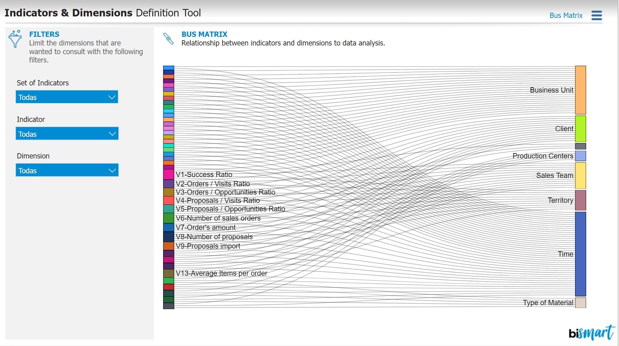
Performance indicators are crucial for monitoring business activity. If these indicators are not clearly defined and based on accurate data, they can negatively impact business strategies. Without the right information and proper measurement of results, progress cannot be made.
That is why dashboards that present relevant indicators, dimensions, and relationships are important. These dashboards serve as both technical and functional analytical environments that foster effective communication between the IT department and the rest of the areas within the company.
Furthermore, dashboards enable any member of the organization to access key information for monitoring business activity. They also help minimize errors, optimize the results of follow-up meetings, and reduce the time spent on report preparation.
4. Cost Optimization Dashboard
In addition to the typical financial dashboard, some companies implement a cost optimization dashboard. This type of dashboard is created to reduce costs and optimize the organization's supply chain.
By using a cost optimization dashboard, companies can monitor the progress of their costs, compare them with historical data, and evaluate the profitability of their projects.
This enables business leaders to consider all the variables that impact financial performance and make decisions that promote positive changes.
5. Customer Segmentation Dashboard
Customer segmentation is one of the most crucial strategies in modern customer management. Segmentation dashboards empower companies to classify their customers based on predetermined criteria and provide personalized solutions, products, and experiences.
In recent years, customer segmentation dashboards have gained significant importance, becoming an indispensable tool for most departments within an organization. They enable decision-makers to establish priorities, focus efforts on the right customers, and enhance marketing actions.
Moreover, customer segmentation dashboards offer an excellent opportunity to gain deeper insights into customers, identify pain points, areas for improvement, and business opportunities.
6. Customer Journey

The customer journey, or customer journey, is becoming an increasingly important aspect of customer care strategies. Having a map that allows us to quantify our customers' journey is essential to improve the experience we offer them, create personalized loyalty and retention strategies, and guide customers to the next stage in their buying process.
A dedicated customer journey dashboard should visually represent the conversion process, identify stages in the customer's buying process, and include the most relevant key performance indicators for the customer journey.
7. Marketing Insights Dashboard
Nowadays, the majority of companies have a marketing department due to the increasing importance of marketing in the digitalization of the business sector. As a result, marketing dashboards have become a crucial tool in 2021.
These dashboards allow for monitoring the performance of marketing actions, including campaigns, content generation, new customer acquisition, segment performance across communication channels, and more.
An effective marketing dashboard should include the most relevant results of the marketing strategy and serve as the primary guide for the CMO to evaluate the success of marketing activities within a specific time period.
8. Social Media Insights
Social media is a crucial communication channel for businesses, and having a strategic plan for content creation is essential. Social Media Insights dashboards include relevant metrics related to each company's social media presence, and depending on their strategy, they can include different performance indicators.
An effective social media monitoring dashboard should provide an ideal environment for analyzing content performance and communication campaigns in the digital landscape. It should also allow for studying the relationship between the audience and the brand on social media. Understanding audience behavior and customer opinions about products and services can also be crucial in times of crisis.
9. Customer profit dashboard

An efficient method of classifying our customer base is by focusing on their profitability. Profitability-based customer segmentation dashboards are emerging as a vital technological solution to help marketing, sales, and business departments concentrate their efforts on the right customers.
These dashboards allow companies to align their business strategies with customer profitability, determine their target market, identify strategic customers, uncover high-risk or unprofitable customers, and more.
The ultimate purpose of these dashboards is to provide a supportive tool for customer strategy teams to enhance their efficiency and assist them in making informed strategic decisions.
10. Hotel Management Dashboards
The Covid-19 pandemic has had a significant negative impact, especially on businesses in the tertiary sector, particularly those that rely on tourism as their main source of income. As a result of this situation, hotel companies have started investing in technology to thoroughly monitor their business performance during challenging times, manage the crisis, and explore innovative ways to turn adversity into opportunity.
The Hotel Revenue Management Dashboard is a Power BI dashboard that provides a comprehensive information solution for hotel chain directors and other executives to view indicators for all their hotels and functional areas. This type of dashboard combines all the fragmented information silos of the company into a single environment, offering a 360-degree view of business activity.
The Hotel Revenue Management Dashboard integrates all the information that a hotel director may need, such as revenue management, purchasing, sales, finances, reputation, personnel, economic activity, web traffic, air traffic, and more. It also includes advanced analysis and prediction capabilities, allowing managers to forecast occupancy, optimize purchases, and more.
Our team of Power BI specialists has put together an e-book that showcases the updated list of the 15 essential Power BI business dashboards for the year 2023. Make sure not to miss out on it!

Power BI Updates
At Bismart, as one of the few Power BI partner companies in Spain, we are always keeping a close eye on the latest Power BI updates and informing you about each Power BI update and all the new releases that emerge. Furthermore, we continuously strive to enhance the design of our solutions by utilizing the possibilities offered by the platform, such as Zebra BI.
You can check out the latest Power BI updates in this blog post or discover their new additions to Power BI Microsoft Teams.
One of the most notable visual updates was the addition of the decomposition tree chart to Power BI. This new functionality allows for root cause analysis by visualizing the contribution of individual categories to the overall total. The decomposition tree chart provides the ability to break down a group and examine each category individually, observing how they can be sorted based on a specific measure, such as sales. This tool has proven invaluable for conducting simulations, making predictions, and supporting decision-making.
In addition, Power BI's tree decomposition visualization offered the ability to view data across multiple dimensions. It automatically aggregated the data and allowed for exploration of dimensions in any desired order. It also featured AI-based functionality that suggested the next dimension to explore based on specific criteria. This made the tree decomposition chart a versatile tool for ad-hoc exploration, root cause analysis, as well as predictions and simulations.
One of the most exciting news related to the new Power BI experiences for Microsoft Teams was the introduction of the Power BI app for Teams. While the inclusion of Power BI in the chat app was not the only update, it was certainly the most intriguing. This new app allowed users to visualize and work with Power BI without leaving the chat app.
Furthermore, Microsoft also made other announcements regarding Power BI updates for Teams:
Novelties were introduced in the search options to find and open Power BI content. With the new search experience in Teams, users could quickly find recent reports, dashboards, and applications and open them within the Power BI app for Teams.
Chat experiences were improved to easily find and share Power BI content. Sending links to Power BI reports, dashboards, applications, visualizations, and workspaces within the app became easier.
Changes were made in Dataset Discovery to help find data for creating reports and Excel workbooks. This new option helped users discover available datasets across the organization directly from the Power BI app in Teams. Power BI datasets were secure and governed, with permission-based access, row-level security, the ability to certify, and full support for Microsoft Information Protection. From there, users could quickly generate a Power BI report or choose to analyze and explore the data in Excel.
These options were added to the previously launched tools, which were:
Initiating a Teams chat when viewing reports and dashboards.
Adding a BI tab to channel and group chats.
Beyond Teams, it is important to mention that Microsoft has recently announced the end of featured dashboards in Power BI. This change means that users will no longer be able to create or feature shared dashboards, but they will still be able to view and use previously shared dashboards. Users will need to seek alternatives to organize and access their Power BI dashboards efficiently.
Until now, when a user or company set a dashboard as featured, every time they opened Power BI Service from the browser, an email link, or another shared URL, the featured dashboard or report would automatically open.
With the removal of this feature, it will no longer be possible. Power BI users will no longer be able to set featured dashboards or reports on their Power BI Service home page. However, those who already had a featured dashboard before the removal will still see it on the Power BI Service home page. However, they will not be able to change it for another in the future, only delete it.
In this regard, companies or users who have featured content are advised to consider removing it and adding that content to favorites so that it remains easy to find. However, they will not be able to change the featured content and will not have an easy way to access the reports and dashboards they use most frequently.
This measure announced by Microsoft affects the usability and data governance in Power BI. Although it does not represent a significant problem, it is important to take it into account.

How to implement data governance measures in Power BI?
Data governance is crucial for companies that handle data, although many see it as a tedious task. However, effective data governance goes hand in hand with proper analysis, as both have related goals. To achieve this synergy, it is simply a matter of changing the way we work, so that data governance policies support analysis tasks by incorporating them into the BI workflow. Microsoft Power BI has recently introduced data governance features that help facilitate this collaboration.
Why is data governance important?
Data governance refers to the authority, control, and shared decision-making in managing data assets. Data management, on the other hand, involves the implementation of data policies.
The significance of data governance lies in its ability to ensure data integrity through processes and procedures, standardize systems, and create consistent distribution policies. It also ensures the security and privacy of data assets.
Curating and documenting data is necessary to ensure its organization and accessibility. When the source and data cleansing process are known, confidence in its effectiveness increases. This fosters a data-driven culture and is essential for digital transformation.
How does data management work?
Data management focuses on the curation, provenance, and protection of data with the goal of providing a unified view of data for all stakeholders. This involves organizing and categorizing data so that relevant and reliable information is easily identifiable, tracking the origin of data to understand its lifecycle, and establishing rules at the source to ensure that all derived analyses, visualizations, reports, and dashboards comply with protection constraints. Compliance with data legislation and the presence of confidential customer information often make this process challenging. Sharing knowledge is typically done through documents, spreadsheets, and slides sent as email attachments, which can complicate extending jurisdiction over restrictions or rules.
Power BI simplifies data governance by providing a range of security and data protection features, as well as user-friendly data governance tools such as backed datasets, lineage and impact analysis, and data protection labels. These ensure proper data curation, traceability, and protection without the need to leave the platform.
Some of the new data governance features include backed datasets, which allow for data backed by owners and registered in the cloud service. Lineage and impact analysis enable users to navigate workspace objects and view data sources, gateways, data flows, datasets, reports, and dashboards. Lastly, data protection features offer the ability to add confidentiality and ownership labels to datasets, reports, dashboards, visualizations, and data flows, defined by security administrators and applied to all Microsoft 365 applications.
Implementing a data governance framework in Power BI presents a range of challenges. Content publishing within a workspace can be restrictive, the Power BI portal offers limited customization options, and security is decentralized. Additionally, there is limited access to the data model and its technical documentation, and there is no tool that effectively aligns Power BI assets with their business functionalities. These issues create hurdles when deploying data governance.
Data analysis and data governance are closely related, as they share the same goal. Data governance policies should support data analysis tasks by integrating them into the Business Intelligence workflow. However, implementing these policies requires a data-centric corporate culture. This is where the need for data governance measures in Power BI arises. Power BI has become the preferred environment for creating Business Intelligence tasks that help organizations generate business opportunities and make informed decisions. As organizations grow, they accumulate a large number of datasets, reports, and dashboards in Power BI Service. This abundance of information, content, and users can lead to confusion and hinder workflow, especially in companies with multiple departments or teams. The situation can worsen if team leaders are unable to manage the environment, content, and user activity in Power BI Service. Lack of control and understanding of assets can even impact overall productivity and result in unnecessary costs.
At Bismart, we have helped numerous companies leverage the full potential of Power BI. However, our extensive knowledge of Power BI has led us to identify challenges that many organizations face when working with this analytical system. These challenges include report publishing, user access provisioning, advanced user training, content security, and data governance. To address these issues, Bismart has developed a set of data governance solutions for Power BI.
As a result, we have created our own solution to strengthen Power BI governance. This solution provides organizations with a framework for security and productivity to manage Power BI assets, train users, share information, and monitor activity within the environment. Our solution covers the needs of the five main types of Power BI users: Security Administrators, Access and Content Administrators, Authors, Report Viewers and Users, and External Viewers.

-
Power BI Viewer: Power BI Viewer is a report visualization and management solution for Power BI Embedded users. It combines the capabilities of Power BI Embedded and Power BI Pro, allowing embedded license users to enjoy all the features of Power BI Pro without any limitations on reports or users. It is designed to securely share reports both within and outside the company, without the need for Power BI licenses. This solution is highly customizable and can be tailored to meet the specific business needs of each organization through advanced configuration options. With Power BI Viewer, you can share an unlimited number of reports and dashboards with any desired users, whether internal or external to the organization, without the need for multiple Power BI licenses. The data and reports are protected with layers of security, custom codes, and access restrictions. Visualize and manage all your reports from a single environment, organize them by thematic categories or departments, and customize their presentation. The service is offered as both SaaS and on-premise, providing cost-saving benefits.

The main advantages of Power BI Viewer:
Power BI Viewer offers a report visualization and management solution that optimizes data governance for businesses. This tool is user-friendly, flexible, and secure, allowing users to organize reports by theme and department and create their own categories. Additionally, it incorporates the Power BI toolbar, which allows for filter resets, data refreshes, and much more. Power BI Viewer also enables the definition of different levels of access and degrees of autonomy for users, thereby reinforcing security. This is made possible through the Power BI Embedded license, which also provides access to all the possibilities of a Power BI license from a single license. Furthermore, the platform administrator can customize the platform's functionalities to meet the needs of each user by creating specific roles for each one.
Power BI Viewer helps maximize the productivity of your team by offering optimal usability. The design of the environment is designed to facilitate navigation and work, allowing managers to be independent of workspaces and organize reports by categories. You can also customize the interface to adapt the look and feel to your corporate image by choosing interface colors and adding your logo. Finally, Power BI Viewer offers the ability to share reports without limits on users, space, or capacity, enriching your business or strategic presentations. To complete report management, Power BI Viewer integrates with a unique analysis module that allows you to monitor, analyze, and optimize your data lineage and certification history.
If you want to delve deeper into the benefits of Power BI Viewer, download the e-book "The 8 Great Advantages of Power BI Viewer" below.

If you're interested in Power BI Viewer, you can download the solution's infographic below.

Furthermore, Power BI Viewer allows you to effortlessly access and manage all your Power BI reports, data, and dashboards from one centralized location, enhancing navigation and providing a seamless user experience. You can also organize your reports by thematic categories or departments and customize the presentation of report publishing to suit your specific needs.
The installation of Power BI Viewer is available as both a SaaS and on-premise service, enabling you to easily share reports with other users without the requirement of purchasing multiple Power BI licenses.
.
The new features of Power BI Viewer

Enhanced Report Exporting: With Power BI Viewer, users can now export their reports in PDF or PPTX format, providing them with more options to share their reports with others. Additionally, the export feature preserves the user-selected filters, ensuring a consistent experience.
Improved Report Visualization: In Power BI Viewer 1.1, users have the ability to reset filters and refresh visualizations without having to reload the entire page. This improves efficiency and convenience when resetting applied filters.
Enhanced Security Layer: Power BI Viewer allows administrators to assign different roles, access levels, and degrees of autonomy to users. In version 1.1, this capability is further optimized, as administrators can assign specific access permissions to individual users, rather than applying them only to user groups. This provides a higher level of customization, governance, and security in Power BI.
Streamlined Role Assignment Management: In the previous version of Power BI Viewer, administrators had to reload a report to modify role assignments. With Power BI Viewer 1.1, administrators have a new button that allows them to change roles linked to a report at any time without leaving the current screen. This streamlines the role management process and facilitates permission administration.
Enhanced Visualization and User Experience: Power BI Viewer 1.1 includes various design and user experience optimizations in its interface. Navigating the environment is now easier, more intuitive, and more enjoyable, improving usability and overall user satisfaction.
In addition to these improvements, it is important to note that the installation of Power BI Viewer is now available through Azure Marketplace, making it easier to deploy and use for Power BI users.
Power BI Analytics: Power BI Analytics is a tool designed to enhance business productivity in Power BI. This solution provides an analysis environment without any time, space, or capacity limitations, thanks to an unlimited historical log that stores all Power BI Service activities. This resolves the limitation of monitoring only one month of Power BI Service. Executives now have the ability to view all actions occurring within the service and, through the data obtained, analyze the evolution of performance, compare different time periods, and obtain productivity details. With the use of Power BI Analytics, you can discover which reports users consult, how frequently, and the purpose of their work by applying the management API; uncover which reports are most used and why; manage user activity; and free up storage space and reduce costs by eliminating unused content.

Power BI Analytics offers an unlimited historical log that tracks all activity within Power BI Service and stores it in a unique data repository. This resolves the limitations of monitoring only one month of Power BI Service activity.
This solution empowers executives to review employee actions and visualize all activities performed within the Power BI service. Power BI becomes the environment for analyzing activity data and gaining valuable insights into productivity.
With Power BI Analytics, you can discover which users are working on which reports, with what frequency and purpose. You can also manage user activity through the Power BI management API. Gain valuable insights into user productivity and business performance evolution, all without leaving Power BI Service.
Furthermore, you can identify the most accessed reports and understand the reasons behind their popularity. Power BI Analytics allows you to free up storage space by eliminating unused reports, resulting in cost reduction and increased capacity for more relevant content.
If you're interested in Power BI Analytics, you can watch the webinar on the solution here:
Power BI Data Catalog: Power BI Data Catalog offers a solution to optimize your data governance hub with Power BI. This tool allows you to quickly and automatically document the contents of your Power BI datasets. Business users can easily view the dataset's content, including metrics, tables, columns, data types, and more, to easily identify calculations, verify naming conventions, and understand functional information. You can also review the data sources for each table to ensure you are using the appropriate sources for your reports. Additionally, you can group datasets and access both technical and functional documentation, allowing all users to benefit from it without requiring extensive technical knowledge.

With Power BI Data Catalog, you can enjoy various advantages and functionalities:
Automatic dataset documentation: Power BI Data Catalog allows you to automatically document the content of your datasets. This makes it easier to understand and track the calculations performed in the dataset, ensuring proper naming conventions and providing relevant functional information.
Data source identification: With this tool, you can easily review the data sources for each table in your dataset. This guarantees that you are using the appropriate sources for your reports, which is crucial for maintaining data integrity and accuracy.
Centralized dataset management: Power BI Data Catalog allows you to gather all the datasets of interest in one place and organize them by themes. This provides access to a comprehensive catalog of documentation for these datasets, including technical and functional information. This makes it easier to search for and access relevant information for report development.
The key benefits of Power BI Data Catalog include:
Agile descriptions and functional information: This tool allows you to quickly and efficiently include descriptions and functional information to all elements of interest, such as tables, columns, and measures. There's no need to include each description one by one, streamlining the documentation process.
Modeling best practices monitoring: Power BI Data Catalog enables the monitoring of modeling best practices in Power BI. This helps you maintain the quality and consistency of your data models, ensuring a consistent and efficient approach to your work.
Model element inventory: With Power BI Data Catalog, you can inventory all model elements and highlight key elements for business users. This allows them to develop new content based on existing and certified data models, saving time and resources in report creation.
In summary, Power BI Data Catalog is a tool that facilitates documentation, tracking, and management of datasets in Power BI, allowing you to maximize efficiency and quality in your data work.
How does Bismart use Power BI?
Bismart has been working with Power BI since its release in 2015. In fact, we are one of the few Microsoft Power BI partner companies in Spain. Our experts have extensive experience in building the best solutions for our clients using this powerful suite of tools.
Power BI is an integral part of our daily workflow, and we have successfully integrated it into our organization, ensuring that everyone in the company is proficient in its usage.
Through our journey, we have identified the strengths of this suite of applications and maximized their potential to offer superior and differentiated solutions compared to other companies. We develop our solutions based on three fundamental pillars.
- Data Quality: If the data we analyze is not reliable and 100% accurate, any Business Intelligence solution would be ineffective. That's why we strive to ensure data quality and correct any errors that may be present in the original data of companies.
- Data Modeling: At Bismart, we create simple data models that can be understood by any user, regardless of their technical knowledge. This is essential for users to be able to create their own reports and understand the purpose and meaning of the data.
- Design: We meticulously care for the presentation of our reports, paying attention to every detail, with the aim of creating reports that are easy to understand, use, and visually appealing. We also customize our creations to meet the requirements of our clients, aligning with their style and corporate image. Additionally, we provide design guidance to companies, ensuring the use of efficient colors, fonts, and visual elements. Furthermore, we ensure that all our reports are interactive and tell a compelling story through a cohesive narrative thread.
Bismart is a preferred Microsoft Power BI Partner
Bismart has been a Microsoft Power BI partner for several years and is one of the few in the country. This recognition validates us as leaders in creating optimal solutions for our clients using this powerful tool. We have been working with Power BI for data analysis, dashboards, reports, and data visualizations for many years. Our partnership with Microsoft dates back to Bismart's inception in 2009. Two years later, we were honored as the Best Microsoft Partner in Spain, and in 2013, we positioned ourselves as the top Microsoft partner in the world for business intelligence. Recently, Bismart has achieved Gold Partner status with Microsoft in Spain and is now a Power BI partner. Last year marked our 10th anniversary, and therefore, 10 years as a Microsoft Power BI partner. This drives us to continue in this direction, as being part of the Microsoft partner network offers significant competitive advantages.

What does it mean to be a Microsoft partner?
Microsoft established its network of partners in 1992 as an initiative to promote development, innovation, and collaboration among technology companies. Today, it includes over 640,000 companies worldwide, with more than 100 in Spain. Therefore, being one of the few companies associated with Power BI in the country is a significant achievement. Additionally, being part of this community means enhancing the technical capabilities of businesses, as Microsoft provides its partner network with the best tools for data analysis and integration, technological innovation, and business intelligence. As a result, Microsoft partners have access to top-notch technical resources to enrich and optimize the solutions and experiences they provide to their clients. In the realm of Power BI, Microsoft supports us as leaders in the development of business intelligence strategies, data analysis, data management, and data governance.
Power Platform: Power BI, Power Flows, PowerApps Common Data Service and Dynamics 36
In the business world, databases play a crucial role in providing competitive advantages, optimizing processes, reducing costs, uncovering valuable insights, and predicting behaviors. That's why choosing the right enterprise management software is a critical decision to support our data and objectives.
With Microsoft's Power Platform, a suite of interconnected technologies including Power BI, PowerApps, Microsoft Flow, Common Data Service, and Dynamics 365, a wide range of powerful business solutions are offered.
- Enhance your existing management system or ERP through seamless integration between the two systems, without the need for replacement.
- Our suite of business tools provides a panoramic view of your company or each business process, allowing for comprehensive understanding.
- Improve management control to ensure the execution of your business strategy.
- Significantly increase productivity in specific departments of your organization.
- Simplify the creation of a common data model to integrate necessary satellite applications in production.
- Enable agile creation of custom applications that connect to existing data and systems, addressing business needs and specific processes in a matter of hours, not months.
- Automate business processes and routine tasks to enhance productivity.
Microsoft Flow
Microsoft Flow is a powerful tool within the Power Platform that enables seamless connection and data transfer between various applications, including both Office 365 and third-party apps. This allows for the automation of tasks, such as automatically saving email attachments to a specific folder or scheduling inventory status notifications. The best part is that you don't need any technical expertise to create workflows, as Microsoft provides templates and a thriving user community where you can find and share innovative business solutions.
PowerApps
On the other hand, PowerApps is a platform that provides a rapid development environment for creating custom applications that connect to enterprise data stored in various sources. These applications offer workflow functions and business logic to transform manual processes into digital and automated ones. Additionally, PowerApps applications have an adaptable design and can run on web browsers and mobile devices.
PowerApps democratizes the creation of custom enterprise applications, as users can develop applications without the need for coding, opening up new possibilities for businesses in terms of functionality and features.
Common Data Service
The Common Data Service (CDS) is a powerful platform that enables secure storage and management of data for use in enterprise applications. In CDS, data is organized into sets of entities, similar to tables in a database, that are used to store records. Not only does CDS include a set of standard entities that cover common scenarios, but it also allows for the creation of custom entities specific to an organization.
An entity in CDS represents a collection of related records that contain specific information. This provides a coherent and organized structure for business data. Additionally, the platform offers the functionality of Power Query, which allows these entities to be populated with data from various sources.
App creators can leverage PowerApps, a tool within CDS, to develop custom and comprehensive applications that utilize the stored data. With PowerApps, it is possible to create intuitive and functional interfaces that directly connect with the entities and records in CDS. This provides an agile and efficient way to develop applications tailored to the specific needs of an organization.
In summary, the Common Data Service is a platform that offers secure and managed data storage for enterprise applications. It allows for the creation of custom entities and data population using Power Query. Furthermore, by integrating with PowerApps, it facilitates the development of custom and comprehensive applications that leverage the data stored in CDS.

Power Platform Benefits
Having efficient and powerful tools is crucial in today's business environment to gain a competitive edge. Microsoft's Power Platform suite, including Power BI, PowerApps, and Microsoft Flow, offers a range of benefits that enable companies to achieve a higher level of decision-making and process optimization.
Imagine being able to obtain real-time information about your customers' needs and stay ahead of their demands. With Power BI, you can access a unique report that integrates relevant data such as competitor offers, market situation, customer interest level, and inventory status. This comprehensive and up-to-date view allows you to make quick and intelligent decisions to seize opportunities and maintain a competitive advantage.
Furthermore, with Power Platform, you can say goodbye to tedious database administration tasks. With PowerApps, you can create custom applications without the need for programming knowledge. This allows you to save costs in application development and optimize your company's business processes. You can also automate repetitive workflows with Microsoft Flow, freeing up time to focus on strategic and high-value tasks.
With these tools, the possibilities are limitless. You can design more efficient processes, respond quickly to emails and automatically categorize them. Additionally, by leveraging automated workflows, you can create custom applications that meet the specific needs of your company.
With Power Platform, you can focus on making informed business decisions, identifying correlations between metrics, and anticipating potential issues such as stock shortages. The real world won't surprise you; you'll be one step ahead thanks to these powerful and cutting-edge tools.
According to an analysis conducted by consulting firm Forrester, several organizations have implemented PowerApps and Power Flows as part of their business strategy, with impressive results.
The interviewed organizations highlighted that by using Power Platform, they were able to significantly reduce development costs by accelerating application creation time and allowing even non-developers to customize workflows. This optimization of business processes led to tangible benefits such as reduced time to market, improved customer service, and increased revenue.
The financial analysis revealed that these organizations experienced benefits of approximately $8.9 million over a three-year period, with costs of only $1.9 million. This resulted in a net present value (NPV) of $7 million and an impressive return on investment of 362%.
One of the most notable quantifiable benefits was the drastic 70% reduction in average application development costs using PowerApps and Microsoft Flow. This translated into significant savings in professional service fees and the acquisition of third-party applications, as well as a reduction in the effort required for code maintenance. In addition, there were cases where external applications were replaced by internal solutions developed with PowerApps and Microsoft Flow, resulting in a total savings of $91,454.
Furthermore, PowerApps and Microsoft Flow improved process automation and efficiency, achieving an average improvement of 15% for 1,575 users, resulting in $5.32 million in optimized processes.
In addition to quantifiable benefits, organizations also experienced intangible advantages such as streamlining and automating processes. This resulted in more satisfied customers, shorter time to market, and improved ability to predict revenue. Employees, both in the IT department and other business areas, were able to make faster, data-driven decisions in real-time, increasing their satisfaction and productivity. Additionally, both technical and non-technical users had the ability to create applications that generated business value, something that would not have been possible without these tools. This gave users greater control over their work and eliminated repetitive and tedious manual tasks.
Power Platform news
During the period from October 2020 to March 2021, Power Platform implemented a range of updates across all its applications. Below is a summary of these enhancements:
Power BI Desktop has undergone numerous updates, introducing a range of new capabilities that enable users to create content quickly and easily, thereby enhancing the creation of business content. Additionally, users now have the opportunity to explore artificial intelligence.
Power BI Service has integrated with Azure Synapse, enabling the automatic creation and management of materialized views in larger Power BI models. The integration with SharePoint has also been enhanced, allowing for the construction of additional custom reports.
Power Apps has experienced significant improvements for developers of all levels, increasing the sophistication and ease of use of applications created for both web and mobile devices.
Power Automate has been updated to combine the best of WinAutomation with cloud-based AI Builder and connector capabilities in automated workflows. This update allows for the automation of various tasks. Furthermore, additional improvements have been made to cloud-based automated flows, providing better automation and approval experiences.
Power Virtual Agents has achieved better integration with Microsoft Teams, providing tools to enhance content creation, implementing authentication improvements, and establishing a stronger integration with Power Automate.
In summary, Power Platform has proven to be a valuable investment for organizations, providing significant financial benefits and improving operational efficiency. If you want to increase your company's ROI and empower your employees with powerful tools, Power Platform is a solution you should seriously consider.
Self-service BI with Power BI
What is a self-service BI environment?
At an enterprise level, a self-service BI environment is a set of tools, technologies, and processes implemented within an organization to enable end users to generate their own reports, analysis, and data visualizations independently, without relying solely on the IT department or BI experts. This approach provides users with greater autonomy and agility to explore, analyze, and understand the data relevant to their work, driving informed decision-making and fostering collaboration across different roles and departments in the company.
In a self-service BI environment, users can access a variety of data sources, transform and combine data according to their needs, create interactive visualizations, apply advanced analytics, and share their findings with other users. These tools often have intuitive and user-friendly interfaces that do not require deep technical knowledge, allowing users to be more independent and agile in data exploration and analysis.
By implementing a self-service BI environment, organizations empower their employees to make data-driven decisions in a timely and agile manner. This enables them to identify opportunities, detect issues, and generate innovative ideas to improve business performance. Additionally, by decentralizing data analysis, the burden on the IT department is alleviated, and a data-driven culture is fostered throughout the organization.
It is important to note that a self-service BI environment requires robust data governance to ensure the quality, security, and integrity of the data used. This involves establishing clear policies and procedures for data access, security, privacy, and management, as well as providing training and ongoing support for users in the effective use of self-service BI tools like Power BI.
If you're interested in exploring ways to optimize your self-service BI environment, you can check out our informative session on metrics and dimensions for working in a self-service BI environment.
During the webinar, Víctor provided a detailed explanation of the concept of self-service Business Intelligence (BI) environment and its difference from traditional dashboards. While dashboards are typically created by the functional department and tend to be static, the self-service BI environment allows each user to create their own reports according to their needs. However, the current trend is to combine both forms of work by implementing a dashboard environment that also provides self-service tools for advanced or selected users to create their own reports.
Next, basic concepts of business intelligence were addressed, such as measures, indicators, and dimensions. Víctor illustrated the value of data analysis through practical examples that showed how metrics reveal what happened and dimensions explain why it happened.
This translates into a data model that allows us to identify what information we want to know and why we want to analyze it, such as sales by product, subsidiary, time, among others.
Víctor emphasized the importance of considering the end users of the tool to ensure its success and adoption. To achieve this, it is crucial to develop an appropriate working methodology and have a tool that facilitates its implementation. However, the most essential aspect is to provide continuous support and guidance to the users.
Best practices for building a successful self-service BI strategy
As technology has advanced in the business environment, organizations have sought to adopt self-service BI models that allow them to meet their own analysis and business intelligence needs without relying on technical specialists.
Today, understanding the concept of self-service BI and its importance has become essential for companies that want to maximize the potential of their data and stay competitive in an increasingly demanding market.
With the aim of providing guidance to large companies, our team of business intelligence experts has crafted a comprehensive guide that presents the good practices for implementing a self-service BI strategy.
We invite you to download our e-book titled "10 Best Practices for the Enterprise Adoption of a Self-Service BI Model based on Power BI." In this book, you will find valuable information to empower your organization towards greater autonomy in data analysis and decision-making based on business intelligence.


Developing a self-service BI strategy goes beyond the technical construction of reports; it requires a comprehensive approach that considers technical criteria, data quality and health, data security and governance policies, as well as usage criteria.
It is important for companies to understand the two existing models for developing a self-service BI strategy.
Models for developing a self-service BI strategy:
Internal Experts
This approach is suitable for companies where the majority or all users possess the necessary technical knowledge to create their own reports using BI tools like Power BI.
The organization outsources the processing, integration, organization, and preparation of data sets for later use in Power BI by internal users of the company, who exploit the data and create their own reports using the tool. This approach is ideal for organizations where all users have the ability to build their own reports.
To make this model effective, it is important to provide professional training to internal users of the organization so that they can make the most of Power BI's capabilities.
At Bismart, we offer a type of training that is ideal for Power BI adoption: we provide training to users in your company using your own data sets. This allows for personalized training that empowers users to start working with Power BI immediately and with knowledge of the internal content they will be using.
Enterprise Approach
This approach is most suitable for companies that have a small BI or IT department responsible for creating reports in Power BI, while the rest of the company's users have business profiles and only act as consumers of these reports. It is also a viable option for companies that do not have users with technical knowledge, as they can outsource the entire report generation process.
However, this approach can lead to additional costs. Many organizations incur unnecessary expenses by acquiring multiple Power BI Pro licenses for each business user who only needs to view the reports, which is not really necessary.
Additionally, this approach requires the development of comprehensive policies related to the use and exploitation of data sets, as well as policies for the development of data flows and policies for the creation and consumption of corporate reports. These policies are essential to ensure the proper use of data and maintain the integrity of information throughout the organization.
Key factors and best practices for implementing a self-service BI strategy with Power BI
The effective implementation of Power BI and its ability to generate business value are influenced by various factors. The adoption of any technology presents challenges, and if not properly addressed, they can impact long-term performance and reduce the return on investment (ROI) of Microsoft Power BI.
In addition to the technical support provided by experts in the tool during implementation, the success of Power BI adoption largely depends on the business perspective with which the deployment is approached.
At Bismart, we always emphasize to the companies we collaborate with on Power BI projects that the goal of implementation is not simply to make the tool work. The true objective is to ensure that Power BI delivers the expected business results.
The first part is relatively easy to achieve and does not require extensive preparation. However, achieving the expected business results is more complex, and failing to do so can result in a significant loss of time and money.
At Bismart, we understand that Power BI is a means, not an end in itself. When a company decides to invest in this tool, it does so with the expectation of improving its business results, gaining a deeper understanding of its activities, having greater goal and performance analysis capabilities, and addressing underlying business needs.
The development of a self-service BI model with Power BI is considered successful when all the aforementioned aspects are achieved, and the company meets the established objectives after enabling the technology. It is essential to consider both the technical aspect and the business perspective to maximize the value and impact of Power BI in the organization.
Key Challenges in Implementing a Self-Service BI Strategy with Power BI
Just like with any new technology, implementing Power BI in an established technological environment comes with challenges that can impact its future performance.
Data Incompatibility: Having an appropriate internal data integration process is crucial. To make the most of Power BI, data needs to be properly integrated and compatible with each other. Format incompatibility issues are common and can hinder the tool's effectiveness.
Low-Quality Data: The ultimate goal of acquiring Power BI is to have a strong informational foundation and make more informed business decisions. The quality of decisions depends on data quality. Ensuring data is of high quality involves transformation processes that ensure the accuracy, integrity, consistency, and reliability of data assets.
Data Modeling: Using an appropriate data model is crucial to make the most of Power BI. A poorly constructed model can negatively affect the pre-design steps and make it difficult to transform data into relevant information. It's important to work with simple, correctly labeled data models to meet user expectations when working with reports and dashboards created with Power BI.
Data Governance: Data governance is crucial to effectively harness data in alignment with the business strategy. As a company grows, so do its data assets. Proper data management is important not only for extracting value but also for compliance with regulatory frameworks, strengthening data security, and mitigating risks.
Lack of Technical Knowledge: While Power BI is an intuitive tool, designing a data model, processing it, and creating reports and visualizations require a certain level of technical knowledge. Most Power BI users are data analysts or data scientists.
At Bismart, we follow a hybrid approach that allows companies to maximize the potential of Power BI after adoption. We not only take care of all the necessary processes to create reports and dashboards in Power BI, from data integration to visualization but also provide comprehensive support to ensure that companies achieve desired outcomes over time and address any issues that may arise. Additionally, we offer training services so that end users can make the most of the tool.
Microsoft Fabric and Copilot now in Power BI
On Tuesday, May 23, 2023, Microsoft made an exciting announcement regarding Power BI. They introduced two new features: Microsoft Fabric and Copilot.
Microsoft Fabric showcases Microsoft's commitment to creating a flexible data architecture around Power BI. On the other hand, Copilot provides Power BI users with advanced artificial intelligence capabilities based on machine learning and natural language processing (NLP).
Both Microsoft Fabric and Copilot address the urgent need for organizations to transform their data into value.
Over the years, Big Data has not fully lived up to its initial expectations. Despite the increasing volume of data generated by companies, a recent IBM study revealed that 90% of this data is not successfully utilized for strategic purposes.
This means that large amounts of data (Big Data) do not translate into greater value. The main obstacles to unlocking the value of data are data integration and poor data quality.
Microsoft aims to tackle these challenges with Microsoft Fabric, which is presented as "a comprehensive human-centered analytics solution that brings together all data and analytics of an organization in one place."
The addition of Copilot to Power BI should come as no surprise. The launch of ChatGPT highlighted multimodal artificial intelligence models based on natural language processing (NLP).
Since then, most technology providers have been developing and integrating "their own versions of ChatGPT" into their platforms and software, and Microsoft has done exactly that with Copilot.
Beyond the specific circumstances, both Microsoft Fabric and Copilot have one thing in common: both capabilities promise to revolutionize the Power BI user experience.
What is Microsoft Fabric?
Microsoft Fabric is a groundbreaking platform that seamlessly integrates Power BI, Azure Synapse, and Azure Data Factory into a single environment.
This integration is revolutionary and promises to create a comprehensive analytics ecosystem that encompasses various areas: data integration (Data Factory), data engineering (Synapse Data Engineering), data storage (Synapse Data Warehouse), data science (Synapse Data Science), and data analysis (Power BI).
Bringing together these interconnected disciplines in one environment not only provides unparalleled flexibility but also presents a unique opportunity to foster collaboration between data professionals such as engineers, scientists, analysts, and business users. Enhanced cohesion among these tools can facilitate seamless teamwork across the organization, ultimately achieving a common objective: transforming data into tangible business value and establishing a true data-driven culture that empowers companies to fully leverage the data they generate or, at the very least, a significant portion of it.
What is included in Microsoft Fabric?
Microsoft Fabric encompasses multiple solutions in a centralized platform based on a data lake. These solutions include:
Data Factory (currently in preview): Enables the integration of hybrid and multicloud datasets to unlock their value.
Synapse Data Engineering (currently in preview): Provides data engineers with a high-performance platform based on Spark that encourages collaborative work.
Synapse Data Warehouse (currently in preview): Offers industry-leading performance and scalability in terms of SQL, integrating data engineering, data storage, and BI analysis in one place.
Synapse Data Science (currently in preview): Allows data scientists to work together with data engineers and BI analysts in creating artificial intelligence models.
Synapse Real-Time Analytics (currently in preview): Enables exploration and analysis of real-time data from multiple sources.
OneLake (currently in preview): A comprehensive data lake offered as a cloud service (SaaS).
Additionally, Microsoft is developing Data Activator (currently in private preview), a real-time data change detection system. This solution allows users to create a data analysis monitoring system and take timely actions, both automated and human, throughout the organization.
How will Microsoft Fabric impact Power BI?
Despite all the excitement, Microsoft Fabric is simply the integration of Synapse and Power BI. Microsoft Fabric combines different types of Synapse workloads with the advantages of the Power BI SaaS platform, resulting in a more cohesive, integrated, and user-friendly environment for all involved profiles.
Power BI will continue to function as usual, but Power BI Premium users will have access to new capabilities in data science, data engineering, and more.
This does not mean that Power BI data analysts and developers have to start working with Synapse Data Warehouse if they do not need to. Following the Office 365 approach, Microsoft intends to integrate all its data solutions into one: Fabric.
In Office 365, users rely on Excel for spreadsheets, PowerPoint for presentations, and Word for documents. The same will happen with Microsoft Fabric.
In summary, Power BI users will continue to use Power BI as usual. They will simply have access to new platforms through the Microsoft Fabric suite.
Microsoft Fabric: The New Era of Business Data Analytics
Microsoft Fabric marks a significant evolution in business data management and analytics. This unified platform integrates tools like Power BI, Azure Synapse, and Azure Data Factory, providing a comprehensive solution for the entire data lifecycle.
A key change is the new licensing model based on "Capacity Units" (CUs), allowing organizations to pay only for the resources they use, optimizing costs and adapting to specific business needs.
Additionally, Microsoft Fabric introduces "OneLake," a unified data store that facilitates access and analysis of information from various tools and roles within the organization. This integration enhances operational efficiency and supports more informed decision-making.
The transition to Microsoft Fabric does not mean the end of Power BI; instead, it integrates Power BI into a broader and more powerful ecosystem. Businesses can continue using Power BI as before while benefiting from the new capabilities and improvements offered by Fabric.
Power BI with Artificial Intelligence: Transforming Business Data Analysis
The integration of artificial intelligence into Power BI has revolutionized how companies analyze and visualize their data. With tools like Copilot, users can generate reports, create visualizations, and gain insights more quickly and efficiently, using natural language and without the need for advanced technical knowledge.
Key capabilities include automated report creation, generation of interactive visualizations, development of smart narratives that explain data, and enhancement of semantic descriptions in data models. These features enable organizations to make more informed and strategic decisions, optimizing their processes and resources.
To fully leverage these tools, it's essential to have a well-structured data model and understand the activation requirements based on workspace capacity and organizational settings. Integrating artificial intelligence into Power BI not only improves operational efficiency but also positions companies at the forefront of innovation and competitiveness in today's market.
Copilot: Powerful AI Capabilities for Power BI
Microsoft has recently unveiled Copilot, an exciting artificial intelligence project specifically designed for Power BI.
Copilot is essentially a multimodal AI model based on natural language processing, which can be seen as the equivalent of ChatGPT or DALL·E in the context of Power BI.
With the addition of Copilot to Power BI, users will have the ability to ask questions about their data and generate visualizations and DAX measures through a brief description of what they want to achieve. In a presentation video, Copilot is shown to behave similarly to ChatGPT, through a conversational chat interface. Additionally, the video provides an initial glimpse into some of the capabilities offered by Copilot.
Enhance Your DAX Queries with Power BI Copilot
Power BI Copilot has transformed how users interact with DAX queries, enabling the generation and understanding of complex expressions through natural language. This tool simplifies the creation of measures, calculated columns, and custom tables without requiring advanced DAX knowledge.
To fully utilize Copilot, it's essential to enable it in Power BI Desktop. Once activated, users can describe their desired query in natural language, and Copilot will translate it into the appropriate DAX syntax. Additionally, it offers the capability to explain existing queries, breaking down each component for better understanding.
This functionality democratizes data analysis access, allowing professionals from various fields to gain valuable insights without solely relying on DAX experts. With Copilot, creating and understanding DAX queries becomes more accessible and efficient.
Maximizing Efficiency: Best Practices for Power BI Governance
As organizations expand, efficiently managing Power BI becomes a critical challenge. The increase in users, reports, and datasets amplifies complexity and costs, making the implementation of a data governance framework essential to maintain productivity and optimize investment. Data governance ensures data quality, integrity, and security, while also improving permission management, simplifying license administration, and enhancing operational efficiency.
Bismart offers an integrated approach combining tools like Power BI Viewer —enabling unlimited report sharing without additional licenses—, Power BI Analytics —providing real-time activity monitoring—, and Power BI Data Catalog, which simplifies self-documentation and empowers business users to independently create reports. Implementing this framework helps organizations overcome challenges such as complex management, high licensing costs, and misalignment between data assets and business needs.
In short, a solid data governance strategy in Power BI boosts productivity, reduces costs, and ensures that business intelligence is built on a reliable and robust foundation.

Microsoft Fabric Redefines the Power BI Ecosystem
Microsoft has announced a major transformation in its data analytics ecosystem with the launch of Microsoft Fabric, that does not make Power BI disappear. This new platform brings together key tools like Power BI, Azure Synapse, and Azure Data Factory into a unified SaaS solution, delivering a more streamlined and efficient data management and analytics experience.
One of the most significant changes is the discontinuation of Power BI’s Premium per Capacity (P-SKU) licenses, which will be replaced by Microsoft Fabric capacities starting January 1, 2025. The goal is to simplify purchasing options and provide a unified platform that merges the best of Power BI, Azure Synapse Analytics, and Azure Data Factory.
Beyond integration, Microsoft Fabric introduces a more flexible licensing model based on Capacity Units (CUs), enabling organizations to scale dynamically according to demand and reduce costs through automated resource adjustments.
For companies using Power BI—especially those relying on Premium per Capacity licensing—preparing for this transition is essential. Adapting ahead of the cutoff date ensures a seamless migration and allows full use of the advanced capabilities Microsoft Fabric offers.

Copilot for Power BI: AI-Powered Data Analysis Made Simple
Copilot for Power BI marks a major evolution in how organizations engage with their data.
Integrated directly into the Power BI platform, this generative AI assistant enables users to create reports, perform complex calculations, and uncover insights using natural language prompts. For example, a request like “Show me last quarter’s sales by region” prompts Copilot to generate a relevant report with charts and tables automatically.
This functionality democratizes data analysis, granting wider access to valuable insights without requiring technical expertise. However, the quality of Copilot's outputs depends heavily on a well-structured data model; having a solid data architecture is crucial for accuracy and relevance.
To maintain visual consistency across reports, it’s advisable to use custom Power BI themes. These ensure all reports—regardless of who creates them—adhere to a cohesive design aligned with brand identity.
In short, Copilot for Power BI streamlines and enhances data analysis, enabling businesses to make faster, more informed decisions.
Publishing and Managing Reports in Power BI: Solutions for Business Needs
Power BI provides various options for publishing and sharing reports, catering to different organizational requirements. From direct publishing from Power BI Desktop to the Power BI service, to sharing reports publicly via the "Publish to Web" feature, the possibilities are extensive. Additionally, reports can be shared internally within the organization, ensuring that only authorized users have access. Reports can also be exported in formats like PDF or PowerPoint for offline distribution.
However, these options may not suffice for organizations with more complex needs, such as sharing reports with external users or maintaining strict control over data security and governance. In such cases, complementary tools like Power BI Viewer can be highly beneficial. This solution enables more efficient report management, facilitating controlled access for both internal and external users, and ensuring that reports are organized and shared in accordance with corporate policies.

Power BI Price Increase in April 2025: Impact and Optimization Strategies
Starting April 1, 2025, Microsoft will implement a price increase for Power BI Pro and Power BI Premium Per User (PPU). The cost of Power BI Pro will rise from $10 to $14 per month, a 40% increase, while Power BI PPU will go from $20 to $24, a 20% hike.
This adjustment reflects the platform's evolution, incorporating advanced features such as generative AI, performance enhancements, and deeper integration with Microsoft Fabric.
For organizations, this change necessitates a review of licensing strategies. For instance, a company with 100 Power BI Pro users will see its monthly expenditure increase from $1,000 to $1,400. In this context, optimizing license usage by identifying active users and exploring alternatives like Power BI Viewer, which allows report sharing without individual licenses, becomes crucial.
Additionally, considering the transition to Microsoft Fabric is important, as some Power BI licenses have been replaced by capabilities within this new platform. Proper planning for this migration can help maximize return on investment and ensure efficient adoption of new tools.
Fabric Copilot Capacity: Democratizing Access to Artificial Intelligence in Microsoft Fabric
As of April 28, 2025, Microsoft has made Fabric Copilot Capacity (FCC) available across all Microsoft Fabric capacities, starting from F2. This move democratizes access to generative AI capabilities by allowing more organizations to use Copilot without needing higher-tier capacities like F64 or P1.
With this update, users can access Copilot in Power BI, Data Engineering, Data Factory, and Data Science experiences, even from lower capacities. The resource consumption is centralized through FCC, enabling better cost control and shared access across different workspaces.
No new license or additional fee is required — Copilot features are included in the capacity benefits. However, this functionality is not available in free or trial environments.
Power BI Management and Data Governance: Keys to Secure and Efficient Administration
Today, many organizations face challenges in managing their Power BI environments, especially when it comes to data governance. Lack of control can lead to problems such as proliferation of unofficial reports, difficulties in data traceability, and security risks.
To address these challenges, it is essential to implement a data governance strategy that includes:
- Content usage monitoring: monitoring who accesses which reports and how often.
- Documentation of datasets and dataflows: Maintaining a functional and technical description of data assets.
- Metadata management automation: Facilitate the updating and maintenance of data information.
- Centralized permissions management: Control user access in an efficient manner.
- Control over the publication of reports: Establish processes to validate and approve new content.
Implementing these practices not only improves security and regulatory compliance, but also optimizes operational efficiency and the quality of information used in decision making.

Bismart's Governance for Power BI solution is designed to respond to these needs, providing a comprehensive platform to monitor, organize and govern the Power BI environment in a centralized and automated way.
Its main functionalities include:
- Monitoring of content and user activity
- Automatic documentation of datasets and dataflows
- Permission management from a single interface
- Lifecycle control of published reports
- Clear visualization of asset mapping and dataflows
Implementing this solution not only enhances security and compliance, but also improves operational efficiency, avoids redundancies and ensures the strategic use of data in decision making.
